Browsing Tag

design

Design

Hit Refresh

November 2, 2015
Photo Credit @battery_full

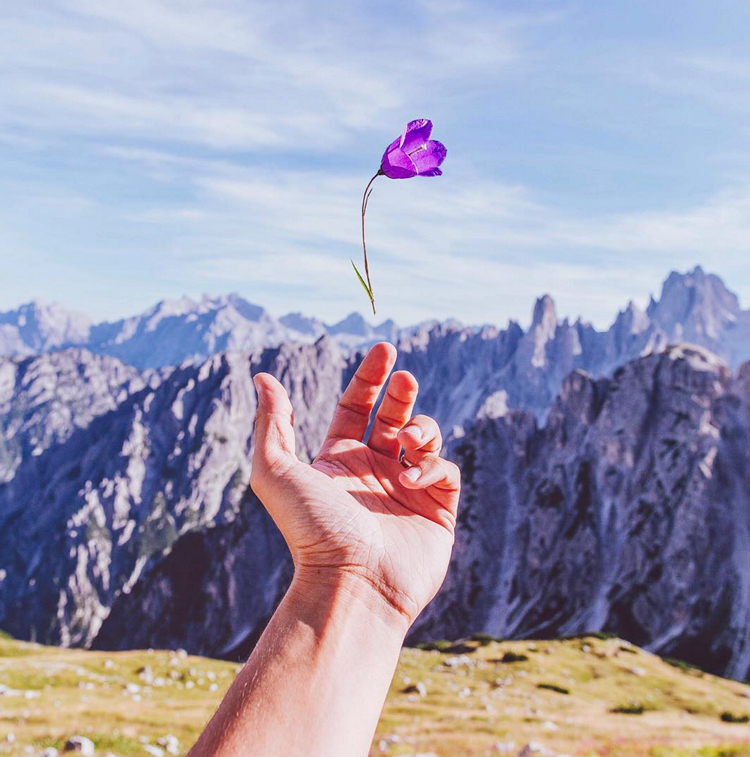
Hello good people! Hope you all had a great weekend, I took a short trip to the mountains today to get away from life, the city, my house…needless to say it was perfect and just what I needed to feel refreshed for a new week.

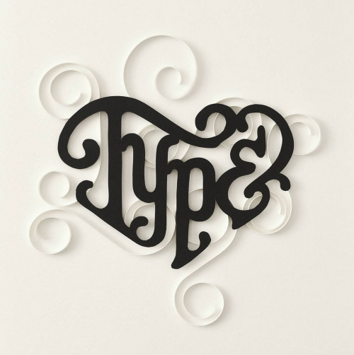
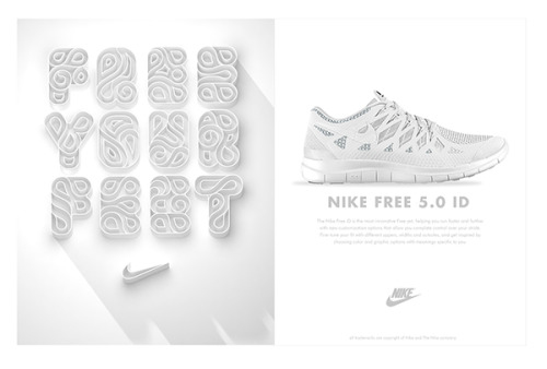
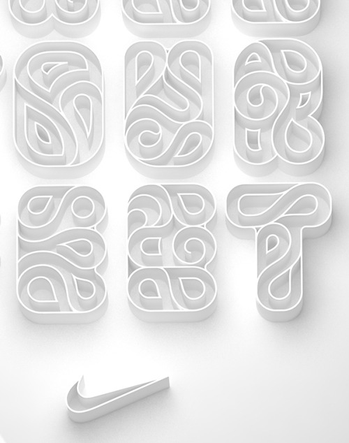
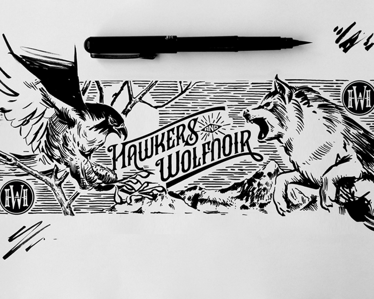
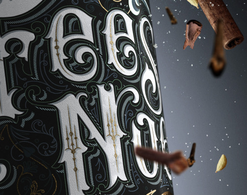
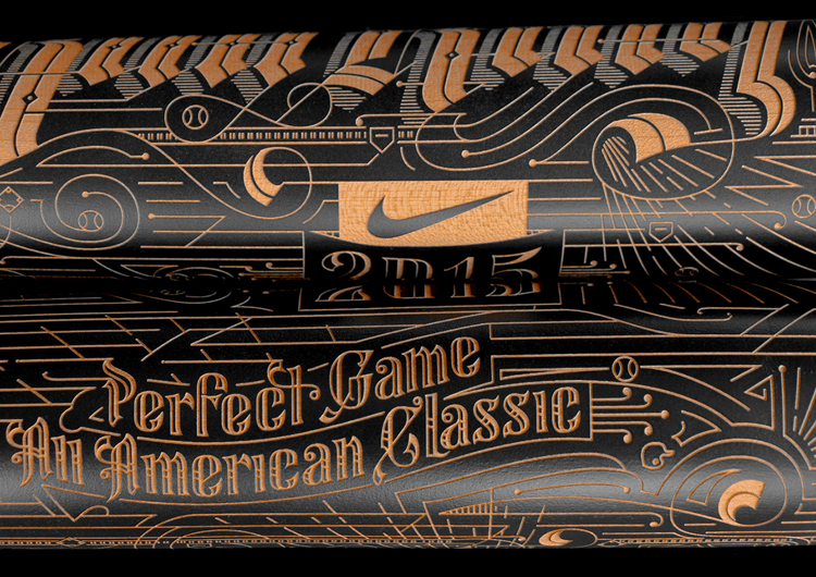
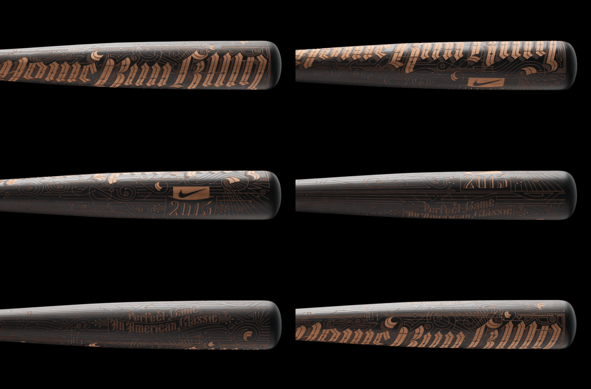
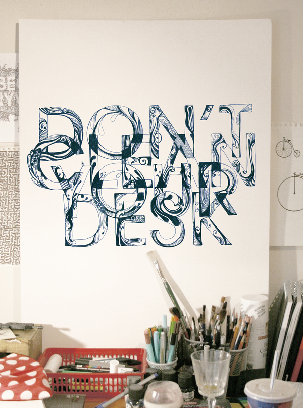
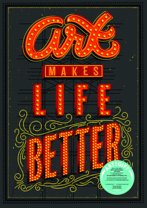
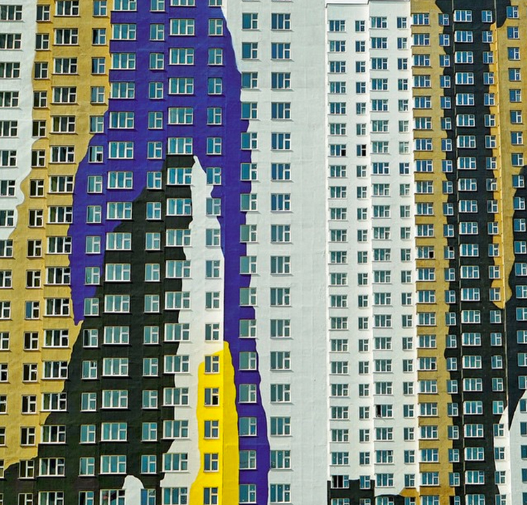
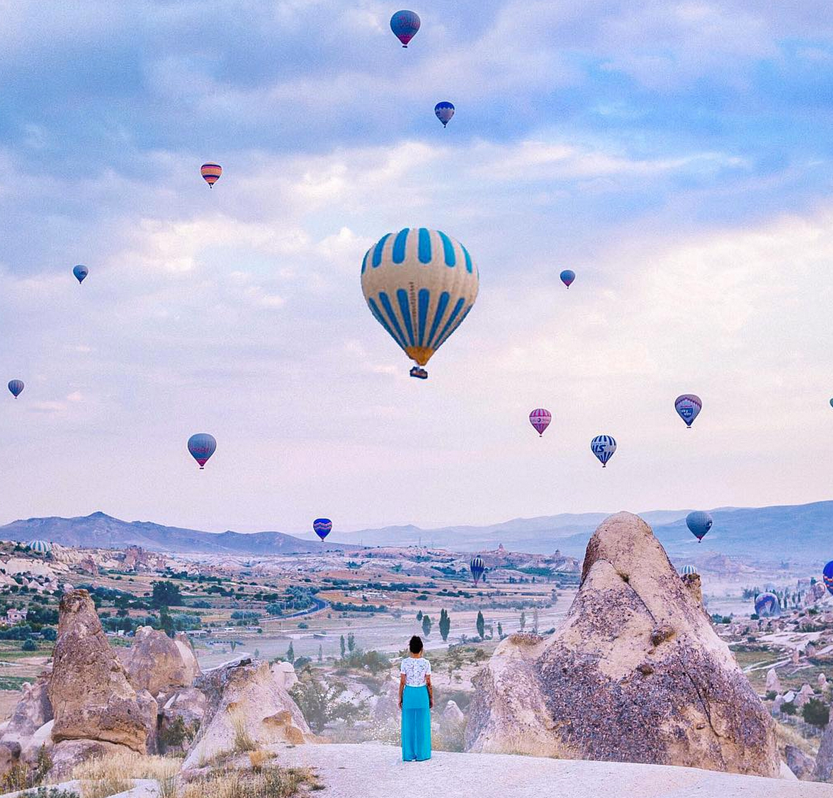
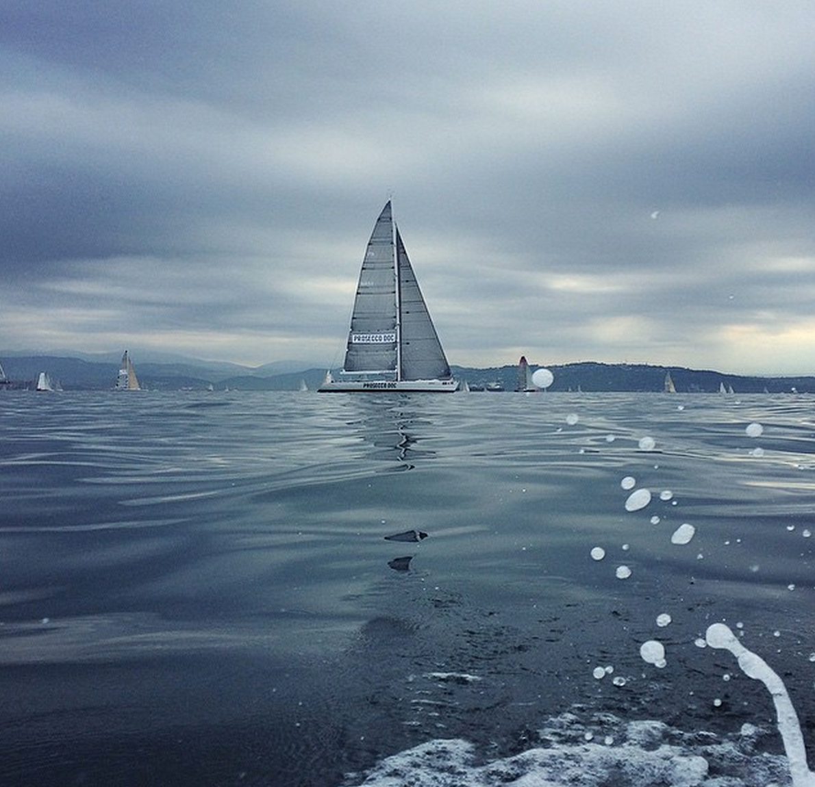
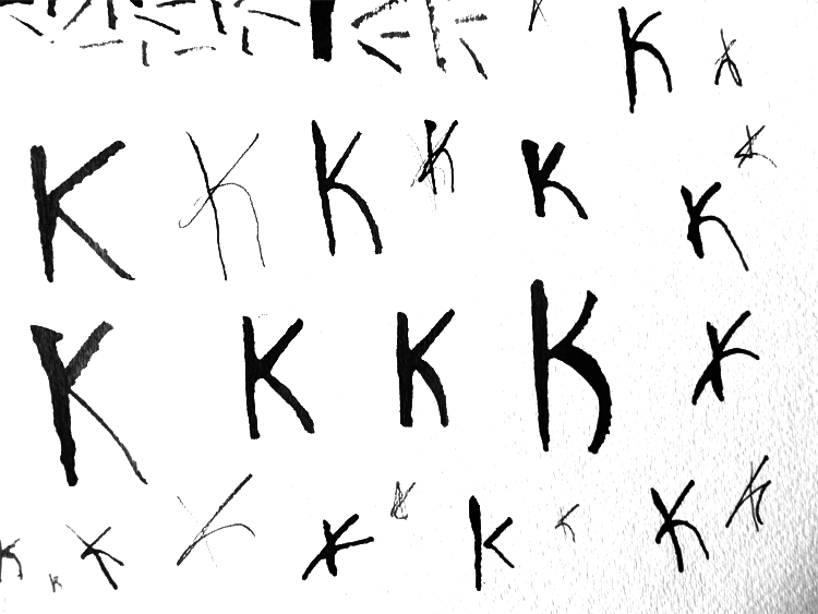
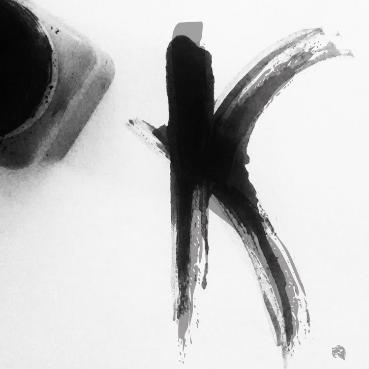
Speaking of refreshed, I thought it was about time for some good, old fashion typography inspiration. I love all things type, therefore; I found far too many examples to fit in one post so I’ll have to try to narrow things down. Enjoy!


Type-1

Photo credit @battery_full

Type-4

Type-5

Photo credit @Luke Ritchie

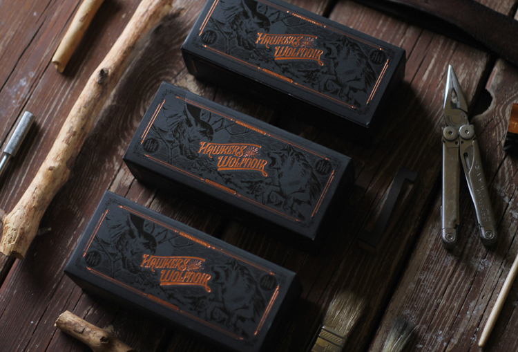
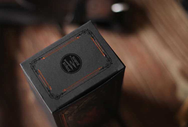
Hawk1

Hawk2

Hawk3

Photo credit @Multiple Owners

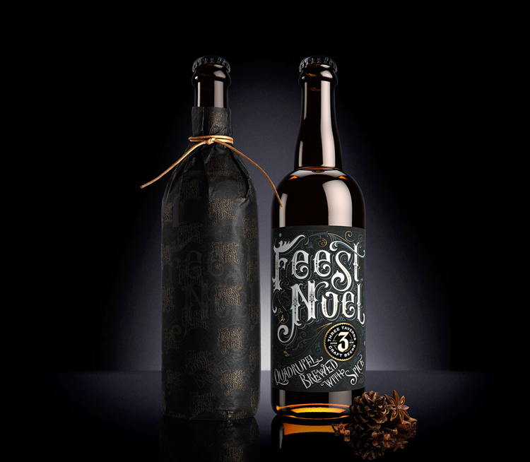
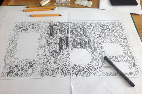
FeastNoel-1

FeastNoel-2

FeastNoel-3

Photo credit @Anton Brumistrov

nike1

Nike-2

Photo credit @Multiple Owners

Type-7

Photo credit @Hanna Viktorsson

Type-3

Photo credit @Jeff Rogers

Inspiration

How to Be an Instagram Legend

October 14, 2015
photo credit @brahmino

Hey all! I wanted to address a topic that’s been pressing heavily in the back of mind. Almost like a guilty presence haunting my daily interactions – I’m speaking of course of my lack-luster efforts reflected throughout my Instagram account! I know October is classically observed as an acceptable space for hauntings, but I am ready to put an end to my insta-nightmare.

Alright, enough of the theatrics. I wanted to share some tips I’ve recently learned on building up and expanding your Instagram empire.

1 Pick a Pattern:

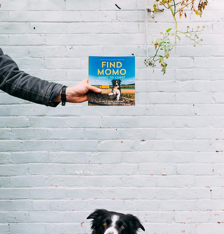
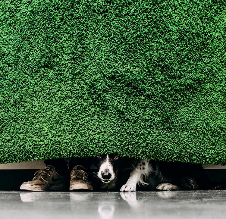
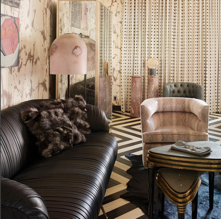
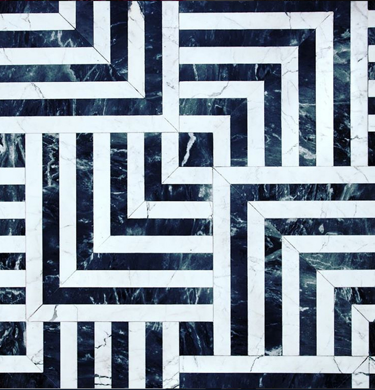
By this, I mean consciously choosing a theme for your Instagram feed. This could involve a variety of things; dark and moody, texture, minimalism, architecture, color palettes. It’s up to you to decide which direction you want, but remember to stay consistent and view your feed as a bigger picture. Here are some enviable accounts who have owned their theme throughout!

Find-Momo-A

Find-Momo-B

Find-Momo-C

Photo credits @andrewknapp

Interior-A

Interior-B

Interior-C

Photo credit @Kellywearstler


2 Lighting does Matter

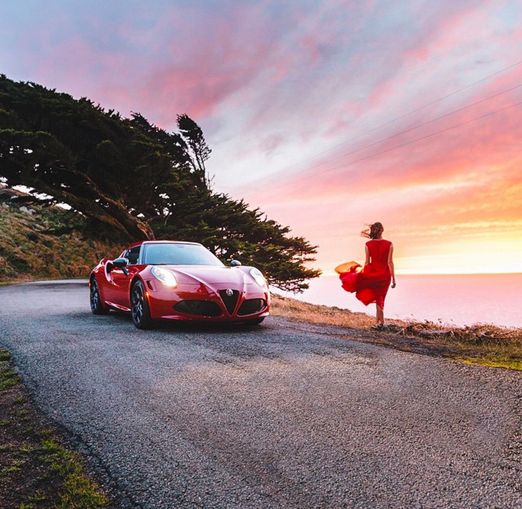
Just because your using a phone, doesn’t mean that traditional photography rules need to fly out the window. For starters, begin taking photos during the “golden hour”, the time of day shortly before sunrise or sunset. Being conscious of good lighting will elevate your photography from meh to amazing.

Avoid using the actual Instagram application to take pictures; instead, shoot with your phone’s standard camera in landscape view. Since most phones have decent camera technology, the resolution and overall quality will be much higher than with the condensed processing of the app itself.

Ram-A

Ram-B

Photo credit @ravivora

Pretty-A

Pretty-B

Photo credit @brahmino


3 Better is Better

Long gone are the days of standard filter options; instead, download some decent editing software. Here are few apps that will make life much easier and prettier during editing.

VSCO Cam
This one is actually free (so no excuses).

Camera+
This is an OS exclusive but allows for a wide range of editing exposures, angles, not to mention a broad selection of filters.

Diptic
For 99 cents you and your cam can access new photography heights.


4 Shoot for the Square

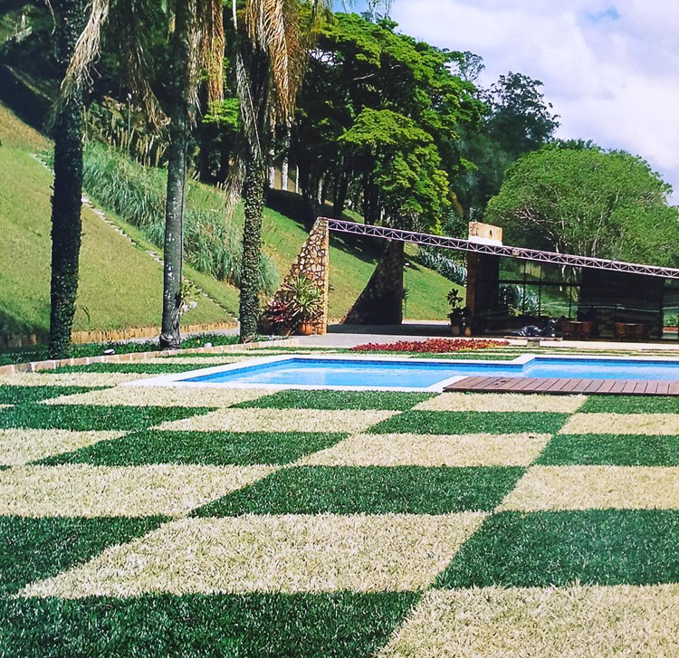
This is exactly what it sounds like. Since Instagram is unique for its square formatting, it is important to plan your shoot instead of having to crop back an amazing rectangular shot. To rock a square, it helps to center or pick a focus point which fits clearly within the frame without any threat of cropping. Play with angles, backgrounds, color contrast to help move the eye to a focal point. Here are some more examples of unbelievable artists to drool over.

Kelly-A

Kelly-B

Photo credit @Kellywearstler

Sim-A

Sim-B

Photo credit @brahmino
I hope this was helpful and inspiring, and now I’m off to build my own insta-empire!


Design

5 Design Trends Hitting 2016

October 1, 2015
http://cinemagraphs.com/

I feel like it has been a lifetime since I’ve posted anything, my apologies! Life has been seemingly busy, but I am almost finished with my final logo design and identity system. Thank you so much for all who voted! I have been doing some research on web design trends and predicted trends into 2016. Unlike some years, I am very excited for the look and feel of this upcoming year – it’s a good time to be alive!

Top five web design trends hitting now and into next year:

1. Semi-flat Design


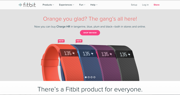
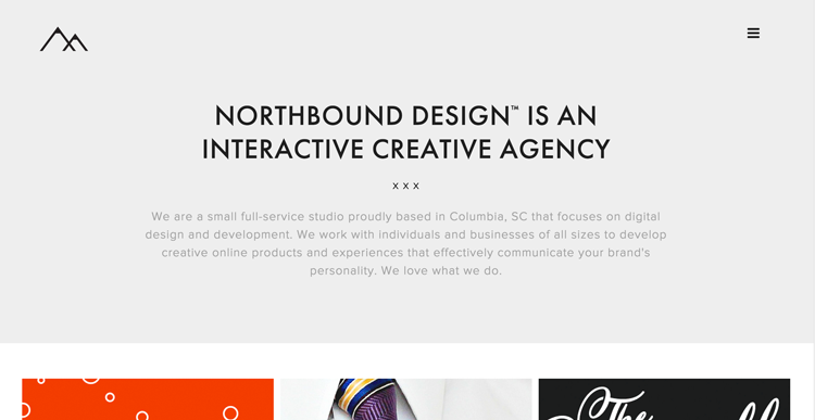
This particular look has been slowly coming into fruition over the last couple of years. Largely influenced by Android interfaces, flat web design is becoming the new standard for clean, sleek design as seen in these examples.

FLAT-TWO2

FLAT-TWO


2. Access to more Designer Typefaces


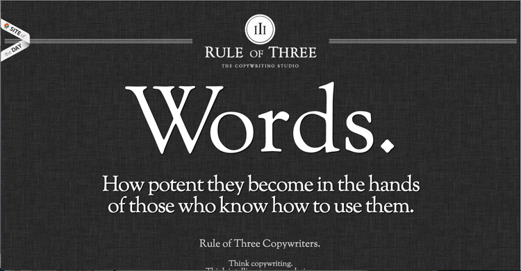
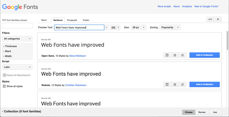
Thanks to Google fonts, web fonts are becoming lets dull and boring, and more creative and custom. With more weight, styles, and sizes available; there are more options than ever for creating beautiful, creative websites even on a limited budget.

google-Font-One

google-Font-Two


3. Quirky, Hand-Drawn Illustrations

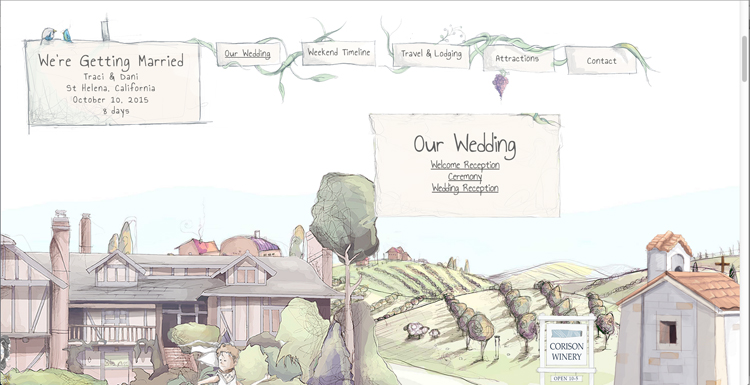
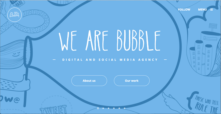
The demand for attention has reached new heights in a world of expanding technology. Taking art back to hand-drawn illustrations is becoming increasingly more popular among web designers. It allows a company or brand to show a more human side while grabbing the reader’s attention with something fresh and creative.

Custom-One

Custom-Two

Custom-Three


4. Better Storytelling

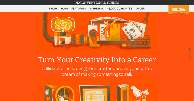
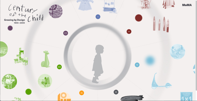
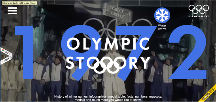
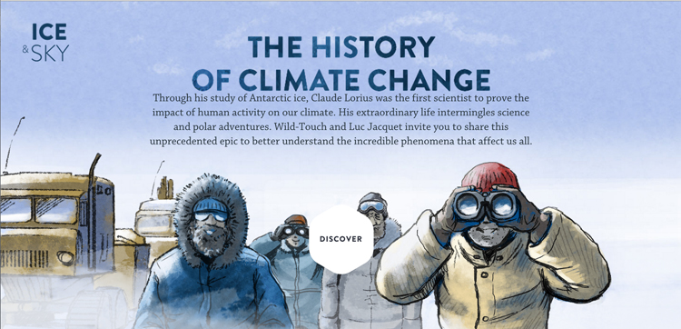
Instead of being so obvious, websites are shifting to more of an interactive experience for the visitor. Creating engagement has been key in communicating the story behind a company, brand and product. Here are a few companies and who have done a fantastic job of displaying a service or product through unconventional means.

Storytelling-One

Storytelling-Three

Storytelling-Two


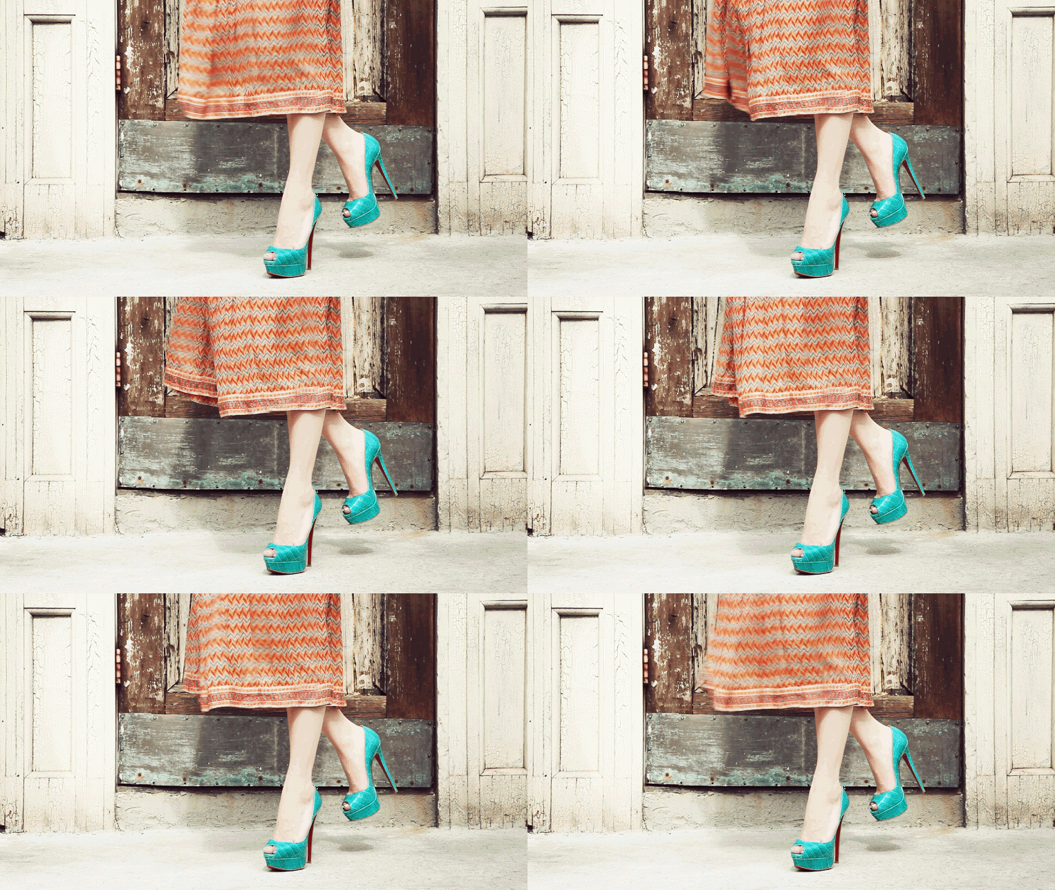
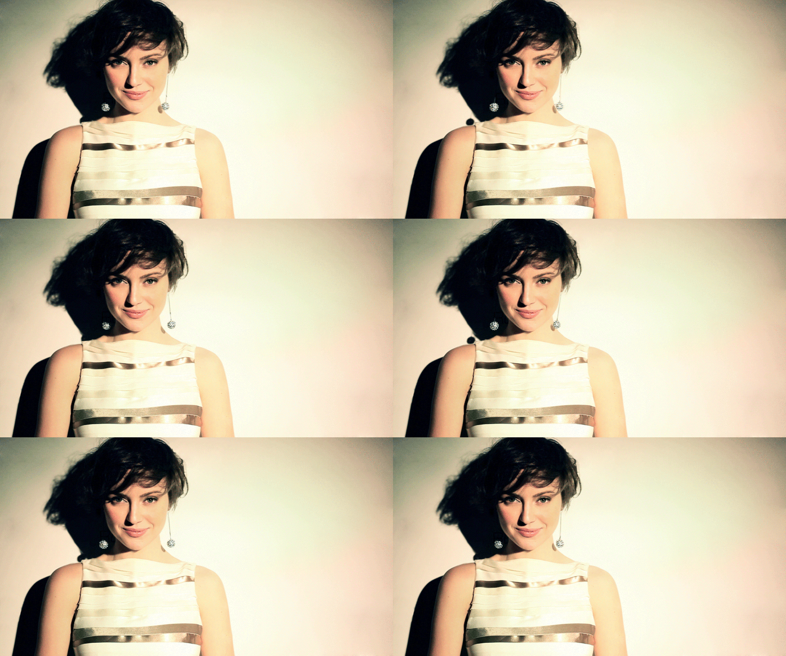
5. Cinemagraphs

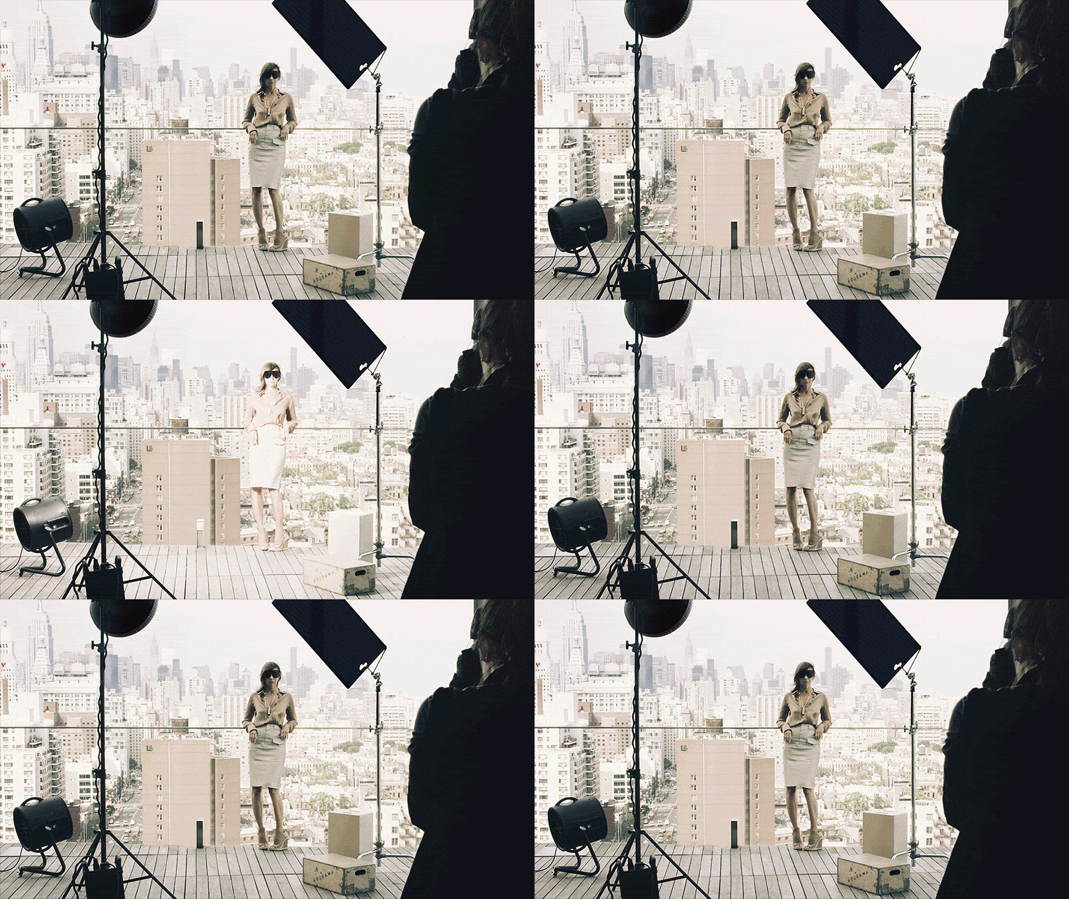
Although this trend has been around for a while; it is probably my most favorite and still raging in predicted design trends. What can be better than a video and still image combined to create mystical visual enchantment? Here are some great examples below to keep you entertained!

cr-429

louboutin-green-shoes-429
nyfw-glamorai-429

Photo source: Fitbit| Northbound Design | Rule of Three | Google Fonts |
Creative Freedom Guide | Bubble | Our Wedding | Ice and Sky | MoMA | Olympic Story | Cinemagraphs

Life and Things

Kumbaya Moment

September 20, 2015
Myspace-old

Do any of you remember the good old days of Myspace and the exuberant amount of mood sharing and homepage theme music? Makes me laugh just thinking about how incredibly irritating that personal theme music was! I am most certain that my status was comparable to a conflicted, deep and brooding fine artist. I actually pulled the photo above from my antique myspace account, sums things up perfectly!

If I could choose a mood status for my life now, I would have to go with feeling peaceful. I am very excited for the possibilities of new directions in life yet very content with how things are now. This is quite the accomplishment considering I’m the biggest planner/worrier on the planet.

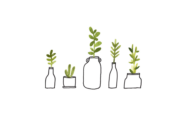
During this kumbaya moment, I wanted to share some of my favorite desktop backgrounds. No computer should be left at default settings, no computer… Enjoy!credit @designlovefestcredit: designlovefest.com | download herecredit @ Nancy Mccabecredit: Nancy McCabe | download here
credit @ designlovefestcredit: designlovefest.com | download here
credit @DAN FUNDERBURGHcredit: Dan Funderburgh | download herephoto credit @http://thefoxisblack.com/credit: thefoxisblack.com | download here

Interview

Guest Artist Matthew Johnson – Interview

September 12, 2015
bluebear

Hello again! I am very excited to announce a new segment to the blog spotlighting local artist/talent from the Colorado area. It’s my privilege today to introduce local designer and illustrator Matthew Johnson working from Denver, CO. Take a look at our interview together and go check at more of his work from the links below.

Behance | Instagram

Interview

1. Tell us a little about yourself and how did you get into Illustration/Graphic Design?

I was born into a creative clan in Pasadena, California, May 4, 1982. Along with being an art director with Ogilvy & Mather Advertising, my Mother is an amazing children’s book illustrator with over 200 books to her credit.

My father is an award-winning copywriter and founder of Big Honkin’ Ideas, a 20-year-old advertising agency in Santa Monica. It’s safe to say I knew I wanted to do something creative when I grew up. But since the Batman gig was already taken I took to art and design.
holly

2. When did you start freelancing and how do you like it compared to industry work?

In December 2010, I graduated at the top of my class from Full Sail University in Winter Park, Florida with a degree in graphic design. I’ve worked professionally with Big Honkin’ Ideas since 2010 creating a wide range of projects. These include identities, logos, web design, print ads, PowerPoint, Flash banners and brochures.

When I’m not working I’m usually painting, researching artists and designers for inspiration for my next project, or exhibiting at art walks. In 2009, I started an artist collective called BLK SHEEP MVMNT that showcases my fine art and supplements my commercial work.

I really enjoy working for myself and choosing projects that speak to me rather then corporate work. It is stressful but way more rewarding.
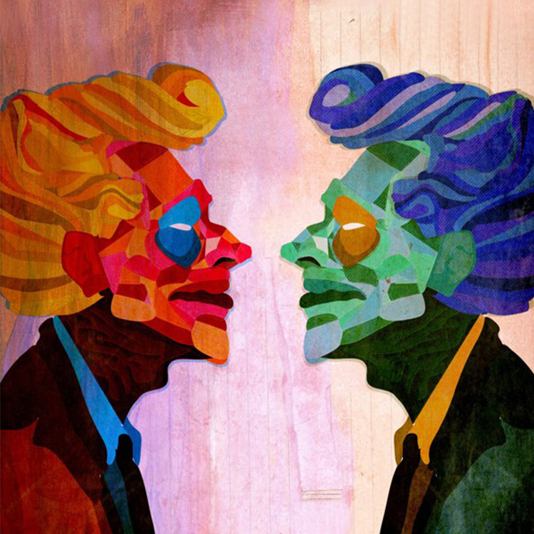
split personaliies

3. Walk us through a typical day

Up at 7. Take the dogs to the park for a couple hours. Then I feed them and myself and check my emails. Working freelance, it’s important that I keep in constant contact with my clients for their needs may have changed. Not really sure how long per day I work. It’s easy to lose track of time when I’m in front of the computer. I always do a bunch of sketches before I go digital and make sure clients like it and sign off before I spend time digitally. Communication is key. And try to sneak some painting in if I have time. Always doing something. I love staying busy.
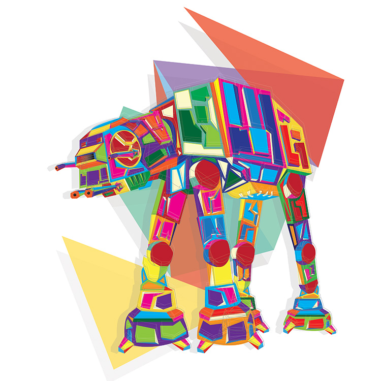
atat

4. Describe your design aesthetic and where do you draw your inspiration?

Everywhere and Everyone. I think it just depends how you look at things. I see the world through typography, art, and design. I believe it’s important to try and learn and get inspired by everything around me.

Even if I don’t particularly like something I can still learn and inspire from it. Even if its as simple as what I would have done differently. It’s so hard to pin down my favorite designers and artists because the more you dig and research the more you find. Its a big world out there.
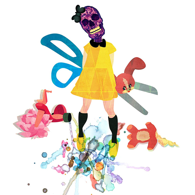
skull girl

5. What are some of your favorite pastimes?

I’ve been drawing since I could hold a crayon. I drew all the time. I drew on everything — on tabletops, garage doors, on the soles of my shoes, on the tops of my sister’s shoes — on the trunk of my Dad’s restored ’67 Pontiac. I wore my action hero underwear backwards so I could see Batman, Hulk, and Ninja Turtles on the front when I looked in the mirror. I drew them on rolls of butcher paper my folks provided — for once staying inside the lines.

Besides art riding my bike long distances, writing, reading a good book, and trying new things. I am in the process of starting a screen-printing business and dog walking company. Pushing myself in new directions is a must.
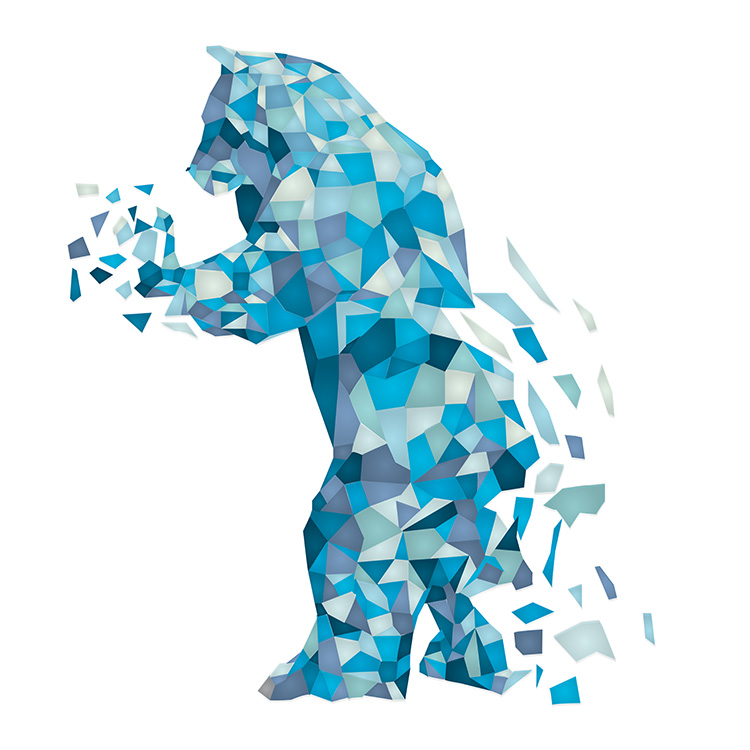
bluebear

Thanks again!
Photo credits: Matthew Johnson.
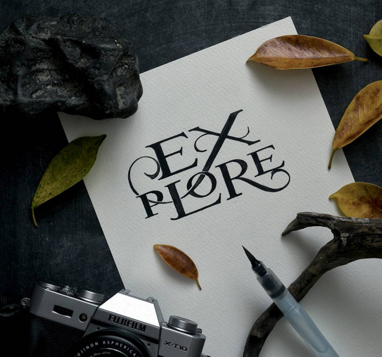
Inspiration

Fresh Finds II

September 7, 2015

Hello! I am sure you all agree that sleeping in on a Monday is the best thing in the world. Thank you Labor Day!

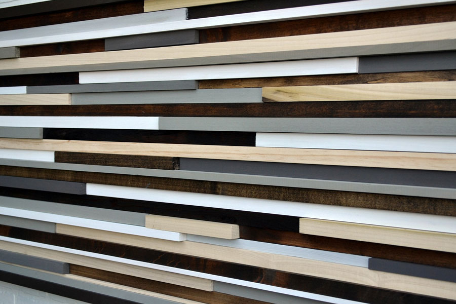
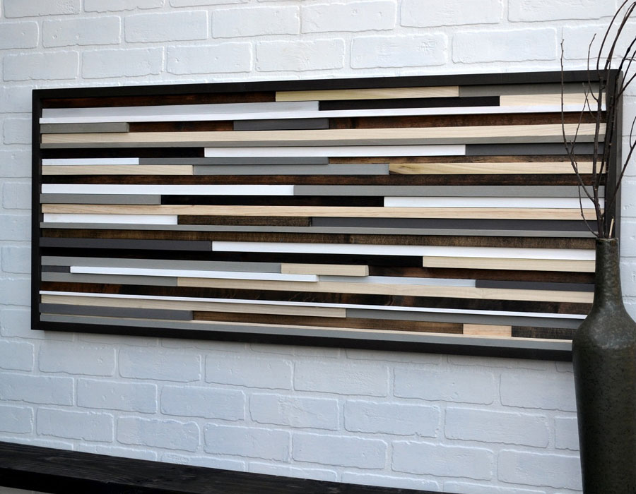
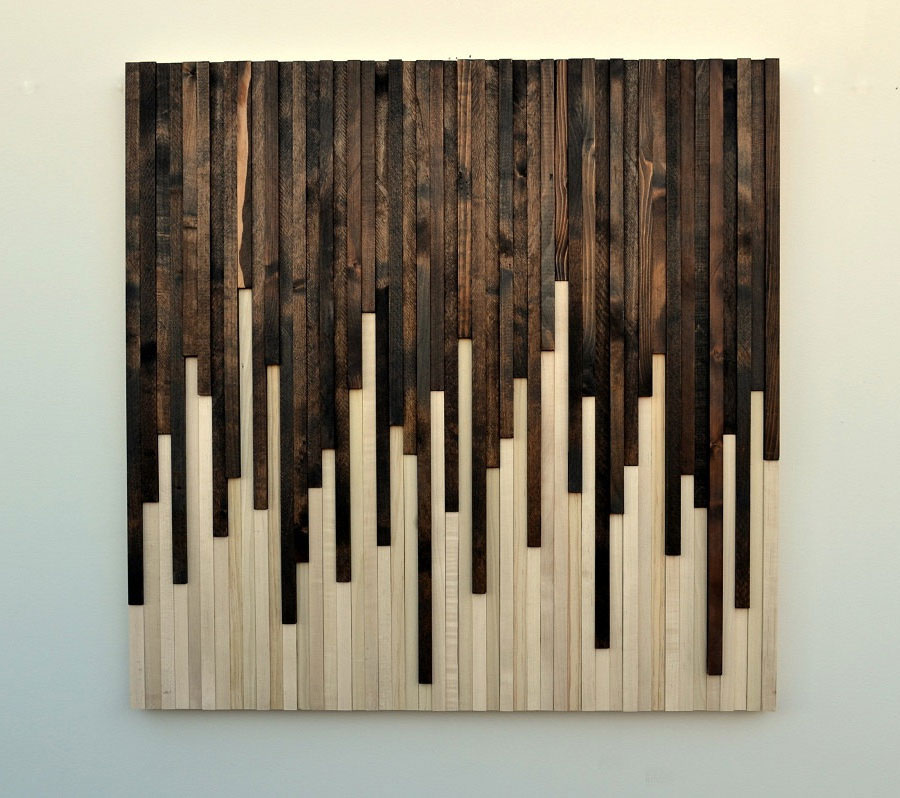
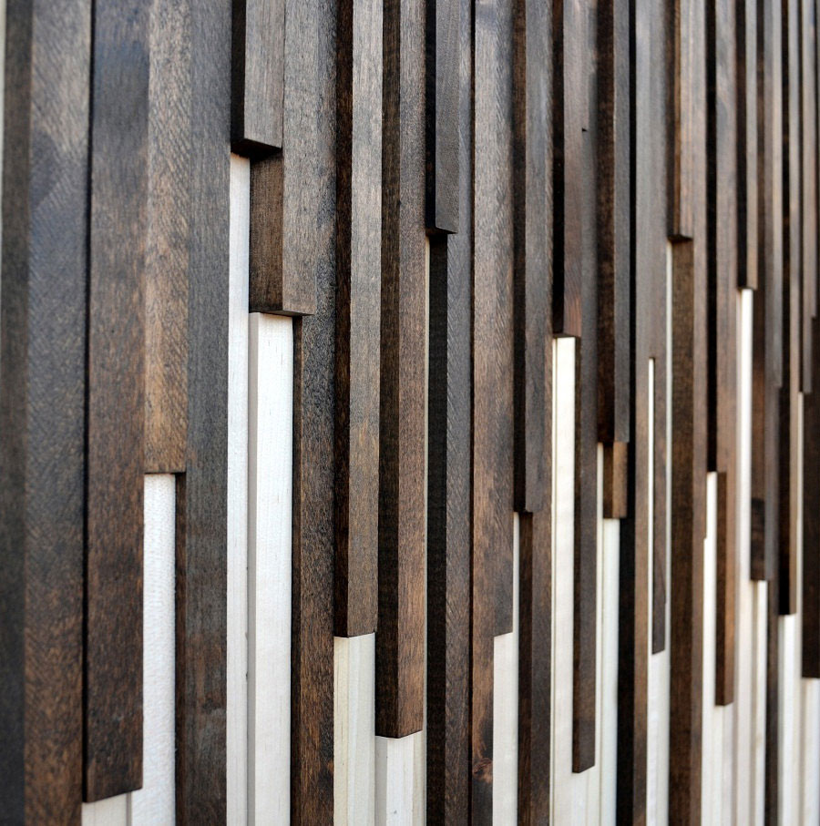
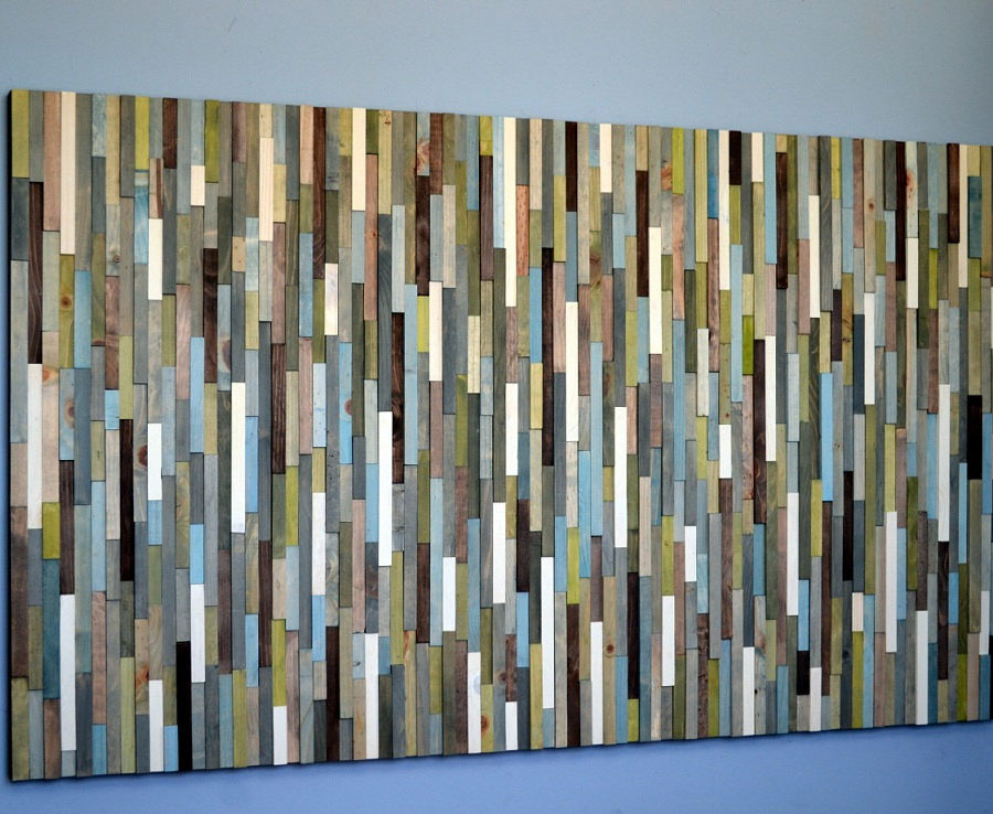
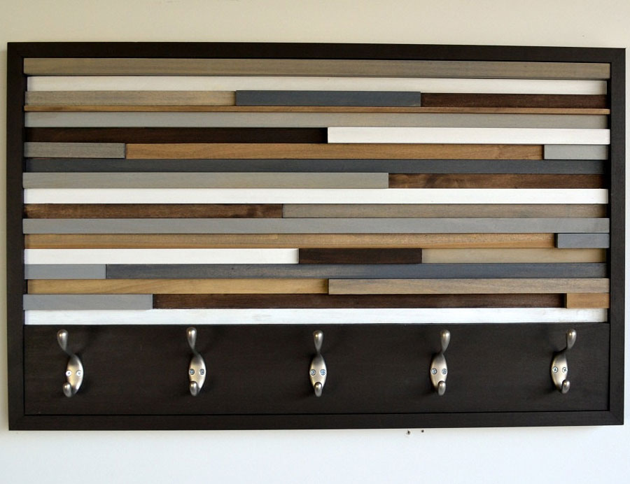
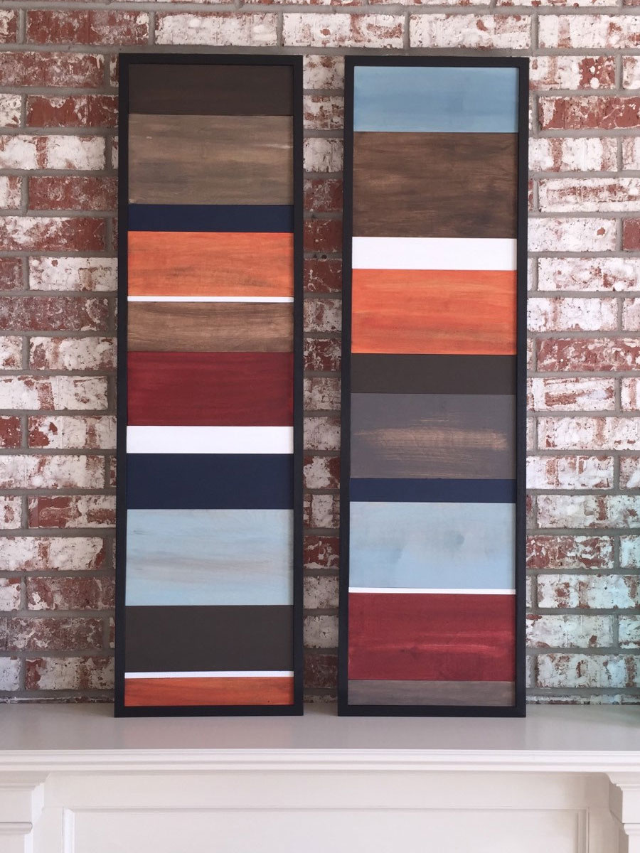
I have been searching for reclaimed/industrial artwork to feature in my bedroom re-design and came across the talented work of Henry Toro from Tulsa, OK. His shop, Modern Textures, specializes in creating custom abstract artwork from reclaimed, up cycled wood scraps, acrylics, and metals. His work is exceptionally well made; I especially love his use of texture, patterns, and colors together with unconventional materials. Here are a few of my favorites, which I would love to add to my wall someday!

Photo credit: Modern Textures by Henry Toro. Go check out all his amazing work!

Life and Things

Nifty Thrifty

August 30, 2015

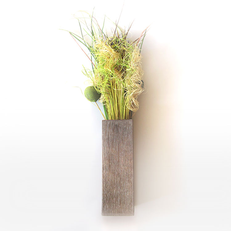
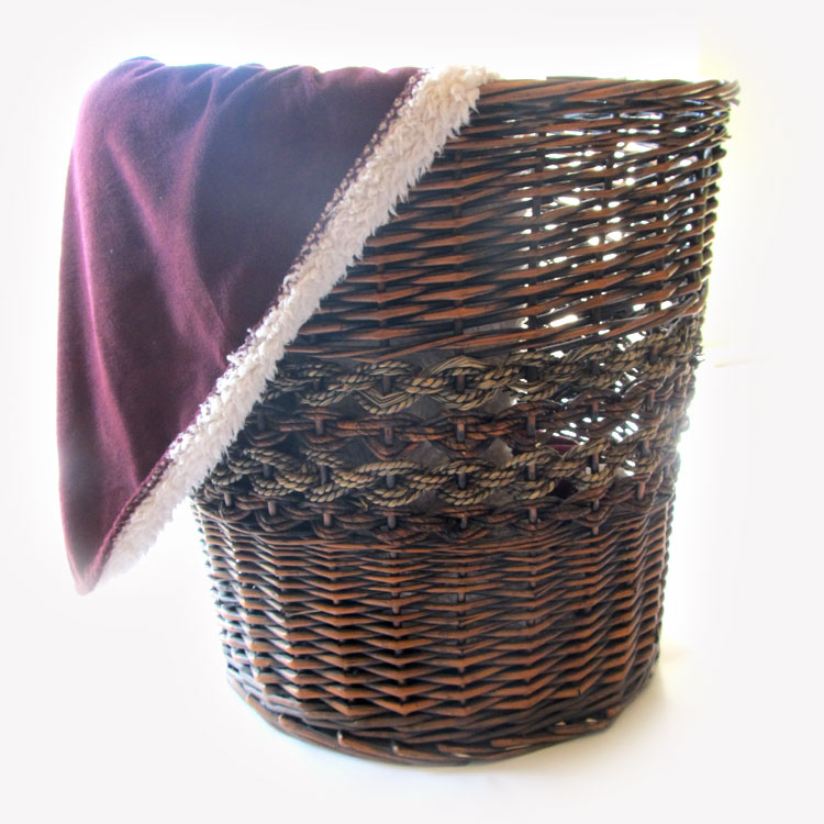
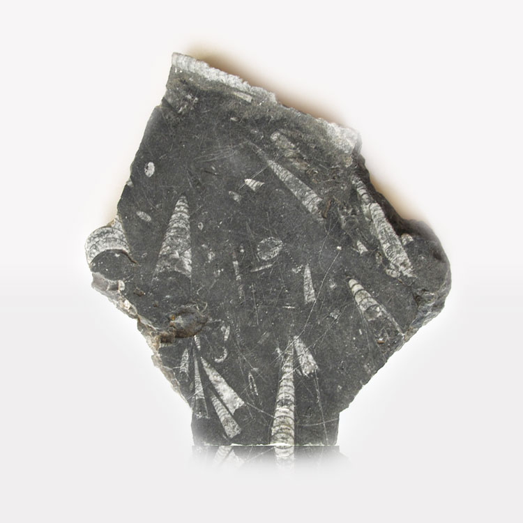
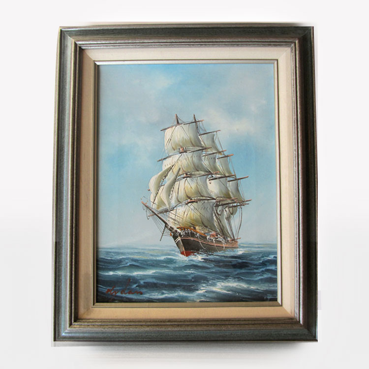
Hope you all had a fabulous weekend! I’ve been working on piecing together new décor for my bedroom makeover. Since buying out Restoration Hardware isn’t an option, I’ve been hunting down thrift stores, craigslist, and second-hand shops for thrifty finds.

Here are a few pre-loved treasures I scored over the last few weekends. I’m so excited for everything to come together its hard to wait!

Left: Texture Vase – $3.00  |  Right: Large Wicker Basket $8.00

Left: Fossilized Rock Segment $4.00 |  Right: Original Oil Painting signed by Artist $5.00

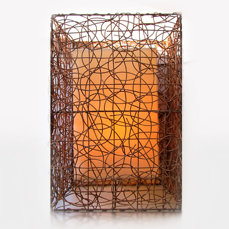
Wicker Lamp Wicker Lamp $9.00 (my favorite so far!)


Life and Things

Bedroom Makeover

August 24, 2015

The day has finally arrived. The bare, neglected bedroom is finally getting a makeover! Over the last ten years, I have moved 11 times which has been a huge deterrent for starting anything just to pack it all up again. But…I’m tired of looking at bland, empty walls and sleeping in an unfinished room.
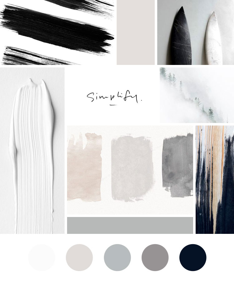
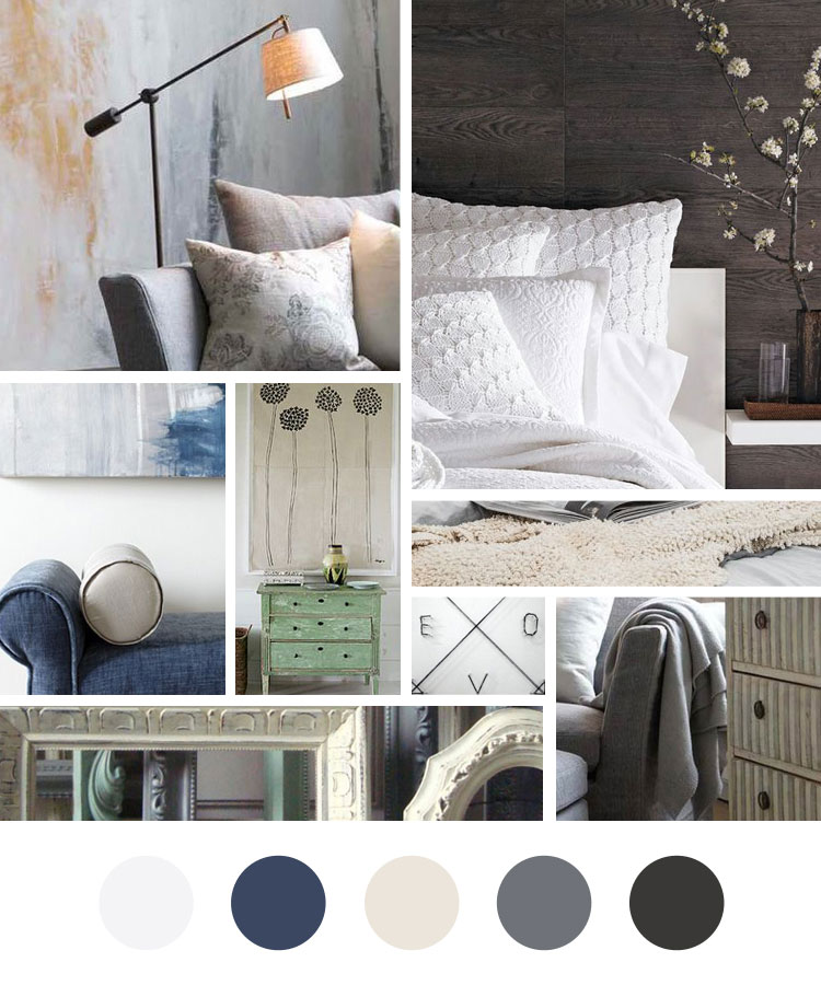
I created a visual mood-board representing the color palate, textures, and overall mood and tone of the room. I’m going for a rustic, sleepy tone, with modern accents and calming colors. (see above)

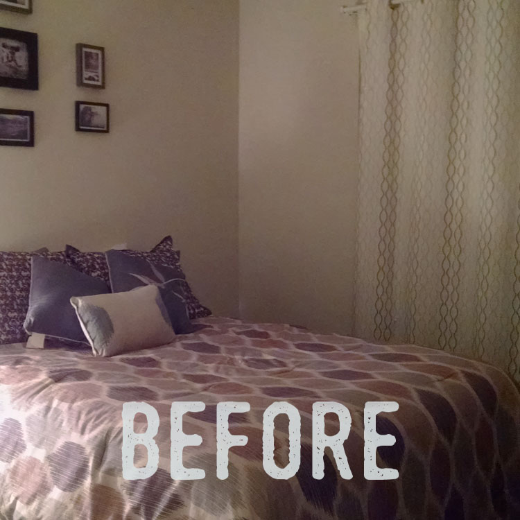
Now for the awful part, here is my current bedroom (people can sleep in those conditions?!) Yes, yes they can.

before-bedroom

I’ll keep you updated. In the meantime, I’d love the hear any thoughts or ideas on the direction of the room or if you have any practical suggestions always appreciated!