Browsing Tag

design

Design Inspiration

10 Refreshing Instagram Designers to Follow

April 23, 2017
Photo credit Robert Jahns

Capturing the world we live in through a visually compelling artistic lens is no easy task. Hats off to these top ten Instagram accounts, who continually inspire, impress and create.

Mortenordstrom

Denmark based photographer quit his desk job to become a full-time international photographer. His work features an eye for ‘the moment’ with high-contrast visual integrity.


Sunday’s in Copenhagen. Stepping in to an alternate universe

A post shared by Morten Nordstrøm, Copenhagen (@mortenordstrom) on


Hawkeyehuey

Son of National Geographic photographer Aaron Huey, this 7-year-old analog photographer has made quite a name for himself with 226k Instagram followers.
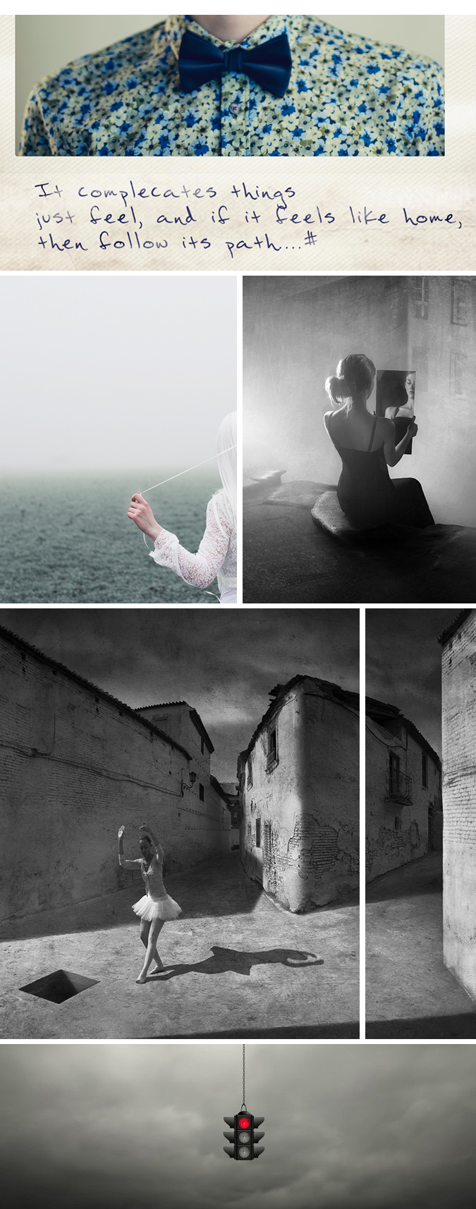
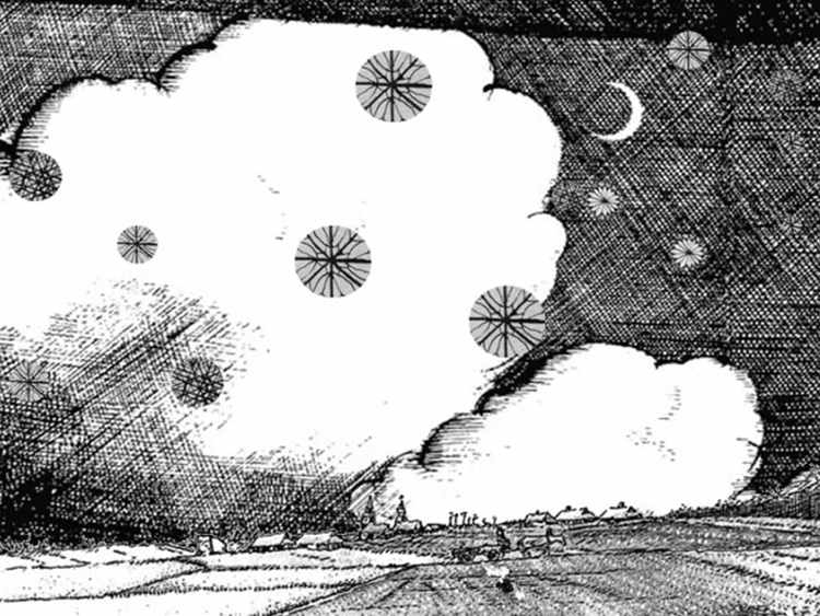
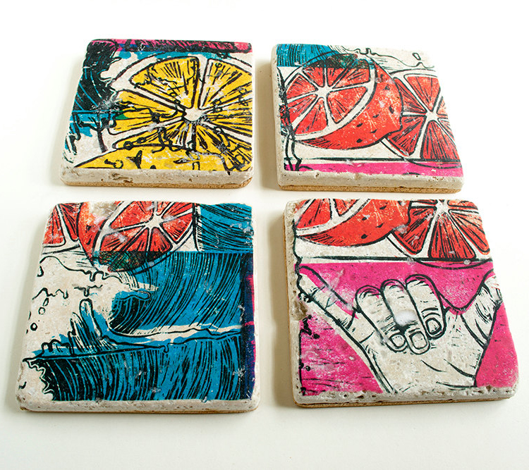


Debgarlickart

Quaint and whimsical, Deb Garlick’s work features texture-heavy acrylics with an emphasis in storytelling.
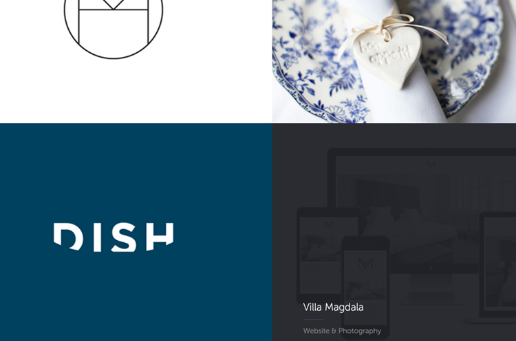
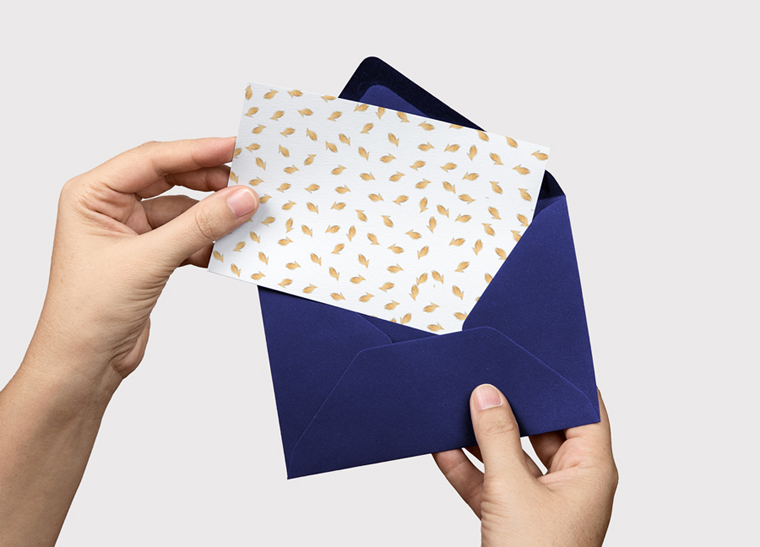
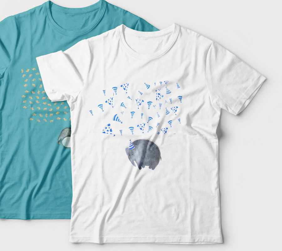


Rowanmade

Specializing in solid, simple design; Rowan Made is a small design studio that consistently inspires.
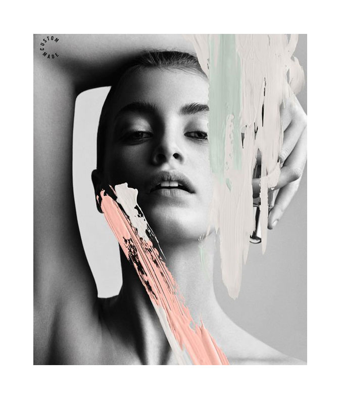
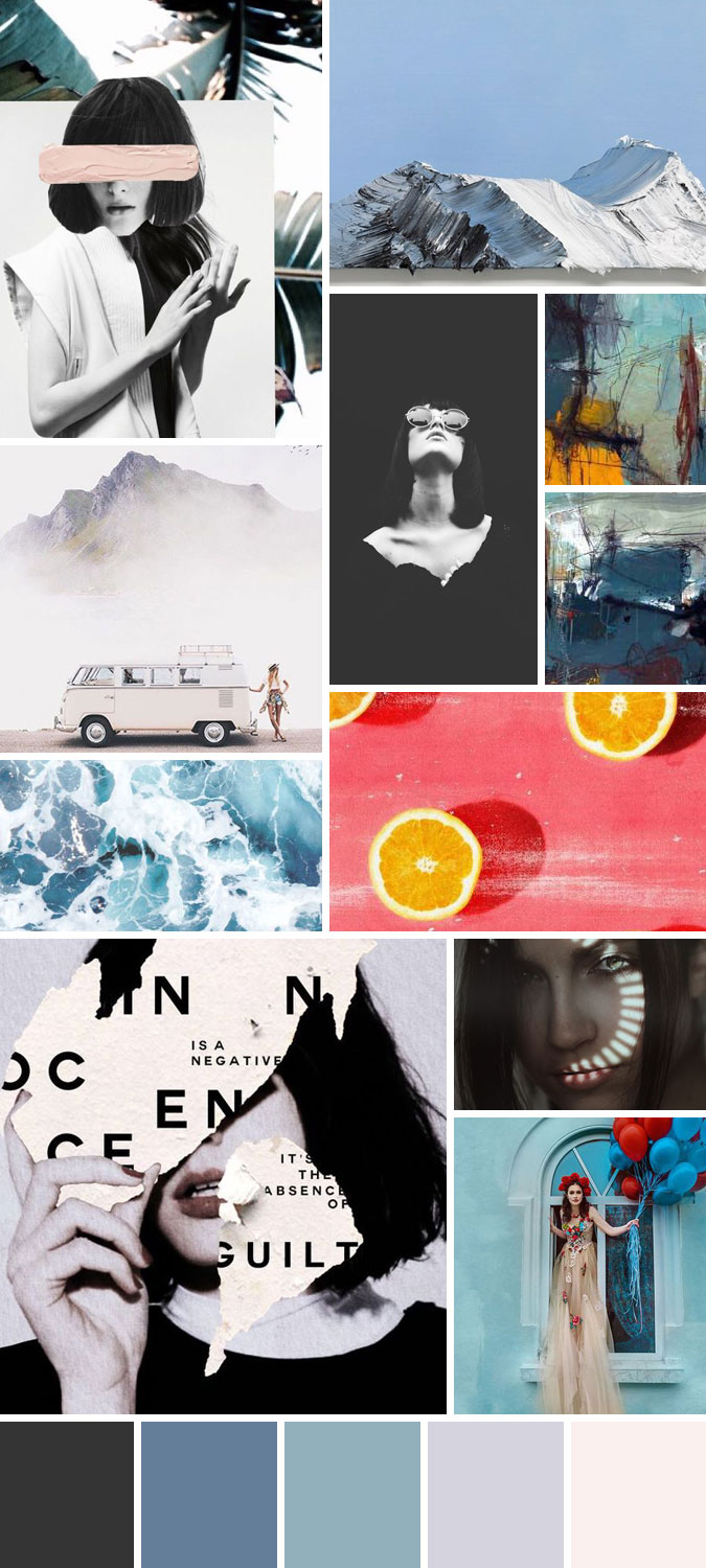
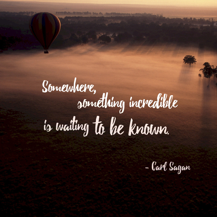
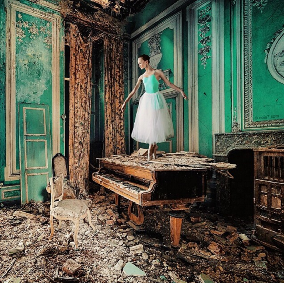


Nois7

Digital artist Robert Jahns transforms the world of photography with his highly imaginative approach to travel imagery.


Abeautifulmess

Founded by sisters Elsie and Emma, A Beautiful Mess features homemade recipes, crafts and inspiration from our readers around the world.


My new favorite mural!! 🍦💜 @rclayton #ABMlovesmurals

A post shared by Elsie + Emma A Beautiful Mess (@abeautifulmess) on
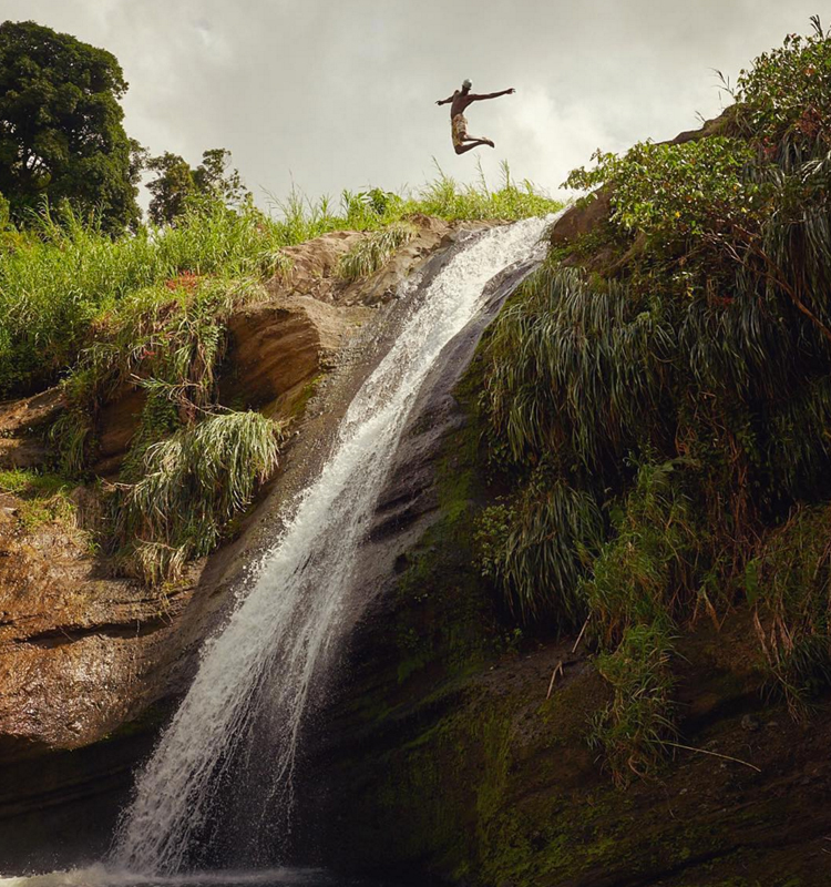
 

Fursty

Representing from the Pacific Northwest, lifestyle and adventure photographer Dylan Furst captures the soul of the PWN with his moody color palettes and stunning scenery.
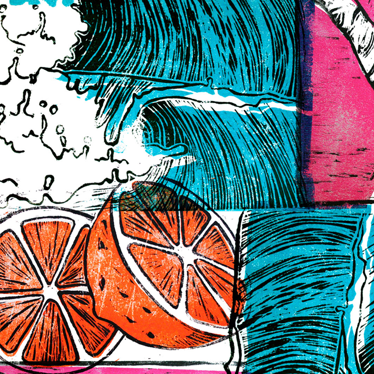
 

Waiting for the perfect salmon to swim by

A post shared by Dylan Furst (@fursty) on


Stevewolfdesigns

Graphic Designer and Illustrator Steve Wolf specializes in bold colorful typographic creations and brand identities.


Part of a big project in the works. #revelstoke #illustration #typography

A post shared by Steve Wolf (@stevewolfdesigns) on


Jacob

Vancouver, B.C based photographer Jacob Riglin captures the heart and soul of travel photography.
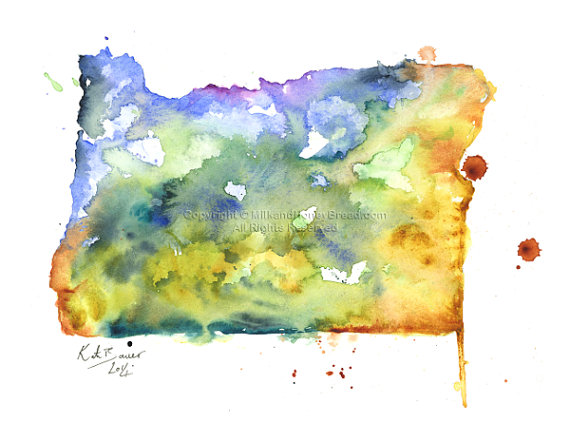
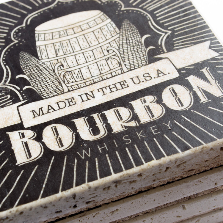


Katiforner

LA based designer, Kati Forner focuses on modern brand identify and typography.


Life and Things

Inner Landscapes

January 4, 2017
2017 New Year Compilation

I was thinking today about the ideology surrounding the promises of a new year, new beginnings, a fresh start. It seems the perception of time and personal fulfillment are synonymous with perfection, tomorrow is another day, future versions of ourselves. The ‘Anne of Green Gables’ philosophy as it was.

I compiled the above images inspired by my feelings toward the new year. So far it hasn’t started off very perfect, and feels more like an extension of December but I think that I am okay with that. Not having a master plan, living in the moment, maybe even being spontaneous 😮


Instead of making a make or break Resolution List, I’d like to focus more on experiences and memories beginning with the following goals:

  • Lean down – Lose 10 pounds
  • Become more financially free – Pay off 5 credit cards
  • Take on Challenges – Run a half Marathon
  • Hike a 14er
  • Take a Photo Journal road trip
  • Start Freelancing/ Explore more personal art projects
  • Travel somewhere new

Stay warm out there!

Design Inspiration

Brainstorming 101

November 27, 2016
homework

Hope you all had a fabulous Thanksgiving! I thoroughly enjoyed mine as it was the first year we celebrated as adult siblings, aka sibsgiving.

With all the extra time off this week, I’ve been thinking more about personal design projects, design contests, photography, freelancing. Although still in the early stages of brainstorming; I’d really like to invest more time into side projects and promoting my own personal brand. I created a visual mood board and keywords to start off but still haven’t landed on any solid brand names. If you have any suggestions, I’d love to hear more ideas :)

Mood and Vibe

Personal Brand Moodboard

Brand Tags

Lifestyle, Texture, Typography, Emotional Expression, Modern, Logo Design, Web Design, Creative, Illustration, Color, Expressive, Moody, Epic, Profound, Thoughtful, Soul Bound, Journey, Creation, Air, Exhale, Depth, Imagination, Tangent, Tangible, Vertex, Wander, Hand-drawn Type, Vibe, Synergy, Explore

Life and Things

Nifty Gifties

November 20, 2016
photo credit @christmascoziness

Can you believe its almost Thanksgiving? Mentally I’ve already skipped over November in anticipation for snow, gift-giving, splurging, time with family etc. Since time moves extra quickly this time of year, I’ve compiled a gift list of unique ideas and concepts to surprise your special people with something new and different this year.

7 Gift Ideas that will Blow the Pants off Other Gift Ideas

A Planter that is a Cat. From: Barruntando | $30.47

https://www.etsy.com/listing/464188351/ceramic-siamese-cat-planter-siamese-cat?ref=shop_home_active_7

https://www.etsy.com/listing/464188351/ceramic-siamese-cat-planter-siamese-cat?ref=shop_home_active_7

Modern, Wall-Mounted Eternal Flame. From Touch of Modern | $165.99

Photo Credit @Touch of Modern

Hand-crafted Artisan Jewelry. From: Story Weaver Mercantile | $26

Photo Credit @http://storyweavermercantile.com
Photo Credit @http://storyweavermercantile.com/

Hand-made all Leather Messenger Bag. From: Story Weaver Mercantile | $135

Photo Credit @Story Weaver Merchantile

Giclee print of Your Home State. From: Milk and Honey Bread | $20+

il_570xn-803462958_evwp

One-of-a-kind Secret Wood Ring. From: Secret Wood  | $145

Photo Credit @ Mysecretwoodrings.com

Customized Wine Club Membership. From: Winc | $52/month

Photo Credit @Winc.com

Design

Print vs Digital vs the Universe

October 2, 2016
The Future of Design photo credit @Eiko Ojala

I remember taking my first interaction design course as part of a pilot program my college was experimenting with. The class itself was very inspirational, but not all that practically helpful when it came to real world experience for new designers. It’s scary how much has changed in just 5 years since I was sitting that classroom at the largest University in the state of Oregon.

Digital design, UI/UX design, graphic design, interaction design, web design are all relevant titles floating around in the design field today and its literally impossible to be an expert in every arena. So where to start? What’s important today and what will be important 10 years from now? It can be overwhelming to try and grasp where the future of design is going and how to stay relevant but, if you really break things down, the fundamentals have never changed.

Old school concepts like typography, eye for detail, organization, space, color theory, user interaction and experience, emotional responsiveness; these are all elements that aren’t going to become outdated but merely transformed in their representation in our visual world.

“The soul never thinks without an image.” – Aristotle


The Future of Design 2 photo credit @Eiko Ojala

It is important for designers to stay relevant with the world and to capitalize on interests and passions. Love typography? Possibilities are endless. From web design messaging and layout, app confirmations, 3D printed messages, hand drawn type illustration, signage etc. Challenge yourself, there’s absolutely no reason to be chained to your assigned title. Define your own path and be what your best at.


Design

New Portfolio Added: Forgotten Tales

March 7, 2016
Forgotten Tales Title

It’s March already can you believe it! I have been a little distracted and pre-occupied as of late with life, work, play, so its been awhile since I’ve posted. Today, I wanted to share some older work of mine; but, still very reflective of who I am as a designer.

As projects often go, my original thought process was to create something edgy, dramatic, moody and dark executed in a thoughtful, mysterious package. Throughout the brainstorming and drafting process, I slowly drifted away from my original mood-board but still managed to capture the mythical playful oddity and wonder of the piece.
Original Moodboard

Always an important concept to learn throughout art and design that its not about forcing an idea, but letting the organic creativity take a direction of its own in a controlled, directed environment. Allowing ample time for the “brainstorming phase” which is so often rushed in the modern workload. Cheers to letting ideas blossom on their own! Forgotten Tales is my magna opus of such a lesson.

Hand Drawn Title

Ticket

Interior Booklet

Drawn Numbers

Animation Clip 1

Animation Clip 2

Forgotten Tales Clip

Interview

Guest Interview – Macey Mackubin

January 11, 2016
photo credit @Macey Mackubin

Hello all. How has the new year been treating you so far? I have an exciting new guest interview to share with you all! I’m happy to introduce local designer Macey Mackubin from Manitou Springs, CO.

Check out our interview together and visit more of her work from the links below.

Website | Behance | Etsy

Interview

1. Tell us a little about yourself and how did you get into graphic design?

I was born in Orlando, Florida. My first encounter with design began when I was pursuing a degree in photography. This was just as the digital world was beginning. Photoshop 1 had just come out. I was working as an intern at a food photography studio called Visual Cuisines and we were still using film. During that time we bought a high-end digital camera. As part of my photography degree I had to take a basic course in design. I fell in love with it while I continued to  work in photography. Photography ended up not being my true calling although it has made an impact on my design choices. Upon leaving Visual Cuisines I returned to school for a long journey towards earning my B.F.A. in graphic design. In the course of this pursuit I moved to Manitou Springs, Colorado and finished my B.F.A. in graphic design at the Rocky Mountain School of Design.

Photo credit @Macey Mackubin


2. It looks like you recently completed your BFA degree, congratulations! How has working in the industry/freelancing compared to your work in college?

I did recently finish thank you! School was more fun. Freelancing is also fun, but just not the same as making all the concept and design choices as you would on a school project. I design patterns, a line of products for sale on etsy.com, I draw constantly, I find old pieces of furniture to refurbish, so I can still feel like I have that freedom outside of work. One of the realities of my career path has been the need to fill in the gaps of freelance work with other types of work.

The internship I did at the end of school was with a company called Mama’s Sauce. It’s a screen print and letterpress shop. Print making has been another love of mine so when Mama’s Sauce asked me to work there in the screen print department I jumped on the opportunity. As this relates to the difference between work and school I envisioned myself working as a full time designer for one company during school. That’s just not how things panned out. However, it doesn’t mean that vision won’t come to pass at some point.


Photo credit @Macey Mackubin


3. Describe your style/aesthetic and where do you draw your inspiration from?

The first thing I do with all jobs is write. I make lists and then I begin sketching. After the lists are made there are so many ideas flowing through my head I have to sketch those. After that I peruse Pinterest, create a mood board and then begin the second round of sketches. Then I finish up; usually in Illustrator. To be able to go through that process on all jobs is a unicorn rainbow dream. I worked as a designer for a t shirt company. Jobs would need to be completed so fast there wasn’t really time for sketching ( this part could fit into question 2 as well ). I also get inspiration from researching the subject.


4. What are some of your favorite pastimes?

Making patterns has become a past time of mine recently. Doodling, print making, dogs, collecting salt and pepper shakers.

Photo credit @Macey Mackubin


5. Any words of advice for aspiring artist or designers?

Hmmm. I would say don’t give up.


All photo credits @Macey Mackubin

Thanks again!


Design

Vibrant Color Trends Shading 2016

January 4, 2016
http://www.graydenpoper.com/

Mastering the power of color isn’t an easy task and requires a good amount of artistic instinct, foundational color theory and psychological emotional projective. To break things down, here are a few tips and techniques trending for 2016 to make choosing the right palette a little easier.


1. Think Monochromatic

Less distracting, monochromatic themes are becoming a strong focus in minimalistic design. Because color can be very overwhelming, choosing a bold shade directs focus towards the text content and message of the page.

Monochromatic Web Design

Monochromatic Web Design


2. Color Blocking and Hovering

This technique is extremely effective for compartmentalizing information in compact, clean formatting. By laying out content in a grid or block presentation, it becomes easier to pick and choose through more content which otherwise may be skipped or overlooked in the mass of things. In addition, hovering allows the viewer to experience a more precise intake of information in ‘visual bite sizes.’


Color Blocking and Hovering Web Design

Color Blocking and Hovering Web Design


3. Color Paired with Texture

In the past, texture has been reserved for neutral backgrounds but not any more! Vibrant color paired with texture is creating exciting bold statements for web and interaction design. This technique can easily become overwhelming so be selective and use colors as accents with texture for best results.

Texture and Color Accent Web Design

Color and Texture Trends for 2016


4. Accent with Color

As stated before, color can be a powerful tool when used as an accent in a high contrast setting. This can be as subtle as a color title or call to action button but beautifully effective when contrasted correctly. Below are some great examples of vibrant color accents executed brilliantly.

Color as Accent in Web Design

Color Accent Trends
In addition to using color effectively, keep in mind the mood of your color choices is a powerful tool as well.

Here are a few general guidelines to setting color mood:

Red: is catchy and provocative. Provokes a call to action and adventure but overpowering if used excessively.

Green: is balance, associated with nature, prosperity and wealth. Banks and financial institutions often use green hues for this same reason.

Blue: is associated with security, trust, peace, realism. Strongly linked to the sky and the sense of dependability.

Purple: is imagination and dreams. Also associated with leadership, respect and wisdom.

Orange: is a positive color and associated with social, physical and mental stimulation. Will put viewers in a good mood.

White: stands for innovation, creativity and purity. It is the color of perfection.

Black: is the color of intellectualism, power and professionalism. It can also be associated with luxury and sophistication.

Photo source: tennisaufemininhyperakt | madebypfd | graydenpoper | thefarmerandthechef | crossroadsalliance
masterdynamic


Life and Things

Farewell 2015

January 1, 2016

Photo by @rossfeighery

Happy New Year to everyone! In the spirit of things, I have been thinking about my own resolutions/goals for 2016 and realize the common thread between everything I hope to accomplish boils down to one concept, creating opportunities. I read a great quote that I feel addresses this exact philosophy perfectly:

If opportunity doesn’t knock, build a door.
-Milton Berle

2015 for me was somewhat chaotic, full of uncertainty being tossed around in the sea of the unknown. As much as I dislike this lack of control in my life, I hope to embrace these uncertainties with a fresh perspective this year (as I’m sure tsunamis lie ahead as they always do.) Instead of fighting to force everything to fit in my perfect comfort zone, I hope to bring on the un-pleasantries and have some amazing new experiences in the process. You only have one life to live, so live it!

New Years Resolution Quote

As philosophical as that all sounds, I do have some practical resolutions I hope to accomplish this year which I will be promptly be crossing off throughout the year.

  1. Take on weekly personal art projects
  2. Repurpose one piece of furniture
  3. Take more Yoga Classes
  4. Work out 3-4 weekly
  5. Lose 8 lbs (not 10…8lbs)
  6. Continue Green Juicing
  7. Cut back on Rockstars
  8. Run a 10k
  9. Attend a Meetup
  10. Pay back one credit card
  11. Read more
  12. Visit a foreign country
  13. Network with other designers
  14. Photography trips

New Year’s Resolution from Currie Person of Spartan Home and Beam & Anchor

Photo credit: Currie Person of Spartan Home and Beam & Anchor
Love & peace :)

Design

Just Added Portfolio: Stuck

November 29, 2015
Photo Credit: Krista Bradshaw

As fabulous and fun as the holidays, travel, family has been, I have been very distracted with everything and apologize in advance for the lapse in posts. Hopefully everyone else is also going through the same seasonal busyness and hasn’t noticed…

I have been thinking about new blog segments for next year and I am excited to bring in 2016 headstrong with new interviews, design bits, portfolio pieces etc. As mentioned previously, I have been revamping my personal website and can’t want to reveal the new layout and design! In the meantime, I have a new portfolio piece to share and will continue to keep you updated as more projects are completed.

Stuck - by Krista Bradshaw

Stuck - by Krista Bradshaw

Stuck - by Krista Bradshaw

Stuck - by Krista Bradshaw

In regards to this project, I love the open-ended creativity and spontaneity that children’s books afford. I had so much fun creating this piece and I hope it touches a little corner of your inner child as well.


Stuck - by Krista Bradshaw

Stuck - by Krista Bradshaw

Stuck - by Krista Bradshaw