Browsing Tag

web design

Design

Print vs Digital vs the Universe

October 2, 2016
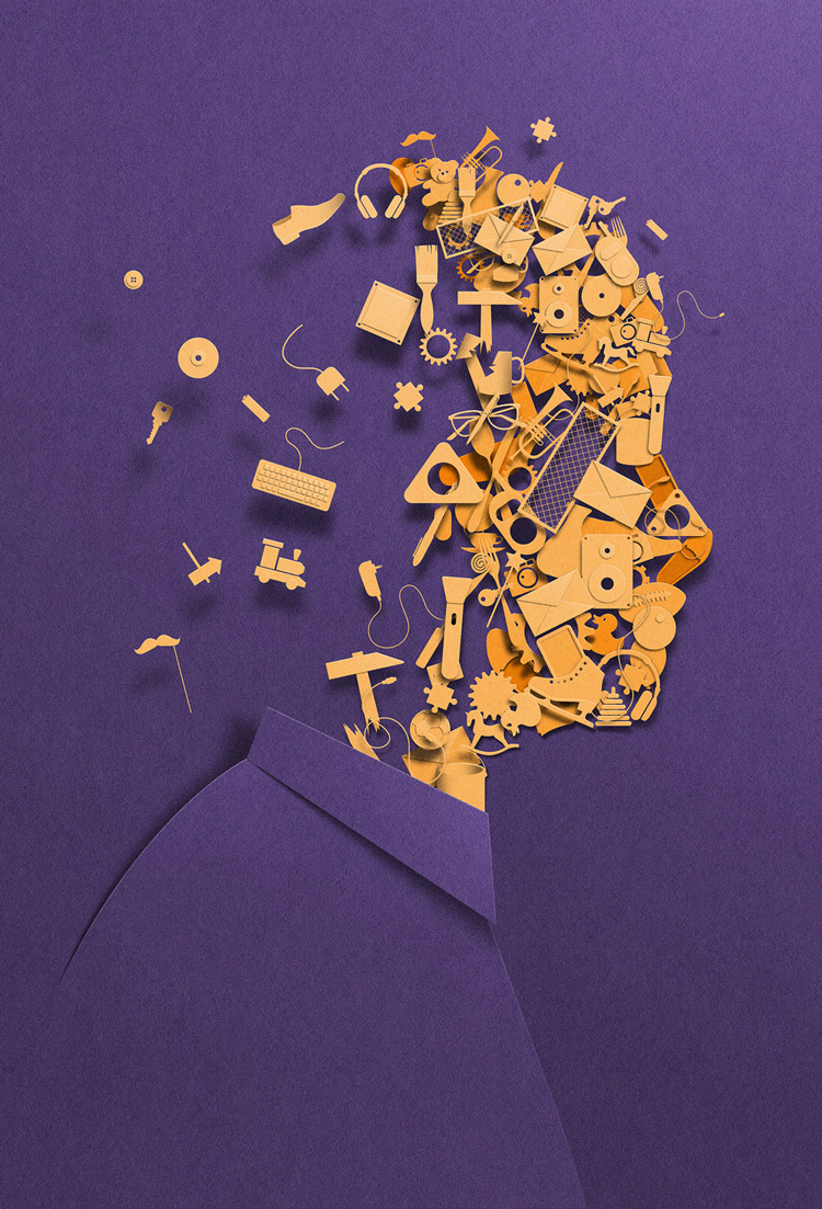
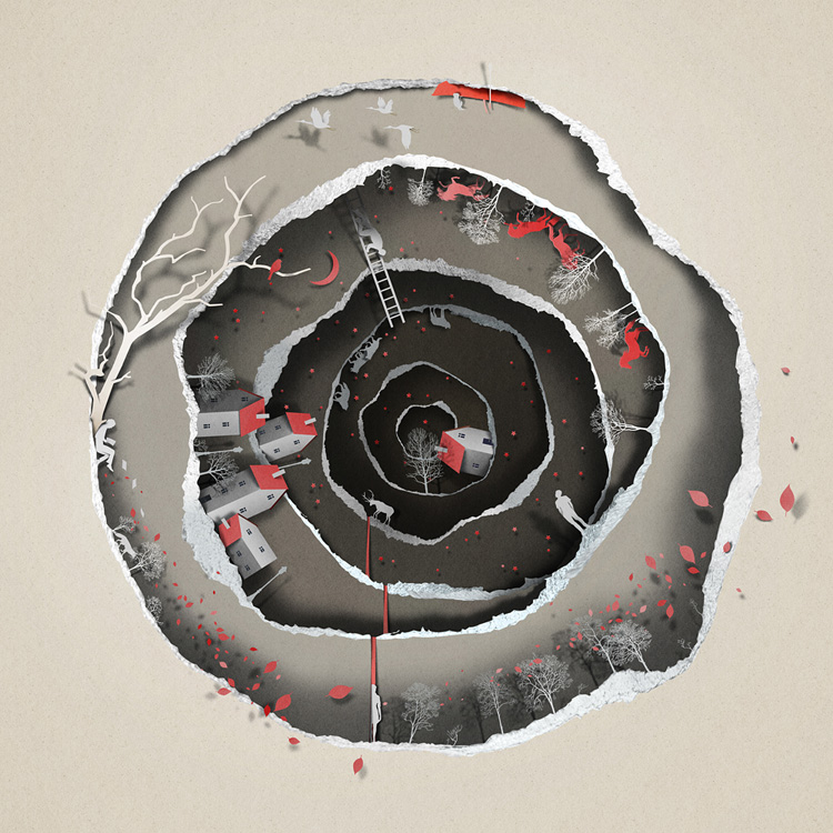
The Future of Design photo credit @Eiko Ojala

I remember taking my first interaction design course as part of a pilot program my college was experimenting with. The class itself was very inspirational, but not all that practically helpful when it came to real world experience for new designers. It’s scary how much has changed in just 5 years since I was sitting that classroom at the largest University in the state of Oregon.

Digital design, UI/UX design, graphic design, interaction design, web design are all relevant titles floating around in the design field today and its literally impossible to be an expert in every arena. So where to start? What’s important today and what will be important 10 years from now? It can be overwhelming to try and grasp where the future of design is going and how to stay relevant but, if you really break things down, the fundamentals have never changed.

Old school concepts like typography, eye for detail, organization, space, color theory, user interaction and experience, emotional responsiveness; these are all elements that aren’t going to become outdated but merely transformed in their representation in our visual world.

“The soul never thinks without an image.” – Aristotle


The Future of Design 2 photo credit @Eiko Ojala

It is important for designers to stay relevant with the world and to capitalize on interests and passions. Love typography? Possibilities are endless. From web design messaging and layout, app confirmations, 3D printed messages, hand drawn type illustration, signage etc. Challenge yourself, there’s absolutely no reason to be chained to your assigned title. Define your own path and be what your best at.
 

Design

Vibrant Color Trends Shading 2016

January 4, 2016
http://www.graydenpoper.com/

Mastering the power of color isn’t an easy task and requires a good amount of artistic instinct, foundational color theory and psychological emotional projective. To break things down, here are a few tips and techniques trending for 2016 to make choosing the right palette a little easier.


1. Think Monochromatic

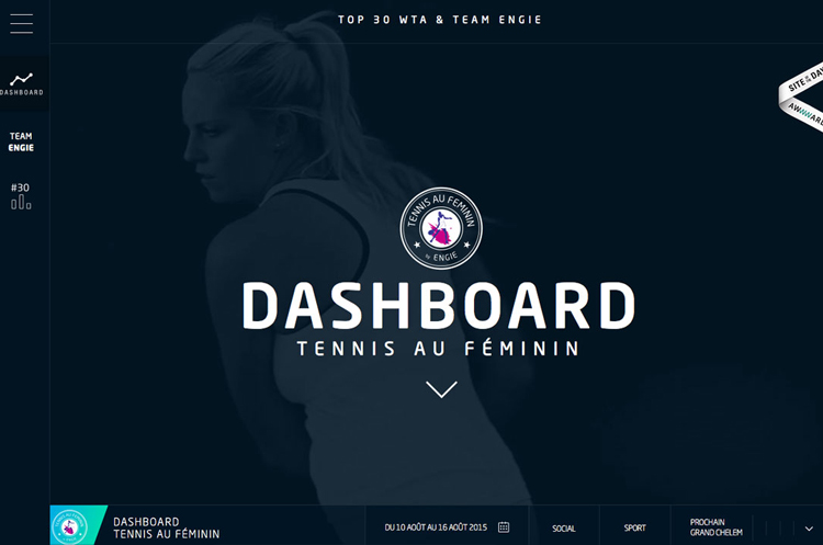
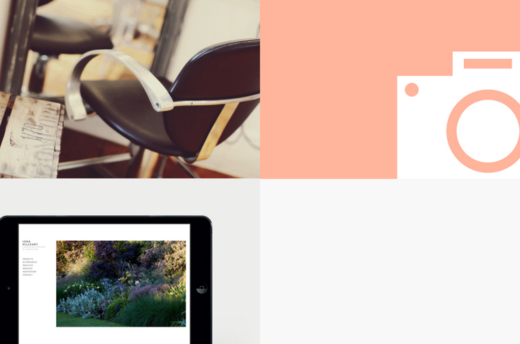
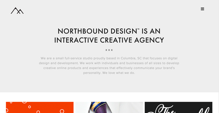
Less distracting, monochromatic themes are becoming a strong focus in minimalistic design. Because color can be very overwhelming, choosing a bold shade directs focus towards the text content and message of the page.

Monochromatic Web Design

Monochromatic Web Design


2. Color Blocking and Hovering

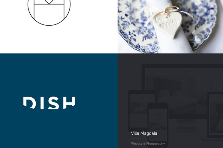
This technique is extremely effective for compartmentalizing information in compact, clean formatting. By laying out content in a grid or block presentation, it becomes easier to pick and choose through more content which otherwise may be skipped or overlooked in the mass of things. In addition, hovering allows the viewer to experience a more precise intake of information in ‘visual bite sizes.’


Color Blocking and Hovering Web Design

Color Blocking and Hovering Web Design


3. Color Paired with Texture

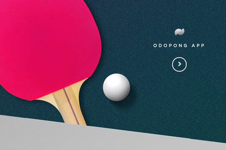
In the past, texture has been reserved for neutral backgrounds but not any more! Vibrant color paired with texture is creating exciting bold statements for web and interaction design. This technique can easily become overwhelming so be selective and use colors as accents with texture for best results.

Texture and Color Accent Web Design

Color and Texture Trends for 2016


4. Accent with Color

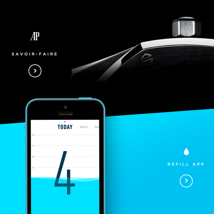
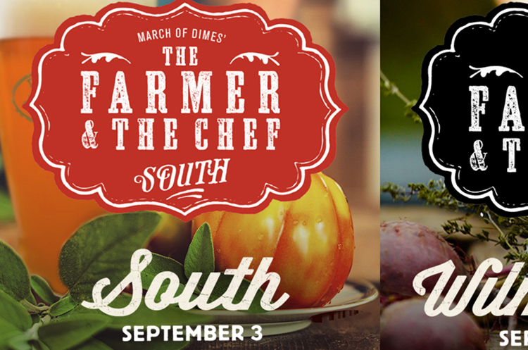
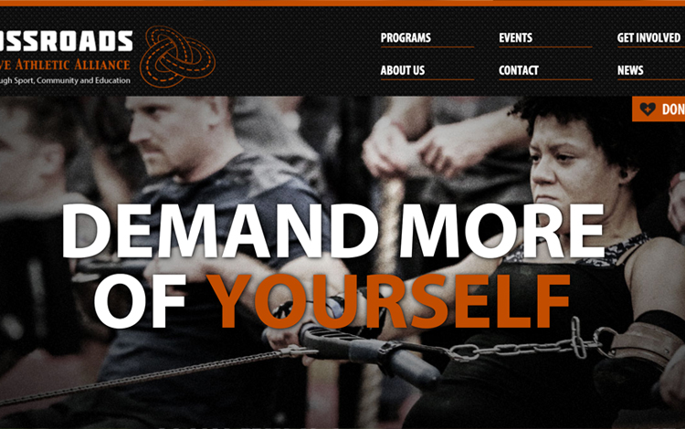
As stated before, color can be a powerful tool when used as an accent in a high contrast setting. This can be as subtle as a color title or call to action button but beautifully effective when contrasted correctly. Below are some great examples of vibrant color accents executed brilliantly.

Color as Accent in Web Design

Color Accent Trends
In addition to using color effectively, keep in mind the mood of your color choices is a powerful tool as well.

Here are a few general guidelines to setting color mood:

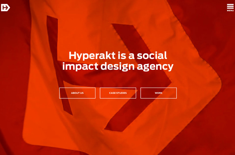
Red: is catchy and provocative. Provokes a call to action and adventure but overpowering if used excessively.

Green: is balance, associated with nature, prosperity and wealth. Banks and financial institutions often use green hues for this same reason.

Blue: is associated with security, trust, peace, realism. Strongly linked to the sky and the sense of dependability.

Purple: is imagination and dreams. Also associated with leadership, respect and wisdom.

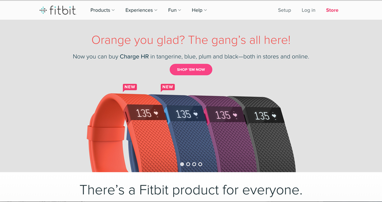
Orange: is a positive color and associated with social, physical and mental stimulation. Will put viewers in a good mood.

White: stands for innovation, creativity and purity. It is the color of perfection.

Black: is the color of intellectualism, power and professionalism. It can also be associated with luxury and sophistication.

Photo source: tennisaufemininhyperakt | madebypfd | graydenpoper | thefarmerandthechef | crossroadsalliance
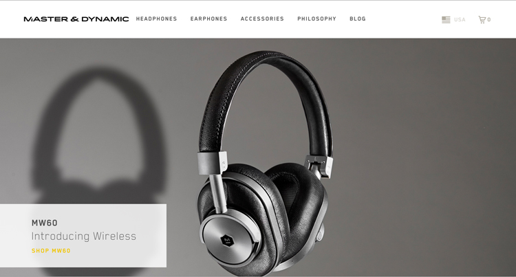
masterdynamic


Design

5 Design Trends Hitting 2016

October 1, 2015
http://cinemagraphs.com/

I feel like it has been a lifetime since I’ve posted anything, my apologies! Life has been seemingly busy, but I am almost finished with my final logo design and identity system. Thank you so much for all who voted! I have been doing some research on web design trends and predicted trends into 2016. Unlike some years, I am very excited for the look and feel of this upcoming year – it’s a good time to be alive!

Top five web design trends hitting now and into next year:

1. Semi-flat Design


This particular look has been slowly coming into fruition over the last couple of years. Largely influenced by Android interfaces, flat web design is becoming the new standard for clean, sleek design as seen in these examples.

FLAT-TWO2

FLAT-TWO


2. Access to more Designer Typefaces


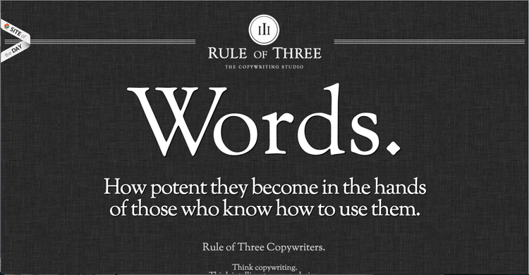
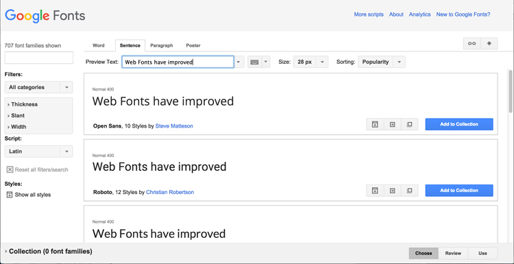
Thanks to Google fonts, web fonts are becoming lets dull and boring, and more creative and custom. With more weight, styles, and sizes available; there are more options than ever for creating beautiful, creative websites even on a limited budget.

google-Font-One

google-Font-Two


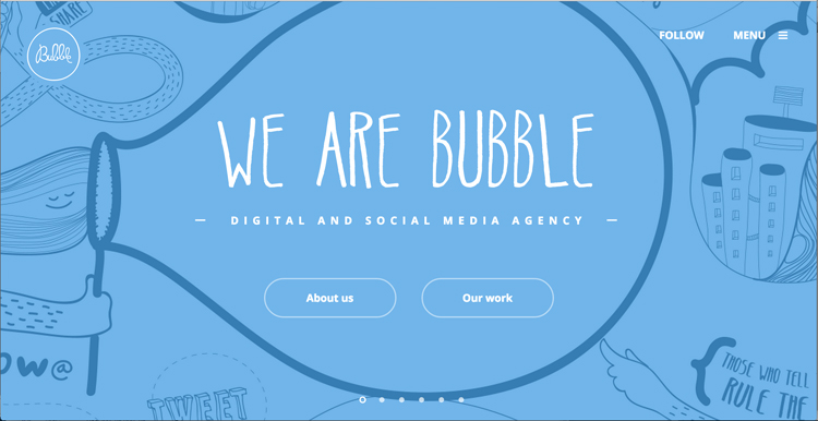
3. Quirky, Hand-Drawn Illustrations

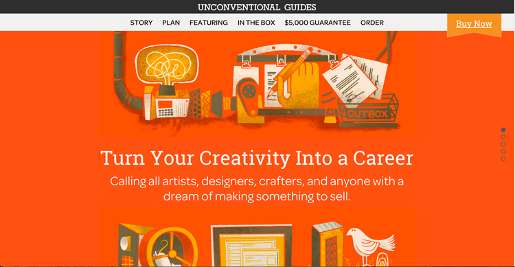
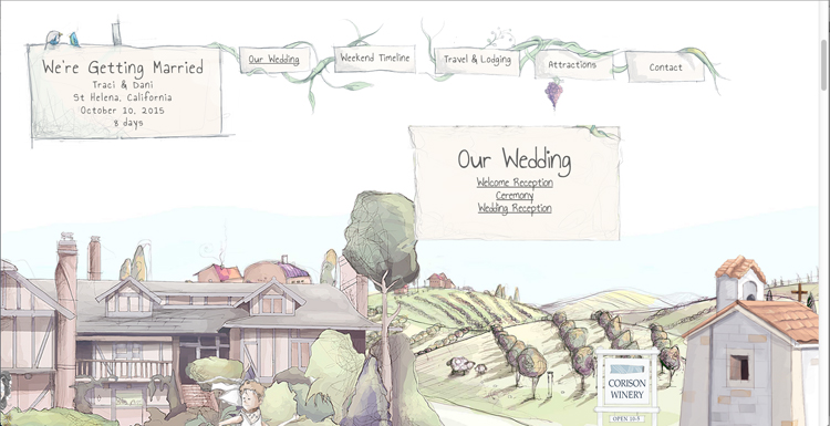
The demand for attention has reached new heights in a world of expanding technology. Taking art back to hand-drawn illustrations is becoming increasingly more popular among web designers. It allows a company or brand to show a more human side while grabbing the reader’s attention with something fresh and creative.

Custom-One

Custom-Two

Custom-Three


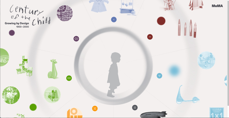
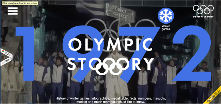
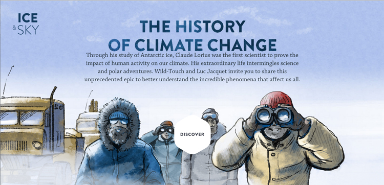
4. Better Storytelling

Instead of being so obvious, websites are shifting to more of an interactive experience for the visitor. Creating engagement has been key in communicating the story behind a company, brand and product. Here are a few companies and who have done a fantastic job of displaying a service or product through unconventional means.

Storytelling-One

Storytelling-Three

Storytelling-Two


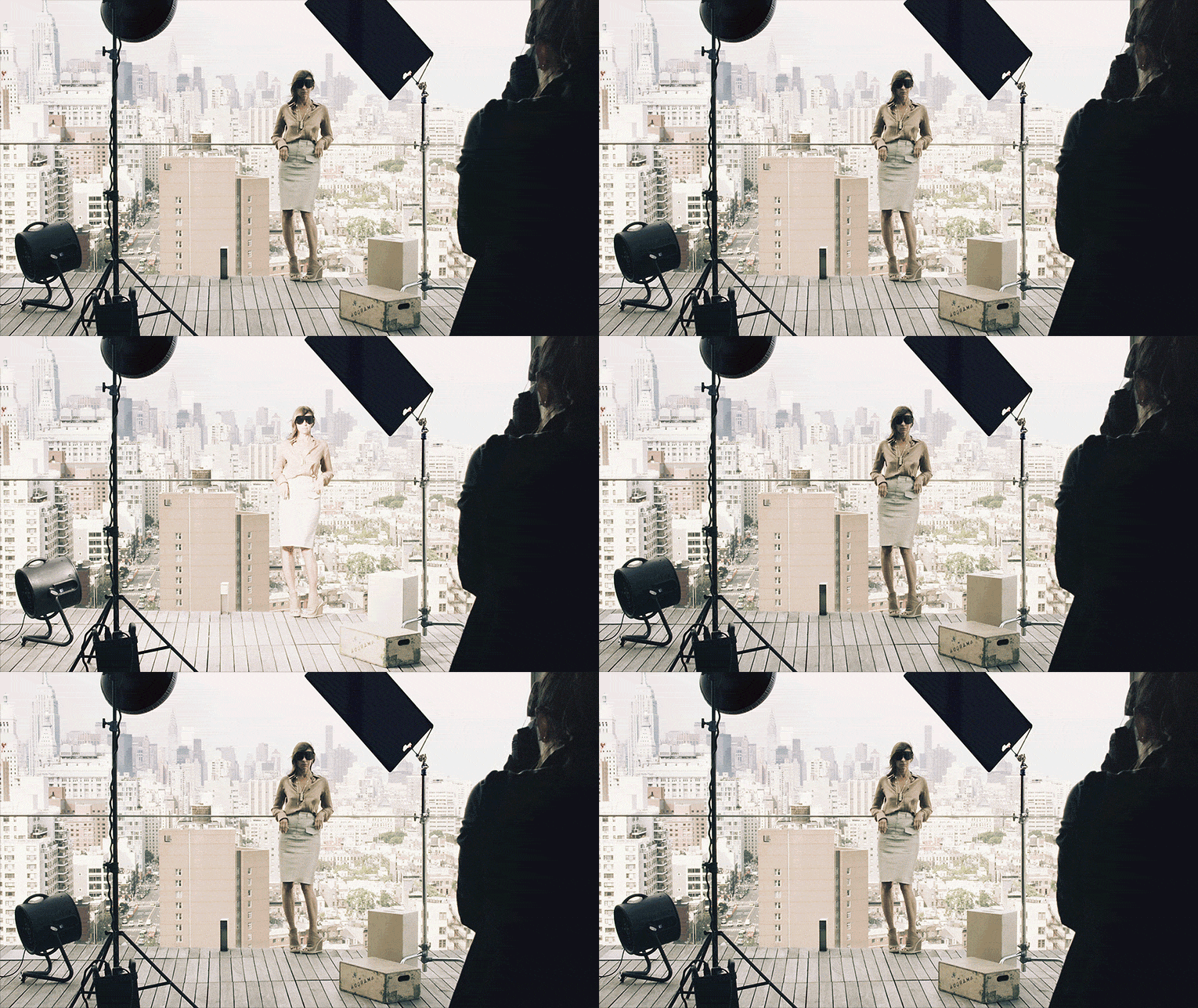
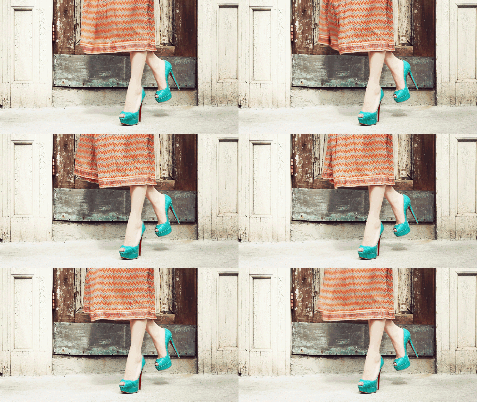
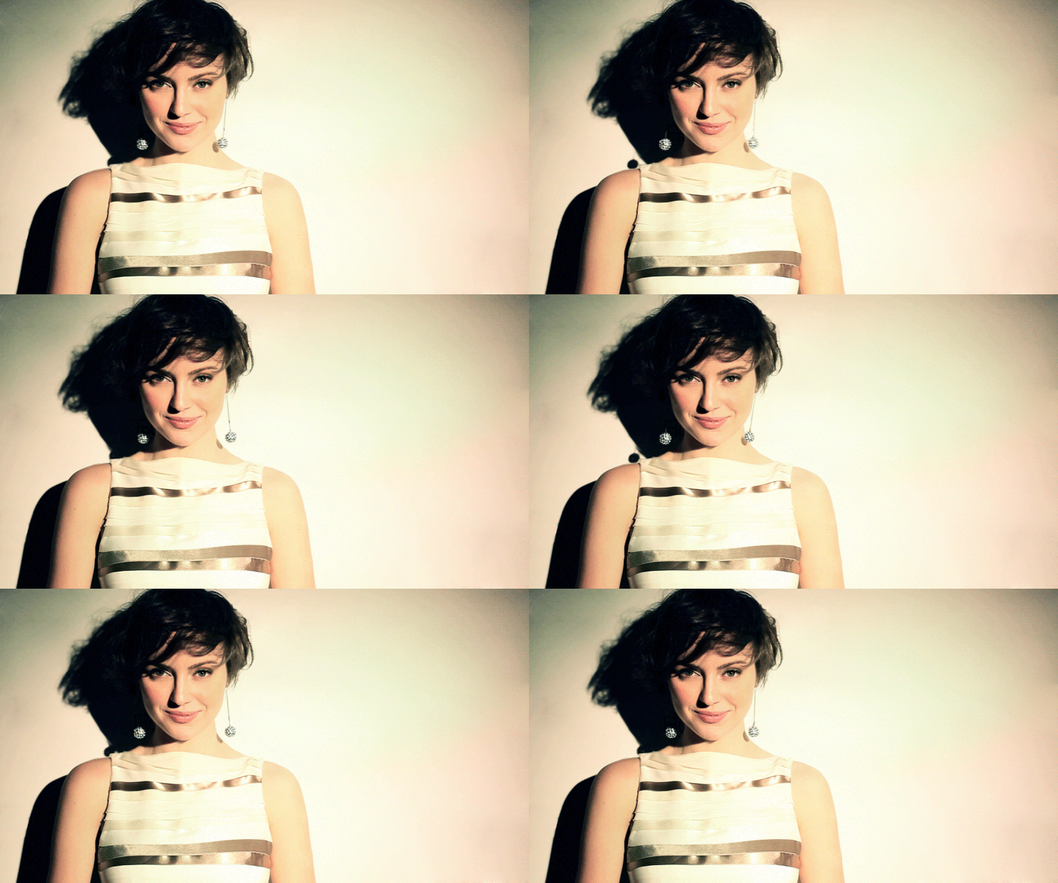
5. Cinemagraphs

Although this trend has been around for a while; it is probably my most favorite and still raging in predicted design trends. What can be better than a video and still image combined to create mystical visual enchantment? Here are some great examples below to keep you entertained!

cr-429

louboutin-green-shoes-429
nyfw-glamorai-429

Photo source: Fitbit| Northbound Design | Rule of Three | Google Fonts |
Creative Freedom Guide | Bubble | Our Wedding | Ice and Sky | MoMA | Olympic Story | Cinemagraphs