Monthly Archives

October 2015

Inspiration

Fresh Finds III

October 28, 2015
Color-Zen-1

This time of year makes me want to update my home decor and accessorize with autumn-hued pillows, evergreen shrubs, extra blankets, cozy imagery etc. You get the idea. It’s essential a form of hibernation I’ve decided.

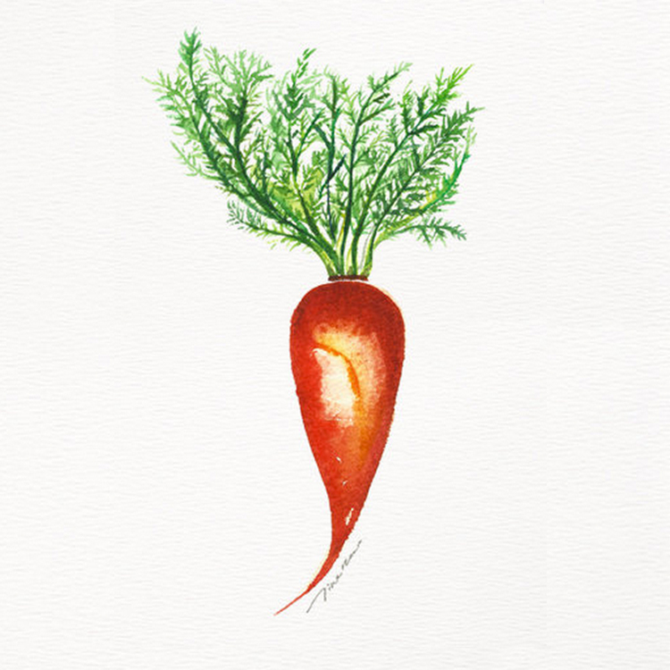
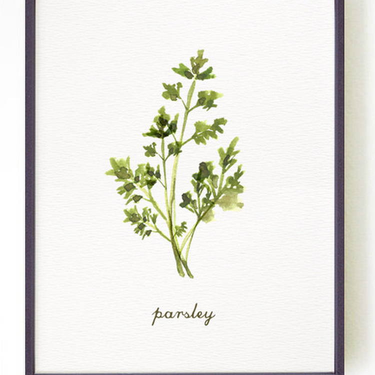
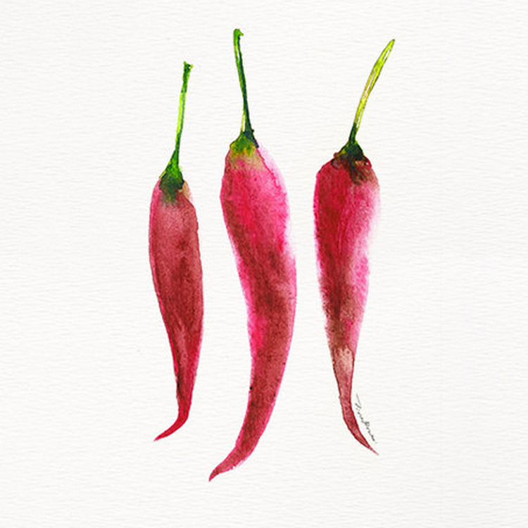
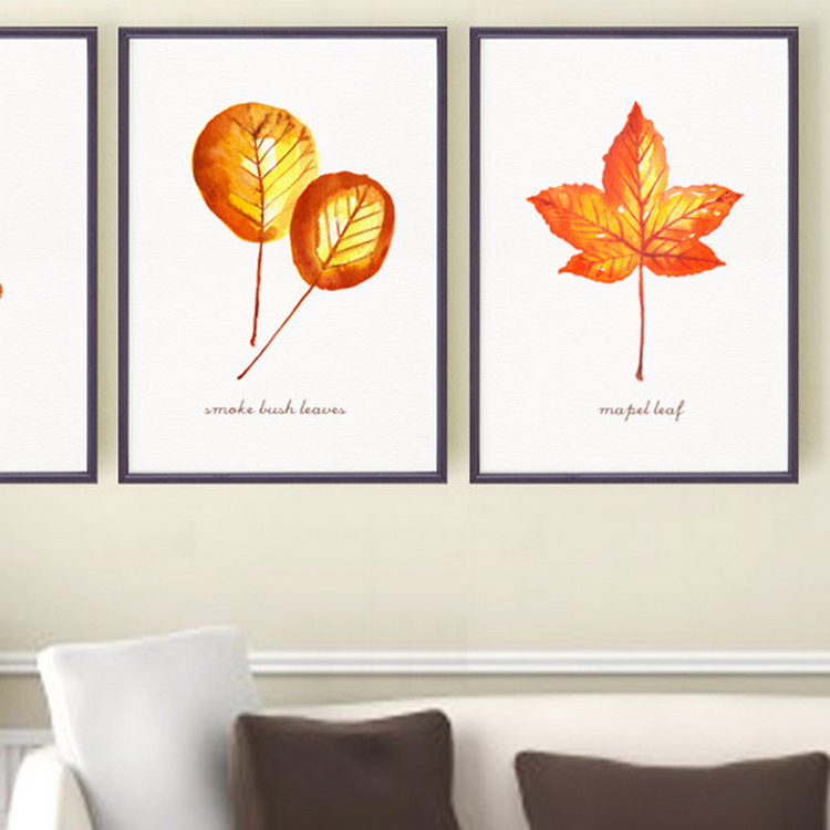
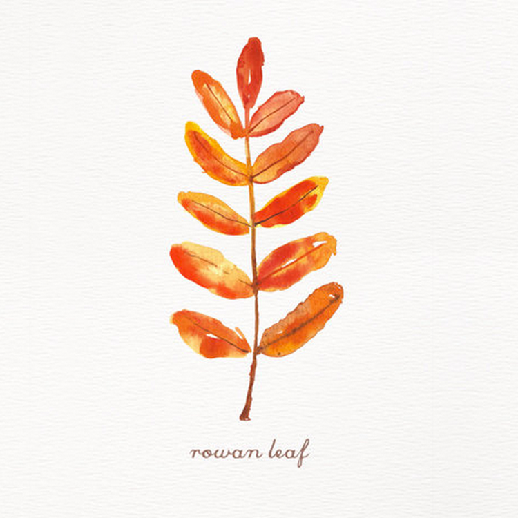
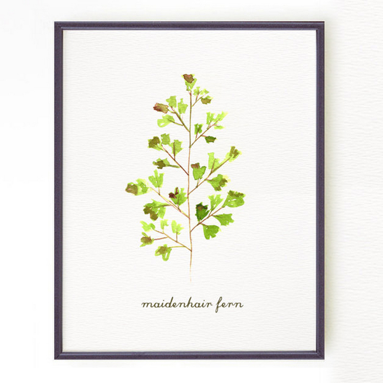
In my searches for a quick pop of coziness, I came across the adorable Etsy shop Color Zen. Their artwork is created upon order and features a variety of simple, fresh watercolor originals to perk up any gloomy interior. Go check out their full page to enjoy a little corner of visual fresh air!


Color-Zen-3

Color-Zen-6
Color-Zen-5

Color-Zen-2

Color-Zen-4

Inspiration

After You, Fall

October 22, 2015
Fall Leaves

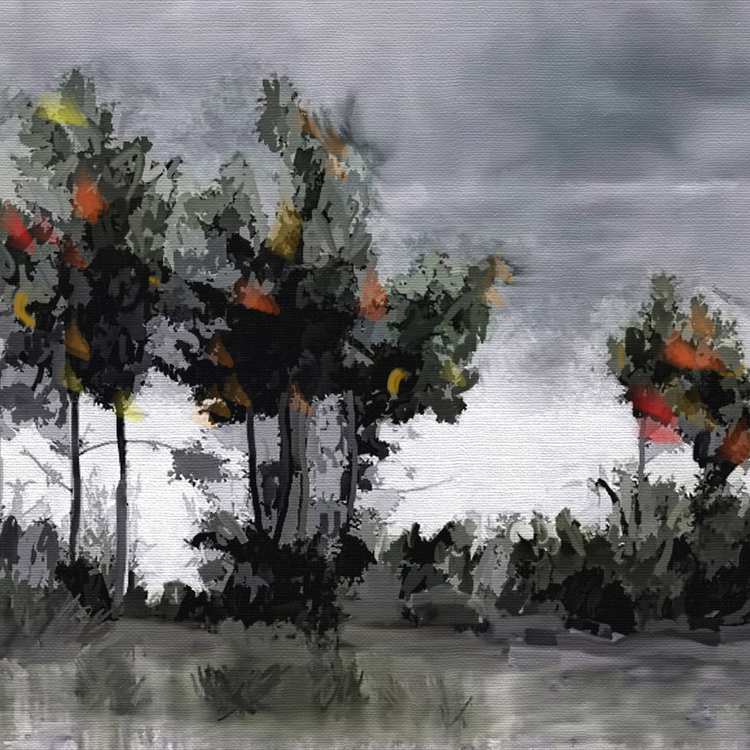
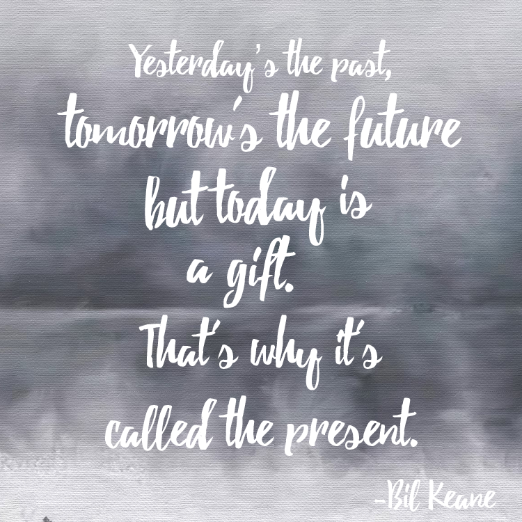
Fall is here; change is in the air. Whenever a time of change or transition occurs, even if only seasonal, I immediately feel the need to align myself with its cadence. Searching for inspiration, I stumbled across a few striking quotes with I felt were worth mentioning.

Life-Quote

I tried to choose the most personally relevant bit for my image but there a few runner-ups which also deserve a place in this space.

Aim for the moon. If you miss, you may hit a star.
-W. Clement Stone

You are never too old to set another goal or to dream a new dream.
-C.S Lewis

Hope you enjoy these as much as I did!

Inspiration

How to Be an Instagram Legend

October 14, 2015
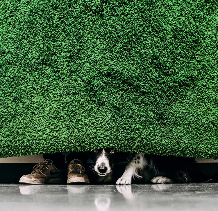
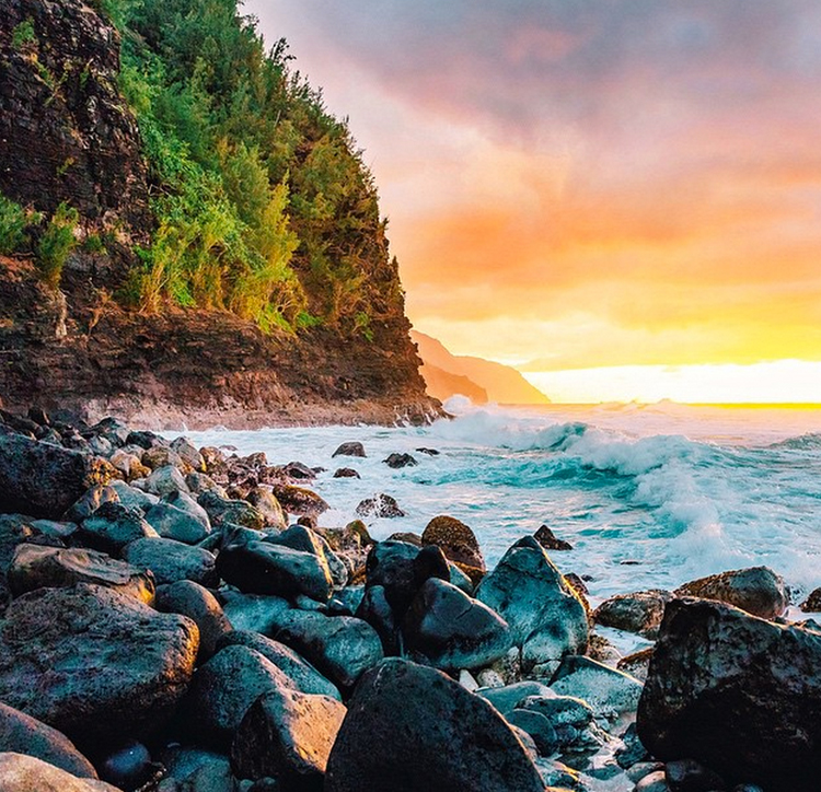
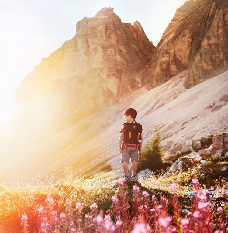
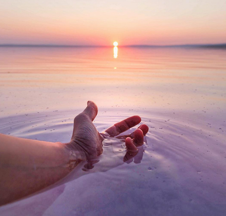
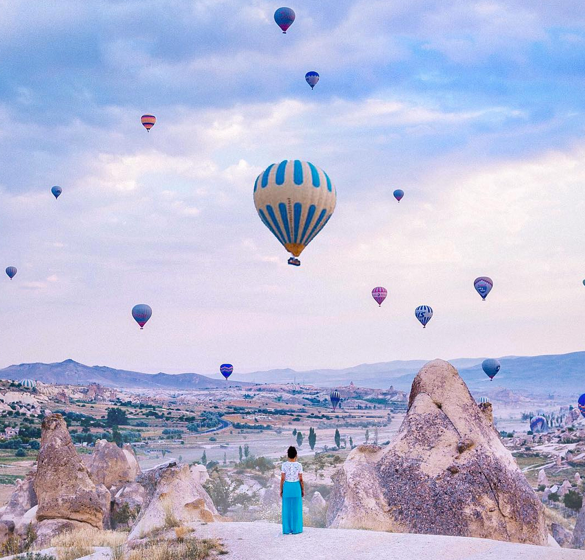
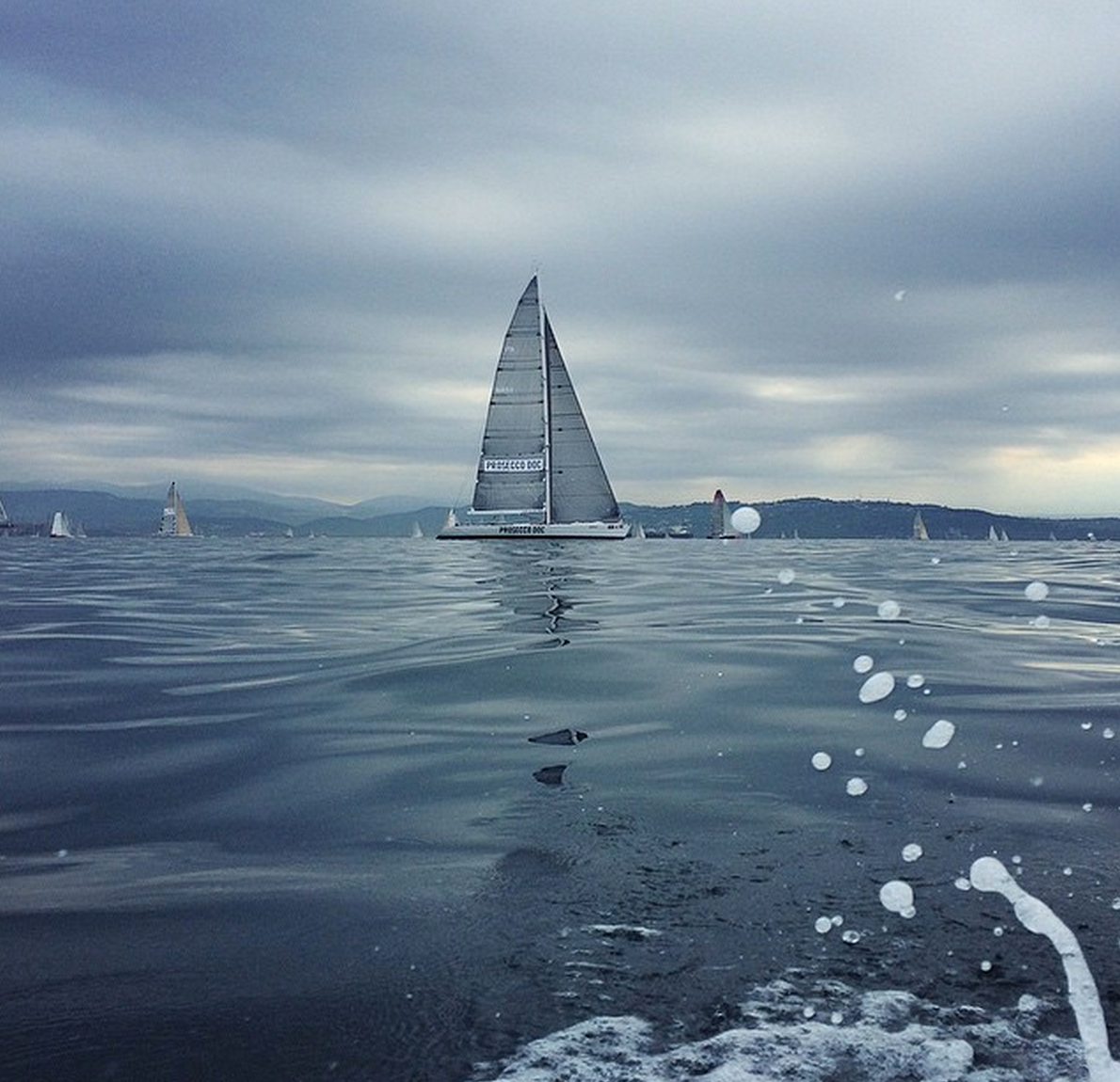
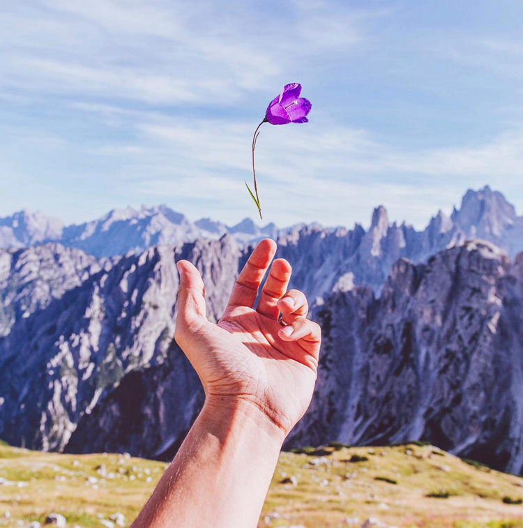
photo credit @brahmino

Hey all! I wanted to address a topic that’s been pressing heavily in the back of mind. Almost like a guilty presence haunting my daily interactions – I’m speaking of course of my lack-luster efforts reflected throughout my Instagram account! I know October is classically observed as an acceptable space for hauntings, but I am ready to put an end to my insta-nightmare.

Alright, enough of the theatrics. I wanted to share some tips I’ve recently learned on building up and expanding your Instagram empire.

1 Pick a Pattern:

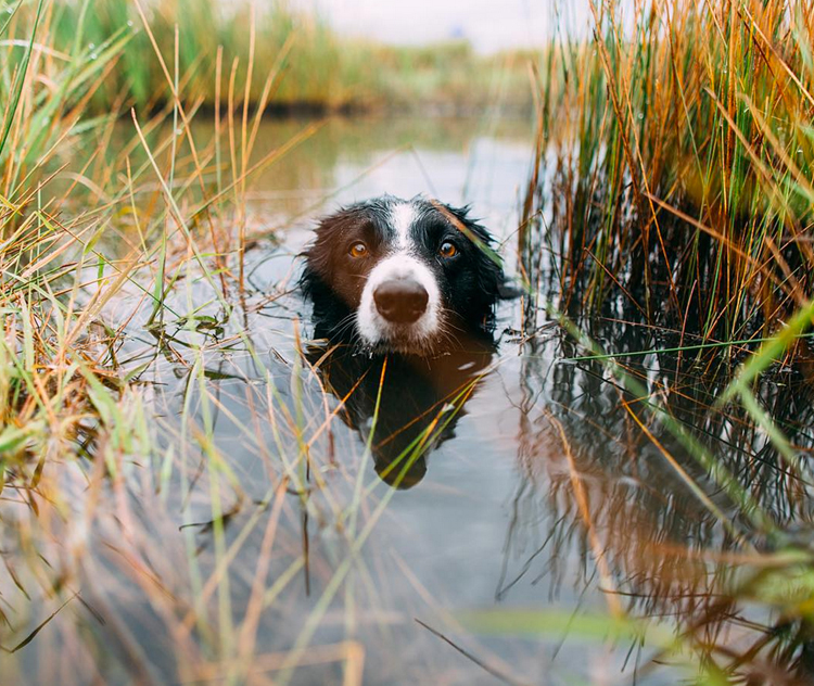
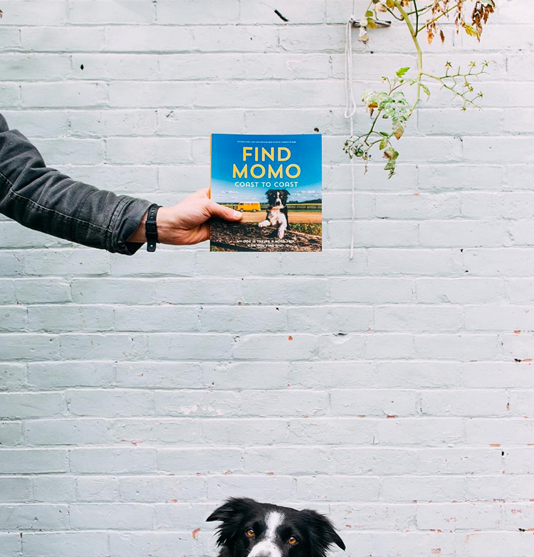
By this, I mean consciously choosing a theme for your Instagram feed. This could involve a variety of things; dark and moody, texture, minimalism, architecture, color palettes. It’s up to you to decide which direction you want, but remember to stay consistent and view your feed as a bigger picture. Here are some enviable accounts who have owned their theme throughout!
Find-Momo-A

Find-Momo-B

Find-Momo-C

Photo credits @andrewknapp

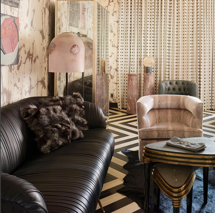
Interior-A

Interior-B

Interior-C

Photo credit @Kellywearstler


2 Lighting does Matter

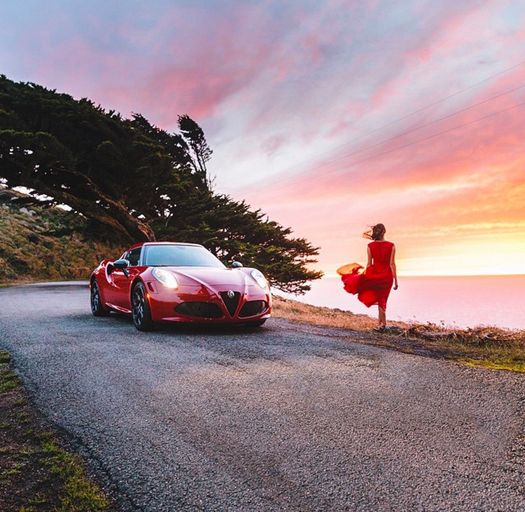
Just because your using a phone, doesn’t mean that traditional photography rules need to fly out the window. For starters, begin taking photos during the “golden hour”, the time of day shortly before sunrise or sunset. Being conscious of good lighting will elevate your photography from meh to amazing.

Avoid using the actual Instagram application to take pictures; instead, shoot with your phone’s standard camera in landscape view. Since most phones have decent camera technology, the resolution and overall quality will be much higher than with the condensed processing of the app itself.
Ram-A

Ram-B

Photo credit @ravivora

Pretty-A

Pretty-B

Photo credit @brahmino


3 Better is Better

Long gone are the days of standard filter options; instead, download some decent editing software. Here are few apps that will make life much easier and prettier during editing.

VSCO Cam
This one is actually free (so no excuses).

Camera+
This is an OS exclusive but allows for a wide range of editing exposures, angles, not to mention a broad selection of filters.

Diptic
For 99 cents you and your cam can access new photography heights.


4 Shoot for the Square

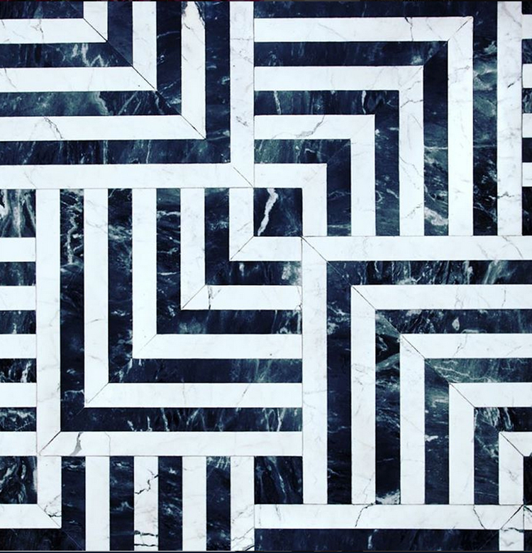
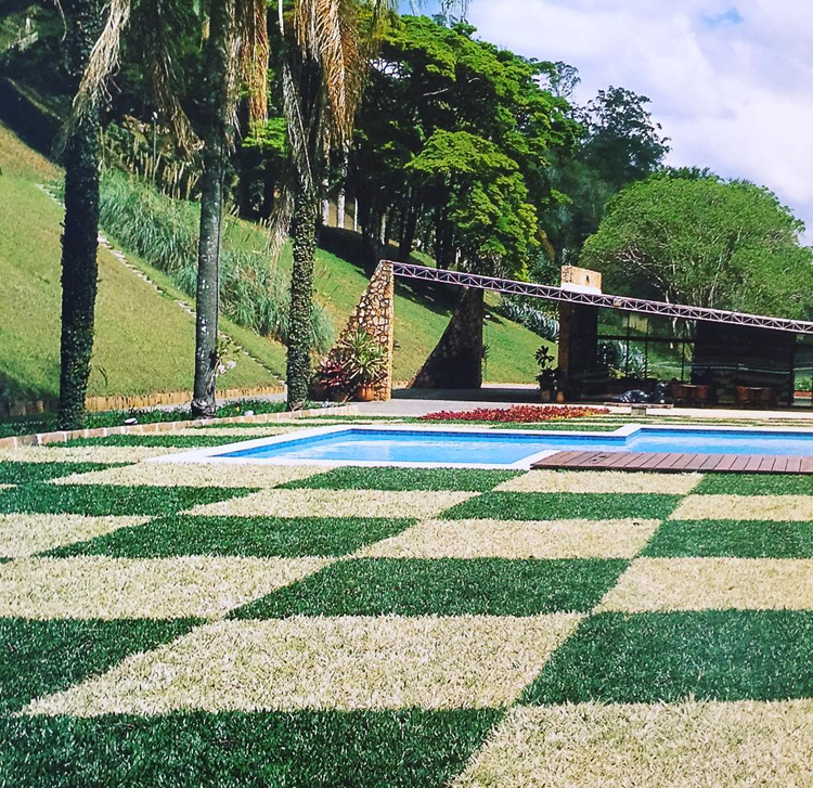
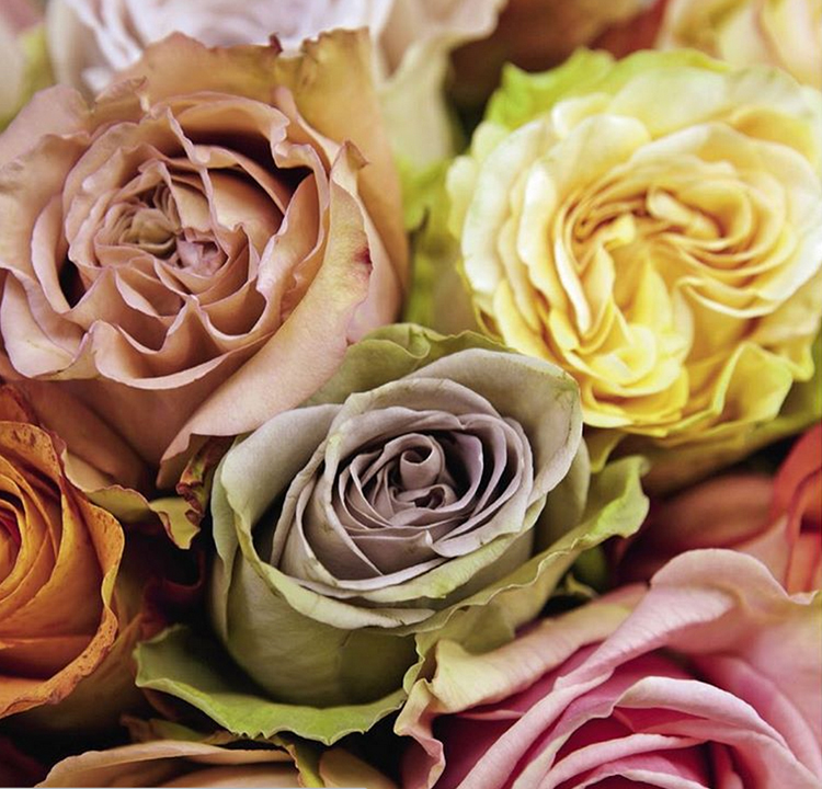
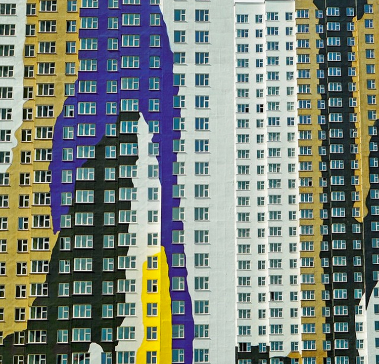
This is exactly what it sounds like. Since Instagram is unique for its square formatting, it is important to plan your shoot instead of having to crop back an amazing rectangular shot. To rock a square, it helps to center or pick a focus point which fits clearly within the frame without any threat of cropping. Play with angles, backgrounds, color contrast to help move the eye to a focal point. Here are some more examples of unbelievable artists to drool over.
Kelly-A

Kelly-B

Photo credit @Kellywearstler

Sim-A

Sim-B

Photo credit @brahmino
I hope this was helpful and inspiring, and now I’m off to build my own insta-empire!
 

Interview

Guest Artist Interview – Dave Hamann

October 7, 2015
Photo Credit@ Dave Hamann

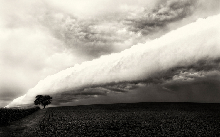
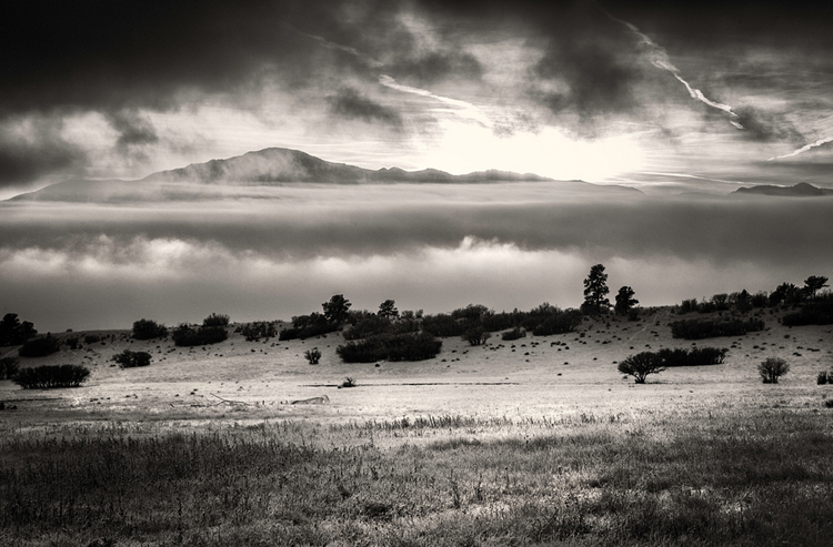
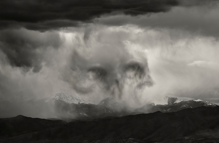
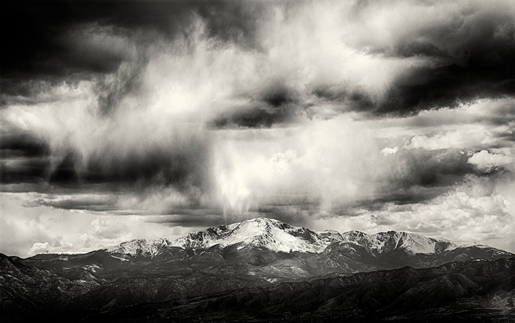
Hello good people! I have some very exciting new interviews to share this month in continuation of local artist/designer spotlights. Tonight, it’s my privilege to introduce local photographer Dave Hamann from Colorado Springs, CO.

Take a look at our interview together and feel free check at more of his work from the links below.

Website | Behance

Interview

1. Tell us a little about yourself and how did you get into photography?

Like many photographers, my interest in photography started when I was young.  My grandfather was an amateur photographer who seemed always attached to a camera.  He bought me my first camera, a Pentax ME SE Super.  From there, my desire to capture great photos and master this new craft blossomed and I quickly found myself devouring the photographic series by Ansel Adams, The Camera, The Negative, and The Print. Invaluable reading for the novice photographer.

Dave-Hamann-B


2. When did you start freelancing and how do you like it compared to industry work?

I started freelancing soon after graduating college.  Initially I began as a food photographer for local chefs.  I loved it!  I love a good still life and food photography is about as complex and challenging as they come.  I turned nearly full time art photography when we moved to Colorado. The landscape draws you in!


Dave-Hamann-H

Dave-Hamann-G


3. Walk us through a typical day.

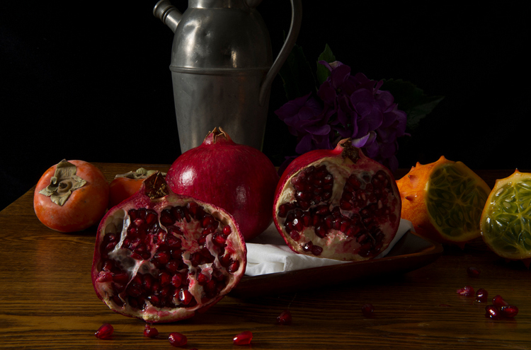
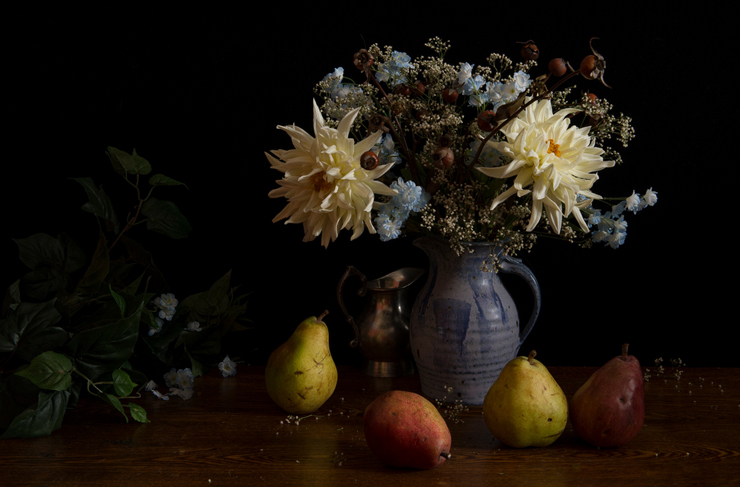
A typical day is unfortunately not very exciting!  If the weather is cooperative, by that I mean moody and brooding with great clouds and the hint of a threatening storm, I will grab the camera and head outdoors (kids and wife permitting!).  Otherwise, I’m in the studio arranging some awesome looking vegetables or fruits I found on a run to the grocery store in some vain attempt to emulate the still life style of the old Dutch Masters!


Dave-Hamann-D

Dave-Hamann-E


4. Describe your style/aesthetic and where do you draw your inspiration?

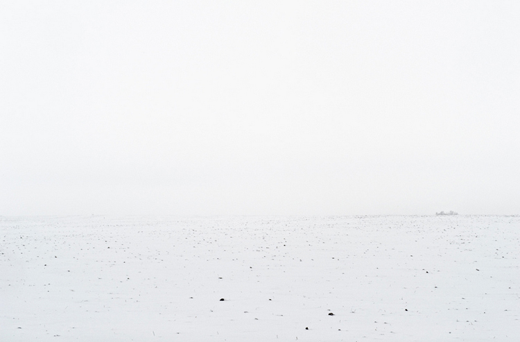
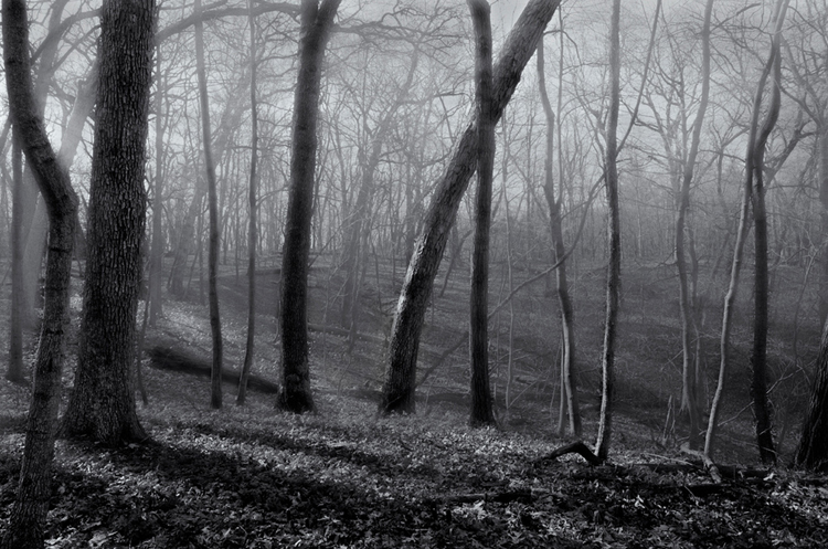
Landscapes I’m 98% black and white.  I come from a black and white wet darkroom tradition and still believe that the absence of color in an image makes the viewer “see” the scene.  We see color all the time and removing that reference makes one rely on the line, texture, shape, and tones of an image – makes one “see”.  For my still life work I’m all “Dutch Master”, XVII century still life.  I am also a fan of photographer Paulette Tavormina’s work.


Dave-Hamann-A


5. What are some of your favorite pastimes?

I love photography.  If I could, I’d love to hike into the backcountry for two or three months somewhere in Montana or Idaho, or even here in Colorado and just photograph!  That being said, I do like cooking and watching cartoons with the kids!


Dave-Hamann-J
Thanks again!
Photo credits: Dave Hamann.


Design

5 Design Trends Hitting 2016

October 1, 2015
http://cinemagraphs.com/

I feel like it has been a lifetime since I’ve posted anything, my apologies! Life has been seemingly busy, but I am almost finished with my final logo design and identity system. Thank you so much for all who voted! I have been doing some research on web design trends and predicted trends into 2016. Unlike some years, I am very excited for the look and feel of this upcoming year – it’s a good time to be alive!

Top five web design trends hitting now and into next year:

1. Semi-flat Design


This particular look has been slowly coming into fruition over the last couple of years. Largely influenced by Android interfaces, flat web design is becoming the new standard for clean, sleek design as seen in these examples.

FLAT-TWO2

FLAT-TWO


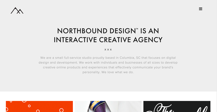
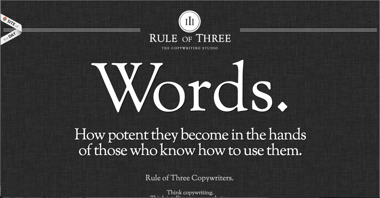
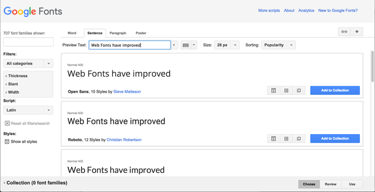
2. Access to more Designer Typefaces


Thanks to Google fonts, web fonts are becoming lets dull and boring, and more creative and custom. With more weight, styles, and sizes available; there are more options than ever for creating beautiful, creative websites even on a limited budget.

google-Font-One

google-Font-Two


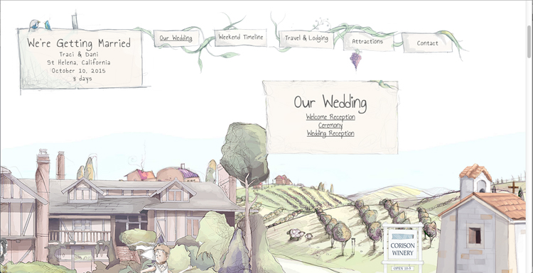
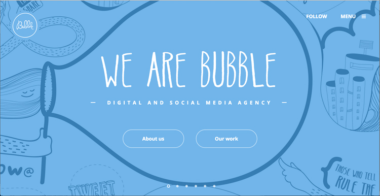
3. Quirky, Hand-Drawn Illustrations

The demand for attention has reached new heights in a world of expanding technology. Taking art back to hand-drawn illustrations is becoming increasingly more popular among web designers. It allows a company or brand to show a more human side while grabbing the reader’s attention with something fresh and creative.

Custom-One

Custom-Two

Custom-Three


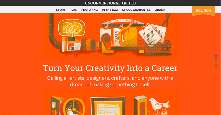
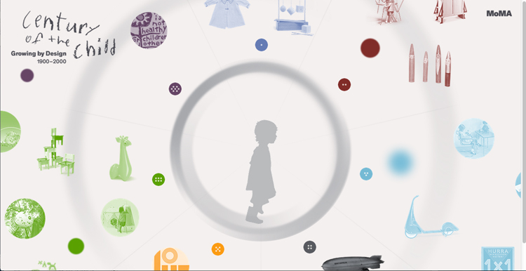
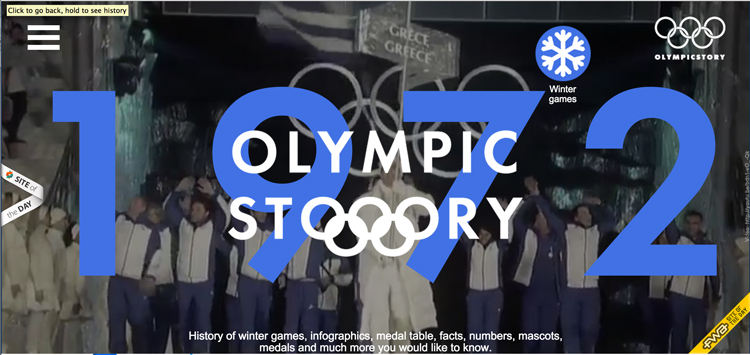
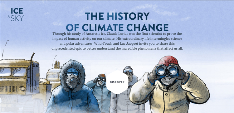
4. Better Storytelling

Instead of being so obvious, websites are shifting to more of an interactive experience for the visitor. Creating engagement has been key in communicating the story behind a company, brand and product. Here are a few companies and who have done a fantastic job of displaying a service or product through unconventional means.

Storytelling-One

Storytelling-Three

Storytelling-Two


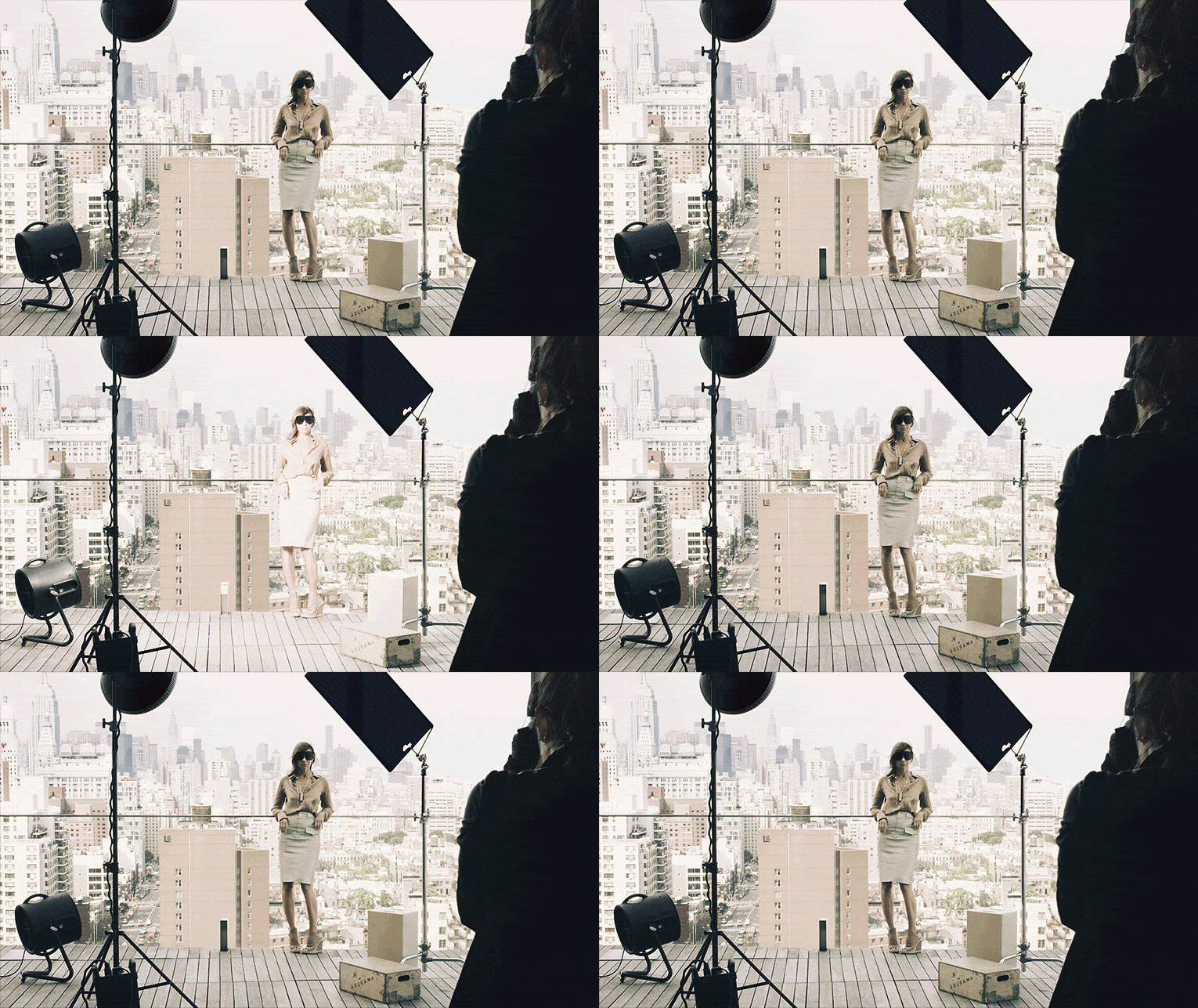
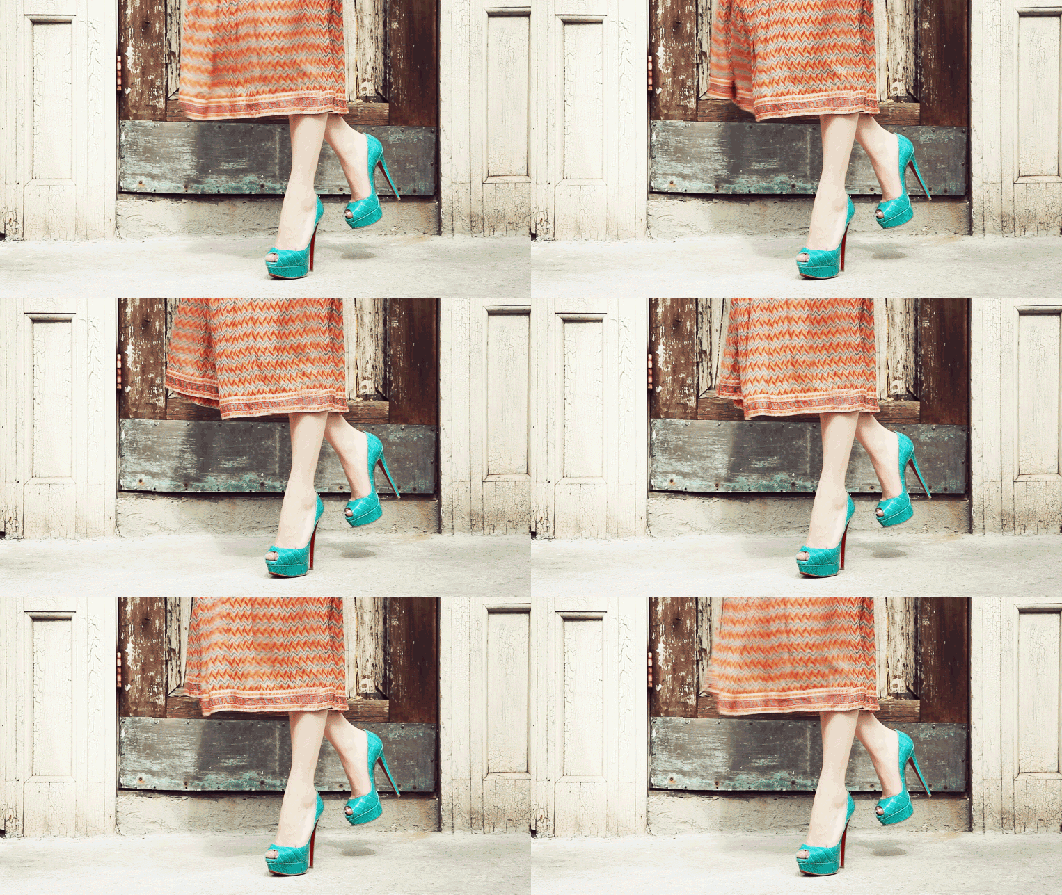
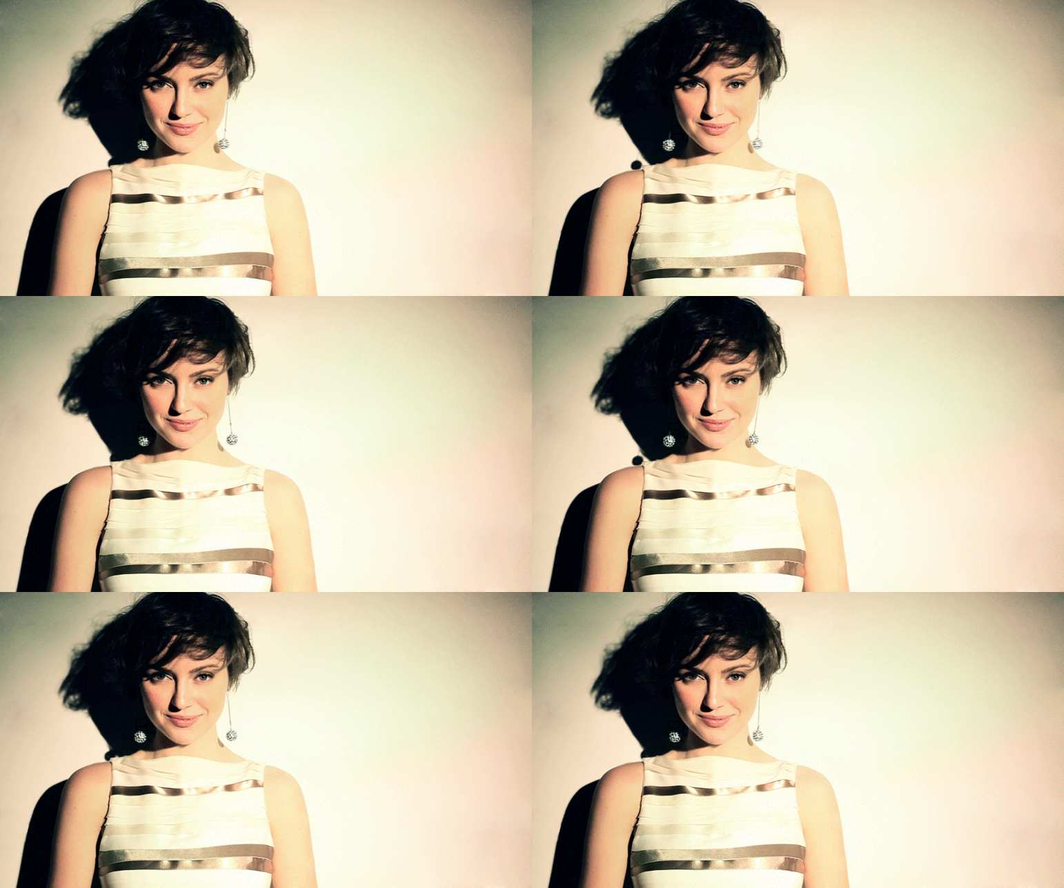
5. Cinemagraphs

Although this trend has been around for a while; it is probably my most favorite and still raging in predicted design trends. What can be better than a video and still image combined to create mystical visual enchantment? Here are some great examples below to keep you entertained!

cr-429

louboutin-green-shoes-429
nyfw-glamorai-429

Photo source: Fitbit| Northbound Design | Rule of Three | Google Fonts |
Creative Freedom Guide | Bubble | Our Wedding | Ice and Sky | MoMA | Olympic Story | Cinemagraphs