Browsing Tag

illustration

Interview

Guest Artist Interview – Chris Svoboda

March 31, 2016
Photo credit @Chris Svoboda

Time flies when your having…fun? I don’t know about you, but I’ve been trying to escape the blizzards of Denver. I’m so ready for warmer weather, breezy open windows, birds, open toe shoes, not having to scrap ice and snow off my car. You get the idea.

Tonight I’m so excited to present a very talented local artist who specializes in clean, creative design and raw ingenuity. Meet Chris Svoboda from Denver, CO and be sure to click the links below to see more of his work.

Behance  |  Instagram


Interview

1 Tell us a little about yourself and how did you get into design?

Becoming a collegiate athlete was once my biggest goal, followed closely by a desire to become a top chef. As I began my athletic career at the University of Nebraska-Lincoln while studying to become a nutritionist, I quickly found that I didn’t feel fulfilled in either path. I started a mission to dig into my interests and find out just what exactly made me tick. While filling general requirement courses for my major, I stumbled upon a course that focused solely on advertising. Throughout the course, I developed a passion for the creative side of advertising and the idea that I could have the power to create something from nothing. I changed my major to Advertising and began narrowing down where my passions fell in the creative zone. As the youngest in my family I spent a lot of time reworking hand-me-down toys to fit my interests and filling every inch of my room with drawings. It didn’t take long to find my niche in design and I haven’t looked back since. Through countless hours of tutorials, perhaps too many coffee breaks, and an endless fascination with the Adobe creative suite, I’ve landed in my place as a graphic designer.


Photo credit @Chris Svoboda

Photo credit @Chris Svoboda


2 Walk us through a typical day?

As I’m currently looking for my next opportunity as a graphic designer I’ve been keeping busy by expanding my skill set, freelancing, and sending out more emails than I’d like to count. When I’m not working on my trusty laptop, I’m doodling or working on DIY projects around the house.


Describe your style/aesthetic and where do you draw your inspiration from?

I do my best not to get comfortable and stick with one particular design style as there are so many to choose from and grow with. My work typically has a clean aesthetic but it truly comes down to what or whom I’m designing for.

My guilty pleasure is illustration. It makes me feel like I’m a kid again, watching old school Disney cartoons and creating my own characters. 


Photo credit @Chris Svoboda

Photo Credit: Chris Svoboda

Photo credit @Chris Svoboda


On your site, you reference sasquatch a few times, any backstory on your rare creature interactions?

The sasquatch is my way of saying that my style and background is different and that I don’t want to be put in a category as a designer with a single track of work. I chose the sasquatch because it follows its own path and still makes history.


Photo credit: Chris Svoboda

Photo credit: Chris Svoboda


What are some of your favorite pastimes?

I’ve always found the best way for me to unwind was through exploration. I’m always up for a hike, trying a food truck, or even a drive through the mountains. I like to live life a little off the map and off the wall.

Thanks again!

Photo credits: Chris Svoboda

Design

New Portfolio Added: Forgotten Tales

March 7, 2016
Forgotten Tales Title

It’s March already can you believe it! I have been a little distracted and pre-occupied as of late with life, work, play, so its been awhile since I’ve posted. Today, I wanted to share some older work of mine; but, still very reflective of who I am as a designer.

As projects often go, my original thought process was to create something edgy, dramatic, moody and dark executed in a thoughtful, mysterious package. Throughout the brainstorming and drafting process, I slowly drifted away from my original mood-board but still managed to capture the mythical playful oddity and wonder of the piece.
Original Moodboard

Always an important concept to learn throughout art and design that its not about forcing an idea, but letting the organic creativity take a direction of its own in a controlled, directed environment. Allowing ample time for the “brainstorming phase” which is so often rushed in the modern workload. Cheers to letting ideas blossom on their own! Forgotten Tales is my magna opus of such a lesson.

Hand Drawn Title

Ticket

Interior Booklet

Drawn Numbers

Animation Clip 1

Animation Clip 2

Forgotten Tales Clip

Design

Just Added Portfolio: Stuck

November 29, 2015
Photo Credit: Krista Bradshaw

As fabulous and fun as the holidays, travel, family has been, I have been very distracted with everything and apologize in advance for the lapse in posts. Hopefully everyone else is also going through the same seasonal busyness and hasn’t noticed…

I have been thinking about new blog segments for next year and I am excited to bring in 2016 headstrong with new interviews, design bits, portfolio pieces etc. As mentioned previously, I have been revamping my personal website and can’t want to reveal the new layout and design! In the meantime, I have a new portfolio piece to share and will continue to keep you updated as more projects are completed.

Stuck - by Krista Bradshaw

Stuck - by Krista Bradshaw

Stuck - by Krista Bradshaw

Stuck - by Krista Bradshaw

In regards to this project, I love the open-ended creativity and spontaneity that children’s books afford. I had so much fun creating this piece and I hope it touches a little corner of your inner child as well.


Stuck - by Krista Bradshaw

Stuck - by Krista Bradshaw

Stuck - by Krista Bradshaw


Interview

Guest Artist Interview – Kristen Williams

November 8, 2015
Kristen-Williams

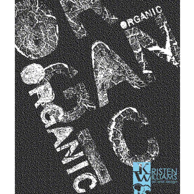
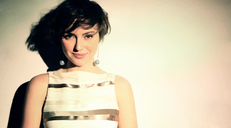
I have an exciting new guest interview to share with you all! It’s my privilege to introduce local designer Kristen Williams from Pueblo, CO.

Check out our interview together and visit more of her work from the links below.
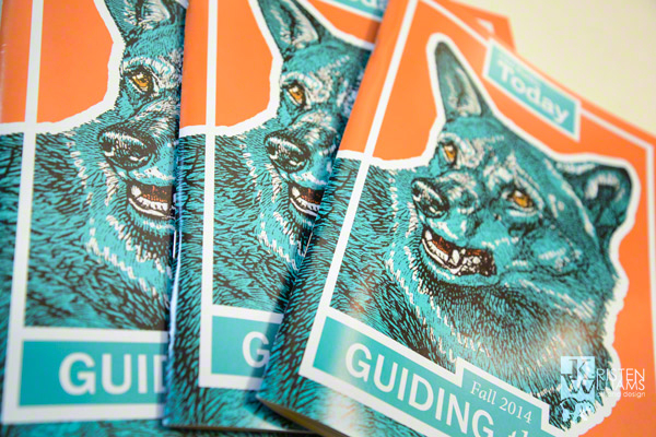
Website | Blog

Interview

1. Tell us a little about yourself and how did you get into graphic design?

I was always artistically inclined. As a tiny child, I loved to draw and paint and when I turned five I finally got my hands on my mom’s Pentax SLR. I was drawn to typography and fell in love with the Egyptian typeface on my mom’s antique typewriter. I always noticed the logos on my toys. I think I was doomed from a very early age to be an artist and graphic designer.

It almost didn’t happen though. My family didn’t understand the difference between commercial and fine artists and I think they feared the “starving artist” stereotype. Wanting the best for me, they encouraged me to pursue other fields ranging from math, to aeronautical engineering and finally journalism, which is what they sent me to college to obtain. If it weren’t for a passing comment from my advisor that I could double major in graphic design, I’d probably be working at a newspaper right now. Ironically, journalism is far lower paying than graphic design, so I focused on my BFA and switched my journalism to the more complimentary integrated communications. I’ve never looked back since.

Photo credit @Kristen Williams


2. Describe your style/aesthetic and where do you draw inspiration from?

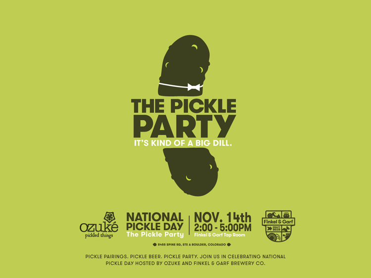
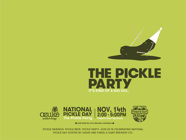
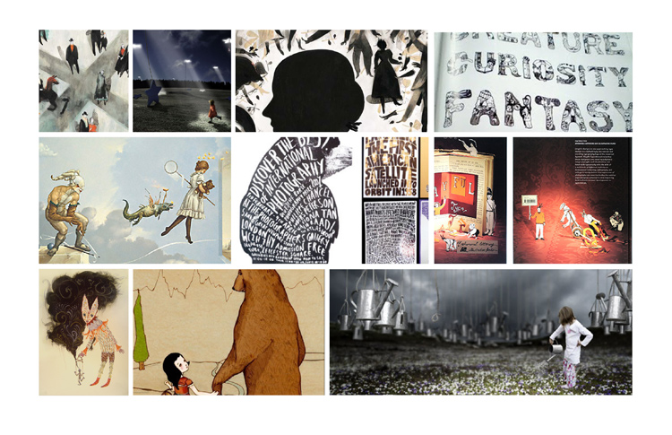
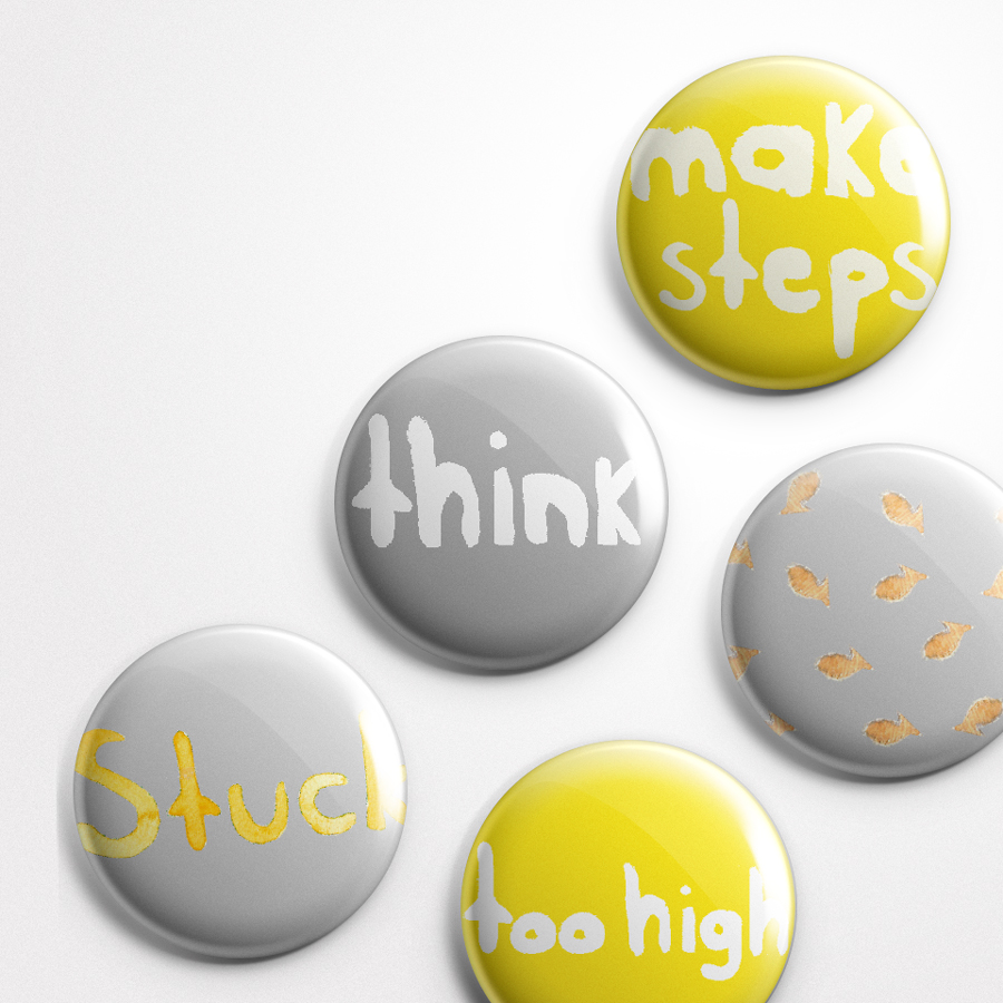
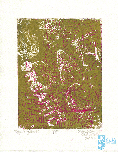
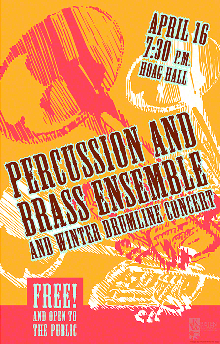
My style fluctuates a bit depending on my client’s needs, but it’s usually somewhere between eclectic retro, hipster and grunge on a Swiss modern structure. I’m a 90’s child and so grunge is a dominating influence, but I’m also inspired by 1960s advertising, halftones, drawing, printmaking and the colors of local Hispanic and Latin-American paintings. I’m in love with the contemporary Argentinian graphic design circuit as I see them working with the same influences—60s halftones, 90s grunge and contemporary Latin-American colors. There’s also a kinship in our environments and graphic design goals as I too am trying to use these in-your-face graphics to take a stand and promote change for Pueblo, Colorado.

Pueblo is my second home. I go to school here, met my best friends here, and I spend most of my free time here. Local leaders are trying to raise Pueblo to a cultural hot-spot and shake away the steel-mill roots and the 80s depression that crippled Pueblo. What was once a Victorian hot-spot for health and mineral water, the location of a Frank Lloyd Wright opera house and the home of gilded, marbled hotels became associated only with the dirt of working-class industry. This town has come so far, made so much progress, but people in other parts of Colorado (or other parts of the US) still over-look it.

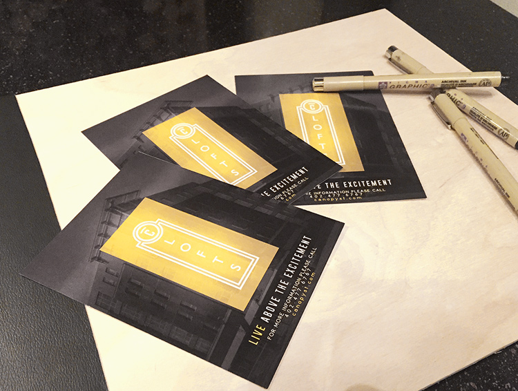
We local graphic designers are trying to provide the visual component to revitalization campaigns, and so rebel graphics resonate with many of us. I’m one of them. Currently I am a designer at the Historic Arkansas Riverwalk of Pueblo, a down-town venue that is one of the fore-runners of Pueblo’s revitalization projects. The Riverwalk has already made major improvements in beatifying Pueblo (it ranks comparable to my favorite spots in San Francisco). My job is to help lead the charge of a fresh visual identity system that will make people remember the Riverwalk fondly and thereby remember Pueblo fondly. The goal is to help people see Pueblo as a thriving cultural and arts center, and forget the long-gone steel-mill past. My love for bright, in-your-face colors and rebel graphics that scream for attention are now a necessary inspiration for my job.


Photo Credit @Kristen Williams


3. Walk us through a typical day.

A truly typical day almost doesn’t exist for me, especially while I’m juggling my last full-time semester of college and two internships. But there are some things I can expect (mostly!). When I walk into the office, I either immediately deal with an unexpected challenge that arose while I was away at class (such as a rush job), or I can go straight to my desk and work on my projects. I like to start the day researching the project, brainstorming the design direction and researching related design trends (as both an example of what to follow or to avoid).

The rest of the day is spent collaborating with copywriters, communications directors, the printers, my boss and anyone else assigned to the project. Graphic design is a lot to juggle, but that’s also what makes it exciting. It’s not like the fine arts where I lock myself into the studio for hours on end, drawing compositions to meet a gallery deadline. Instead, it is a collaborative, back-and-forth effort. Sometimes things change, sometimes I might lose favorite elements in pursuit of the greater goal (or the client’s specific desires), but almost always the project is richer for it. You can’t expect to have a lot of control in graphic design—instead you have to be ready to adapt to change, and quickly.


DSC_2403_1


4. What are some of your favorite pastimes?

I love pastimes that inspire my design, or let me take a break from it. I’ll stroll antique stores in search of vintage graphics or walk the down-town streets of small towns for mural and sign inspiration. My photography is also a great way to decompress and reflect. When I lift up my camera, nothing else exists in the world but me and my subject. It’s complete Zen.

Sometimes I need to take a break from anything visual arts to avoid overstimulation and during this time I’ll focus on spending time with my friends, taking a stroll in nature or watching equestrian sports. There’s something awe-inspiring about watching a man and a horse soar over a five-foot jump in perfect partnership. Thinking about what they had to go through over several years to obtain that level of strength and finesse puts all of my graphic design challenges into perspective. And, in a way, equestrian show jumping represents graphic design—you need strength, confidence and delicacy to clear major obstacles. The jumps look formable, but they are actually delicate–make a mistake and suddenly that jump crumbles and you are out of the competition. I can’t think of a better analogy for graphic design.


Photo credit @Kristen Williams


5. Any advice for future/aspiring new designers?

Never lose sight of the bigger picture, the end goal of the project, and your client’s needs. These are the most important things and if you meet them, you’ll never go hungry. There are going to be times when you will have to stand your ground and defend your design aesthetics, but that is only when you KNOW that the design aesthetics are the best to meet the client’s goals. If they don’t meet the goals, then the aesthetics are just your babies and you’ll have to let them go.

Be ready to juggle multiple projects and a lot of little details, many of which will change as the project progresses. This is what makes commercial art different from the fine arts—it’s not about you spending hours on your favorite image until you’re done. In order to please multiple people and communicate a message, you’ll have to juggle a team of people and roll with the changes. Learn to multi-task and always welcome change. Be like that show jumping horse and rider where your talents are your trusty steed. Always have confidence, always look to the next obstacle (not down), know when to use strength and when to be delicate. Nothing can stop you if you learn that.

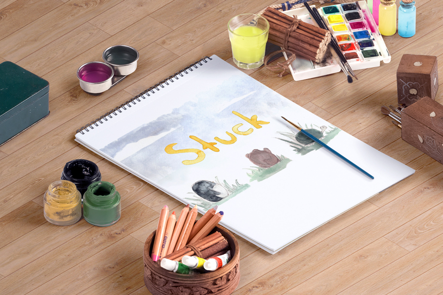
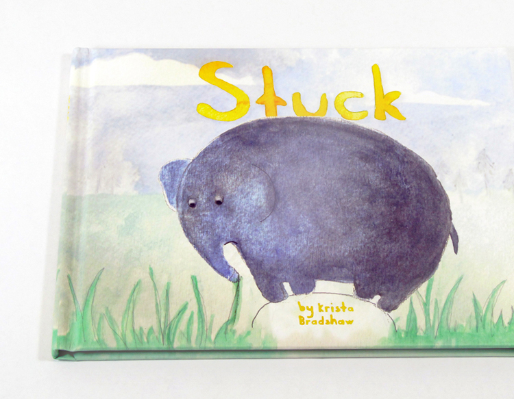
Thanks again! Photo credits @Kristen Williams


Inspiration

Fresh Finds III

October 28, 2015
Color-Zen-1

This time of year makes me want to update my home decor and accessorize with autumn-hued pillows, evergreen shrubs, extra blankets, cozy imagery etc. You get the idea. It’s essential a form of hibernation I’ve decided.

In my searches for a quick pop of coziness, I came across the adorable Etsy shop Color Zen. Their artwork is created upon order and features a variety of simple, fresh watercolor originals to perk up any gloomy interior. Go check out their full page to enjoy a little corner of visual fresh air!


Color-Zen-3

Color-Zen-6
Color-Zen-5

Color-Zen-2

Color-Zen-4

Design

5 Design Trends Hitting 2016

October 1, 2015
http://cinemagraphs.com/

I feel like it has been a lifetime since I’ve posted anything, my apologies! Life has been seemingly busy, but I am almost finished with my final logo design and identity system. Thank you so much for all who voted! I have been doing some research on web design trends and predicted trends into 2016. Unlike some years, I am very excited for the look and feel of this upcoming year – it’s a good time to be alive!

Top five web design trends hitting now and into next year:

1. Semi-flat Design


This particular look has been slowly coming into fruition over the last couple of years. Largely influenced by Android interfaces, flat web design is becoming the new standard for clean, sleek design as seen in these examples.

FLAT-TWO2

FLAT-TWO


2. Access to more Designer Typefaces


Thanks to Google fonts, web fonts are becoming lets dull and boring, and more creative and custom. With more weight, styles, and sizes available; there are more options than ever for creating beautiful, creative websites even on a limited budget.

google-Font-One

google-Font-Two


3. Quirky, Hand-Drawn Illustrations

The demand for attention has reached new heights in a world of expanding technology. Taking art back to hand-drawn illustrations is becoming increasingly more popular among web designers. It allows a company or brand to show a more human side while grabbing the reader’s attention with something fresh and creative.

Custom-One

Custom-Two

Custom-Three


4. Better Storytelling

Instead of being so obvious, websites are shifting to more of an interactive experience for the visitor. Creating engagement has been key in communicating the story behind a company, brand and product. Here are a few companies and who have done a fantastic job of displaying a service or product through unconventional means.

Storytelling-One

Storytelling-Three

Storytelling-Two


5. Cinemagraphs

Although this trend has been around for a while; it is probably my most favorite and still raging in predicted design trends. What can be better than a video and still image combined to create mystical visual enchantment? Here are some great examples below to keep you entertained!

cr-429

louboutin-green-shoes-429
nyfw-glamorai-429

Photo source: Fitbit| Northbound Design | Rule of Three | Google Fonts |
Creative Freedom Guide | Bubble | Our Wedding | Ice and Sky | MoMA | Olympic Story | Cinemagraphs