Mastering the power of color isn’t an easy task and requires a good amount of artistic instinct, foundational color theory and psychological emotional projective. To break things down, here are a few tips and techniques trending for 2016 to make choosing the right palette a little easier.
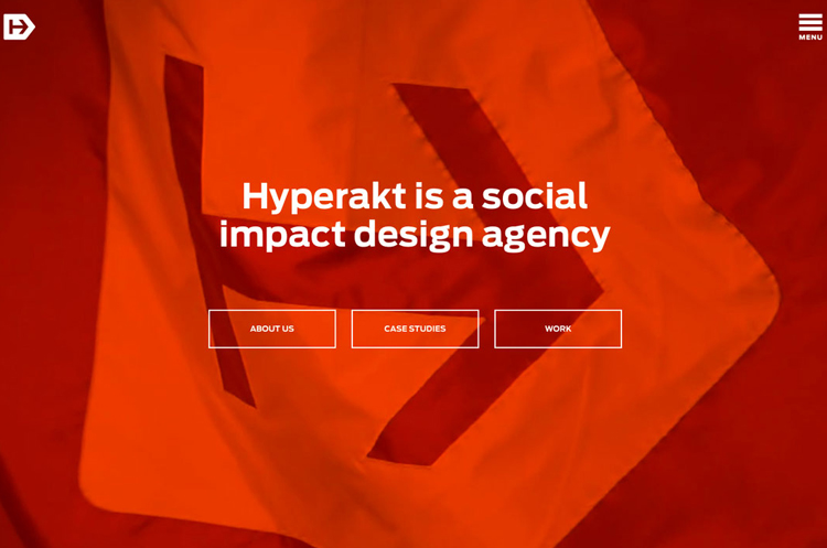
1. Think Monochromatic
Less distracting, monochromatic themes are becoming a strong focus in minimalistic design. Because color can be very overwhelming, choosing a bold shade directs focus towards the text content and message of the page.
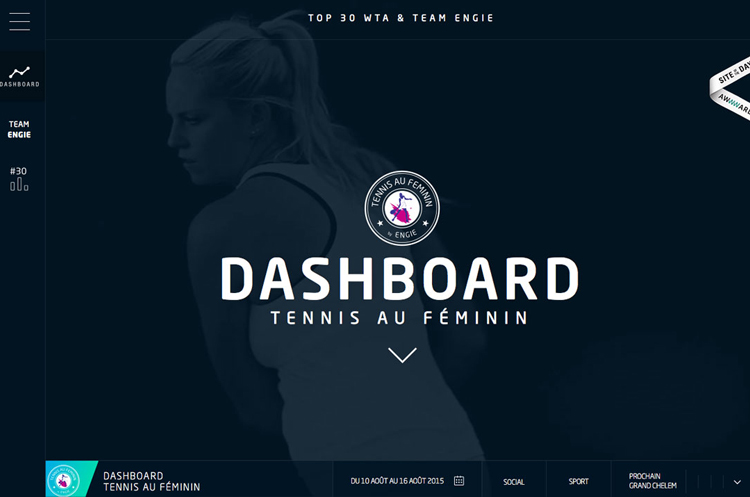
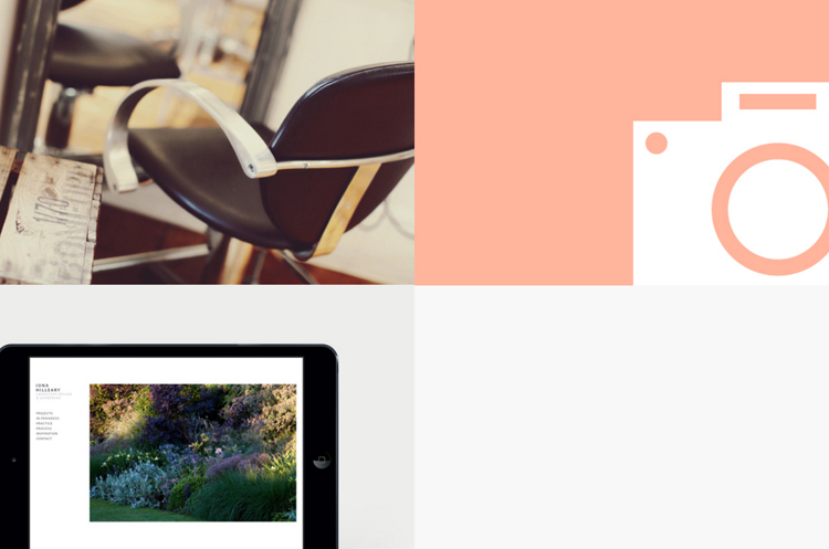
2. Color Blocking and Hovering
This technique is extremely effective for compartmentalizing information in compact, clean formatting. By laying out content in a grid or block presentation, it becomes easier to pick and choose through more content which otherwise may be skipped or overlooked in the mass of things. In addition, hovering allows the viewer to experience a more precise intake of information in ‘visual bite sizes.’
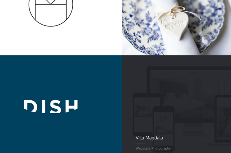
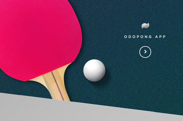
3. Color Paired with Texture
In the past, texture has been reserved for neutral backgrounds but not any more! Vibrant color paired with texture is creating exciting bold statements for web and interaction design. This technique can easily become overwhelming so be selective and use colors as accents with texture for best results.
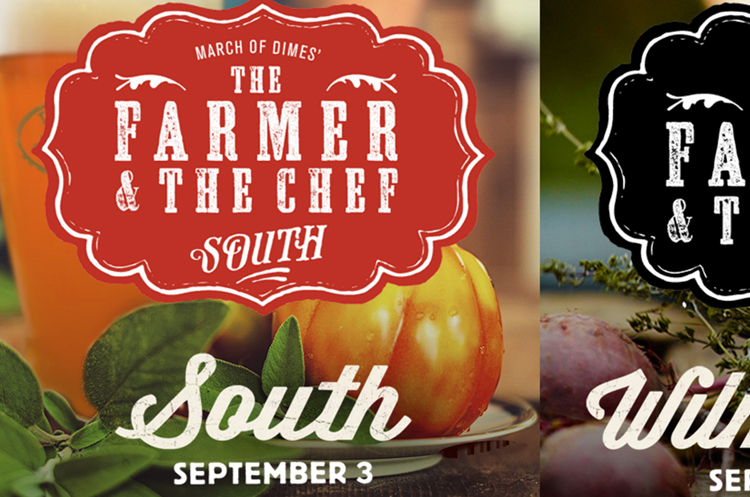
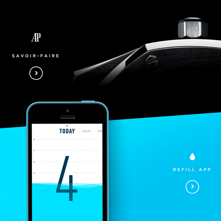
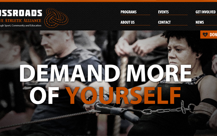
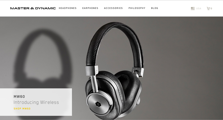
4. Accent with Color
As stated before, color can be a powerful tool when used as an accent in a high contrast setting. This can be as subtle as a color title or call to action button but beautifully effective when contrasted correctly. Below are some great examples of vibrant color accents executed brilliantly.
In addition to using color effectively, keep in mind the mood of your color choices is a powerful tool as well.
Here are a few general guidelines to setting color mood:
Red: is catchy and provocative. Provokes a call to action and adventure but overpowering if used excessively.
Green: is balance, associated with nature, prosperity and wealth. Banks and financial institutions often use green hues for this same reason.
Blue: is associated with security, trust, peace, realism. Strongly linked to the sky and the sense of dependability.
Purple: is imagination and dreams. Also associated with leadership, respect and wisdom.
Orange: is a positive color and associated with social, physical and mental stimulation. Will put viewers in a good mood.
White: stands for innovation, creativity and purity. It is the color of perfection.
Black: is the color of intellectualism, power and professionalism. It can also be associated with luxury and sophistication.
Photo source: tennisaufeminin | hyperakt | madebypfd | graydenpoper | thefarmerandthechef | crossroadsalliance
| masterdynamic