I wanted to share the inspirational work of artist Said Dagdeviren from Istanbul as he shares a powerful message of nature, wildlife, and preservation. We all leave a footprint behind, what’s your legacy?
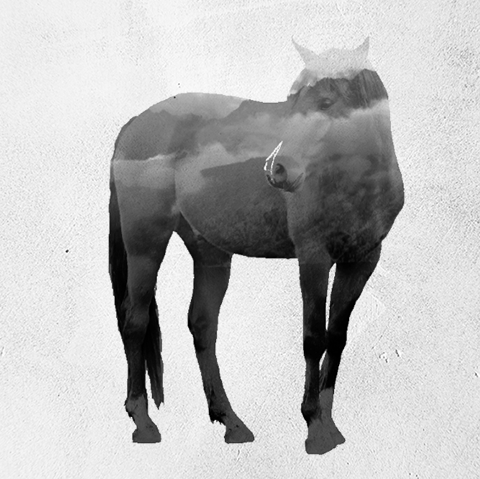
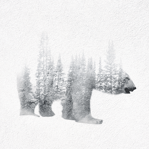
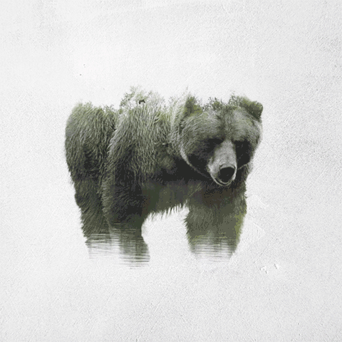
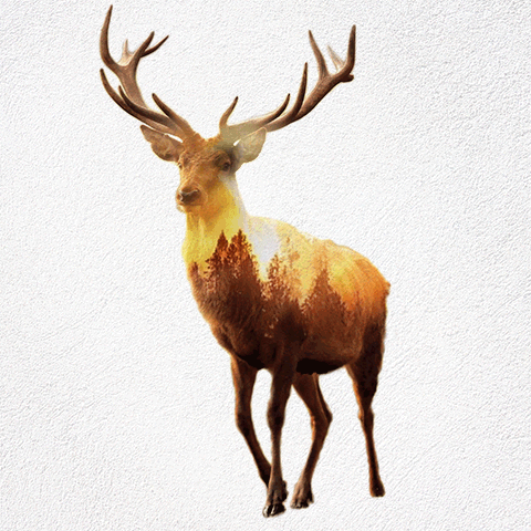
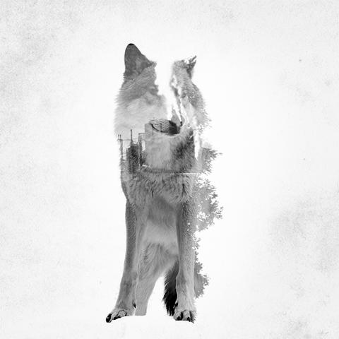
Photo Credit | Said Dagdeviren
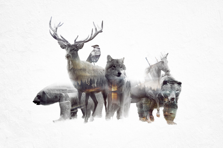
I wanted to share the inspirational work of artist Said Dagdeviren from Istanbul as he shares a powerful message of nature, wildlife, and preservation. We all leave a footprint behind, what’s your legacy?
Photo Credit | Said Dagdeviren
It’s the end of January…the energetic oomph of the new year is starting to fade. I know for myself, I’m still just as determined to accomplish my goals but the motivation level is starting to lag. Good news! Top productivity tips from the best entrepreneurs and designers to get you motived and pushing the envelope of design and life in general.
1 | Jot It Down
“I have my sketchbook on me at all times. Sketching helps me to externalize the craziness going on in my head, allowing me to see a clearer path of what to move forward with.”
—Leah Shea, product designer at ustwo
Photo credit: ustwo
2 | Quality over Quantity
“You want to be productive? Focus. Do one amazing thing each day. It could be for the world, your life, your partner, or for a friend. But if you do one great thing a day, well, that’s a f***ing productive day.”
—Golden Krishna, senior UX designer, Zappos
3 | Little by Little
“I found breaking down big goals into smaller tasks to be the best way for me to get things done. I can make small progress and knock off these bite-size tasks whenever I have a moment.”
—Jannie Lai, head of UX, Light
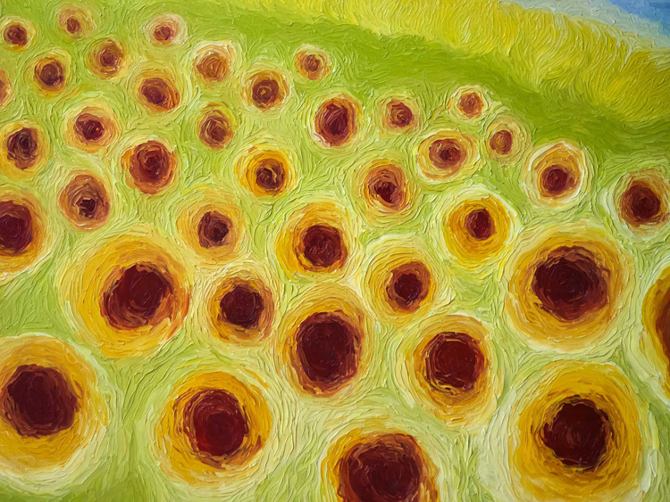
Photo credit: Light
4 | Strategize
“A lot of time can be wasted in pursuit of the wrong goal. The longer I have worked as a designer, the more I have learned establishing that you are working on the right thing from the beginning, not just working, boosts productivity. Sure, in the moment, time spent asking yourself, ‘Am I working on the right thing?’ makes you feel anxious, but it’s worth it.”
—Jared Ficklin, Argo Design
Photo credit: Argo Design
5 | Take a Step Outside
“Many of my design ideas and strategies came from my showers or evening walks.”
—Jannie Lai, head of UX, Light
6 | Let Yourself Off the Hook
“It’s hard to tear myself away, especially when I’m stuck and I’m starting to get get anxious, but it helps ground me and puts me in a better mood if I take a moment to do something I enjoy. Instead of trying to get inspired by looking at Dribbble, or other apps, I look at something completely different. For example, I love mid-century furniture. So I’ll go on my favorite sites, Instagram accounts, Etsy, and look at beautiful mid-century furniture and accessories. I also love to cook, so I’ll go to my favorite YouTube channels and watch a couple videos. ”
—Addy Beavers, UX designer, Google Play
7 | One for the Home Team
“Think about all your haters and the people who don’t believe in you. That’s a huge motivator, as well as thinking about how good it feels to see something you made in the world. Focus on the ends and the means become easier.”
—Ryder Ripps, creative director, OKFocus
Hello all. How has the new year been treating you so far? I have an exciting new guest interview to share with you all! I’m happy to introduce local designer Macey Mackubin from Manitou Springs, CO.
Check out our interview together and visit more of her work from the links below.
Interview
1. Tell us a little about yourself and how did you get into graphic design?
I was born in Orlando, Florida. My first encounter with design began when I was pursuing a degree in photography. This was just as the digital world was beginning. Photoshop 1 had just come out. I was working as an intern at a food photography studio called Visual Cuisines and we were still using film. During that time we bought a high-end digital camera. As part of my photography degree I had to take a basic course in design. I fell in love with it while I continued to work in photography. Photography ended up not being my true calling although it has made an impact on my design choices. Upon leaving Visual Cuisines I returned to school for a long journey towards earning my B.F.A. in graphic design. In the course of this pursuit I moved to Manitou Springs, Colorado and finished my B.F.A. in graphic design at the Rocky Mountain School of Design.
2. It looks like you recently completed your BFA degree, congratulations! How has working in the industry/freelancing compared to your work in college?
I did recently finish thank you! School was more fun. Freelancing is also fun, but just not the same as making all the concept and design choices as you would on a school project. I design patterns, a line of products for sale on etsy.com, I draw constantly, I find old pieces of furniture to refurbish, so I can still feel like I have that freedom outside of work. One of the realities of my career path has been the need to fill in the gaps of freelance work with other types of work.
The internship I did at the end of school was with a company called Mama’s Sauce. It’s a screen print and letterpress shop. Print making has been another love of mine so when Mama’s Sauce asked me to work there in the screen print department I jumped on the opportunity. As this relates to the difference between work and school I envisioned myself working as a full time designer for one company during school. That’s just not how things panned out. However, it doesn’t mean that vision won’t come to pass at some point.
3. Describe your style/aesthetic and where do you draw your inspiration from?
The first thing I do with all jobs is write. I make lists and then I begin sketching. After the lists are made there are so many ideas flowing through my head I have to sketch those. After that I peruse Pinterest, create a mood board and then begin the second round of sketches. Then I finish up; usually in Illustrator. To be able to go through that process on all jobs is a unicorn rainbow dream. I worked as a designer for a t shirt company. Jobs would need to be completed so fast there wasn’t really time for sketching ( this part could fit into question 2 as well ). I also get inspiration from researching the subject.
4. What are some of your favorite pastimes?
Making patterns has become a past time of mine recently. Doodling, print making, dogs, collecting salt and pepper shakers.
5. Any words of advice for aspiring artist or designers?
Hmmm. I would say don’t give up.
All photo credits @Macey Mackubin
Thanks again!
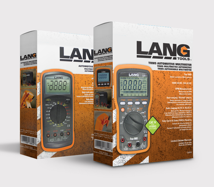
I’m excited to present new portfolio work this evening adding to my ever evolving collection. I love the raw texture and vibrant aesthetics this project emotes. Very much my style, which is hard to say for many commercial projects! Let know what you think!
As a disclaimer, the Lang Tools logo was provided, the art direction, packaging design and photography are all my own.
![]()


Mastering the power of color isn’t an easy task and requires a good amount of artistic instinct, foundational color theory and psychological emotional projective. To break things down, here are a few tips and techniques trending for 2016 to make choosing the right palette a little easier.
1. Think Monochromatic
Less distracting, monochromatic themes are becoming a strong focus in minimalistic design. Because color can be very overwhelming, choosing a bold shade directs focus towards the text content and message of the page.
2. Color Blocking and Hovering
This technique is extremely effective for compartmentalizing information in compact, clean formatting. By laying out content in a grid or block presentation, it becomes easier to pick and choose through more content which otherwise may be skipped or overlooked in the mass of things. In addition, hovering allows the viewer to experience a more precise intake of information in ‘visual bite sizes.’
3. Color Paired with Texture
In the past, texture has been reserved for neutral backgrounds but not any more! Vibrant color paired with texture is creating exciting bold statements for web and interaction design. This technique can easily become overwhelming so be selective and use colors as accents with texture for best results.

4. Accent with Color
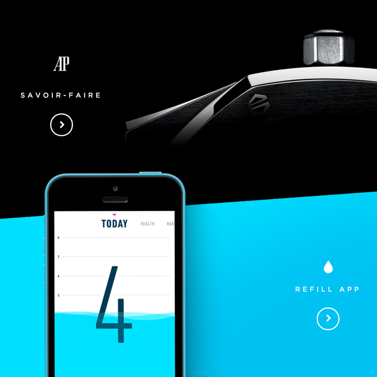
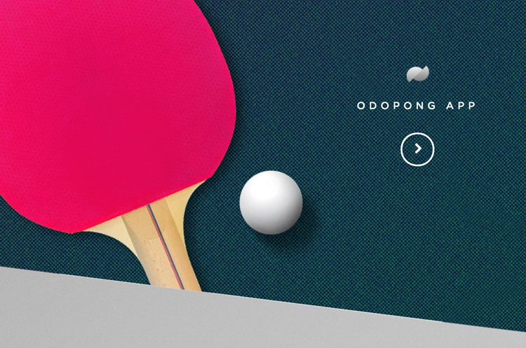
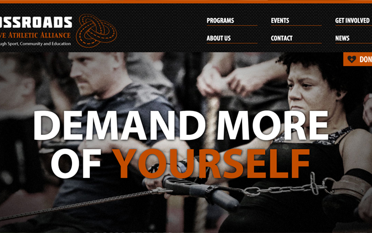
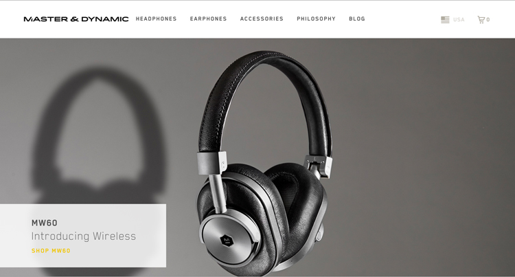
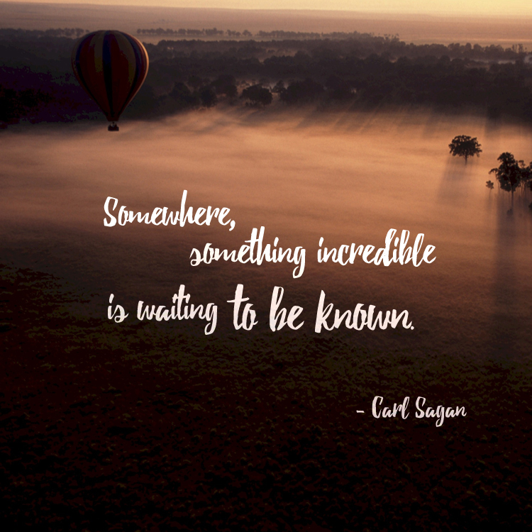
As stated before, color can be a powerful tool when used as an accent in a high contrast setting. This can be as subtle as a color title or call to action button but beautifully effective when contrasted correctly. Below are some great examples of vibrant color accents executed brilliantly.
In addition to using color effectively, keep in mind the mood of your color choices is a powerful tool as well.
Here are a few general guidelines to setting color mood:
Red: is catchy and provocative. Provokes a call to action and adventure but overpowering if used excessively.
Green: is balance, associated with nature, prosperity and wealth. Banks and financial institutions often use green hues for this same reason.
Blue: is associated with security, trust, peace, realism. Strongly linked to the sky and the sense of dependability.
Purple: is imagination and dreams. Also associated with leadership, respect and wisdom.
Orange: is a positive color and associated with social, physical and mental stimulation. Will put viewers in a good mood.
White: stands for innovation, creativity and purity. It is the color of perfection.
Black: is the color of intellectualism, power and professionalism. It can also be associated with luxury and sophistication.
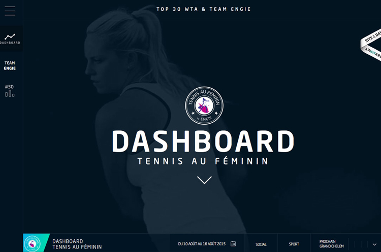
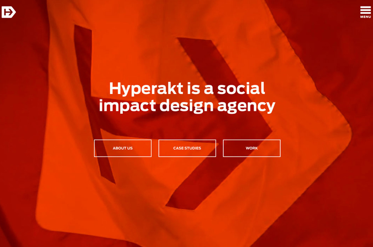
Photo source: tennisaufeminin | hyperakt | madebypfd | graydenpoper | thefarmerandthechef | crossroadsalliance
| masterdynamic

Happy New Year to everyone! In the spirit of things, I have been thinking about my own resolutions/goals for 2016 and realize the common thread between everything I hope to accomplish boils down to one concept, creating opportunities. I read a great quote that I feel addresses this exact philosophy perfectly:
If opportunity doesn’t knock, build a door.
-Milton Berle
2015 for me was somewhat chaotic, full of uncertainty being tossed around in the sea of the unknown. As much as I dislike this lack of control in my life, I hope to embrace these uncertainties with a fresh perspective this year (as I’m sure tsunamis lie ahead as they always do.) Instead of fighting to force everything to fit in my perfect comfort zone, I hope to bring on the un-pleasantries and have some amazing new experiences in the process. You only have one life to live, so live it!
As philosophical as that all sounds, I do have some practical resolutions I hope to accomplish this year which I will be promptly be crossing off throughout the year.

Photo credit: Currie Person of Spartan Home and Beam & Anchor
Love & peace 
As fabulous and fun as the holidays, travel, family has been, I have been very distracted with everything and apologize in advance for the lapse in posts. Hopefully everyone else is also going through the same seasonal busyness and hasn’t noticed…
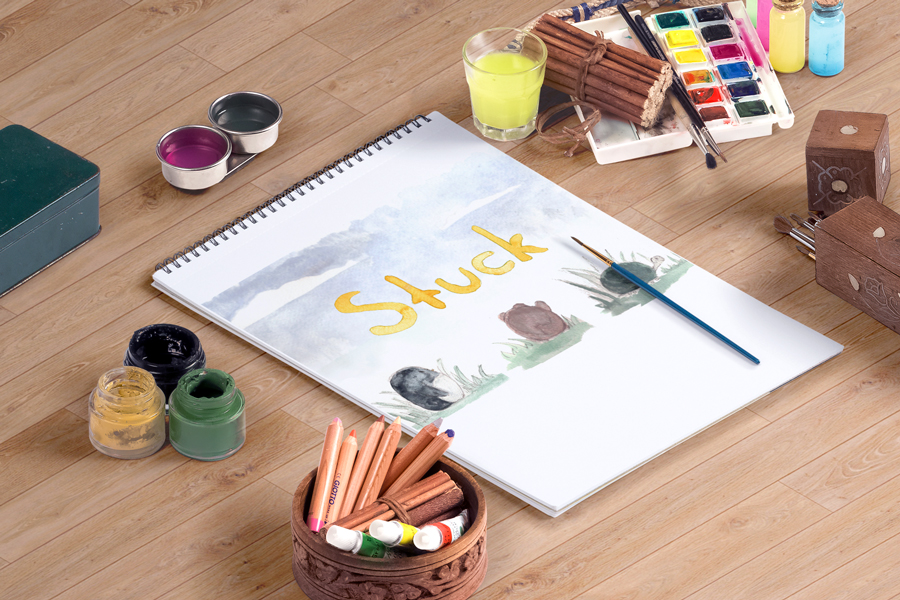
I have been thinking about new blog segments for next year and I am excited to bring in 2016 headstrong with new interviews, design bits, portfolio pieces etc. As mentioned previously, I have been revamping my personal website and can’t want to reveal the new layout and design! In the meantime, I have a new portfolio piece to share and will continue to keep you updated as more projects are completed.
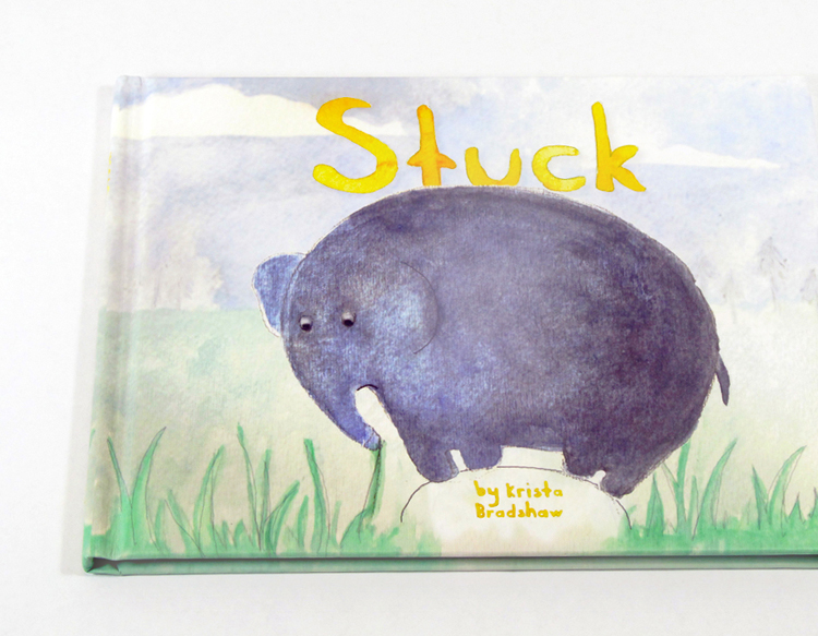
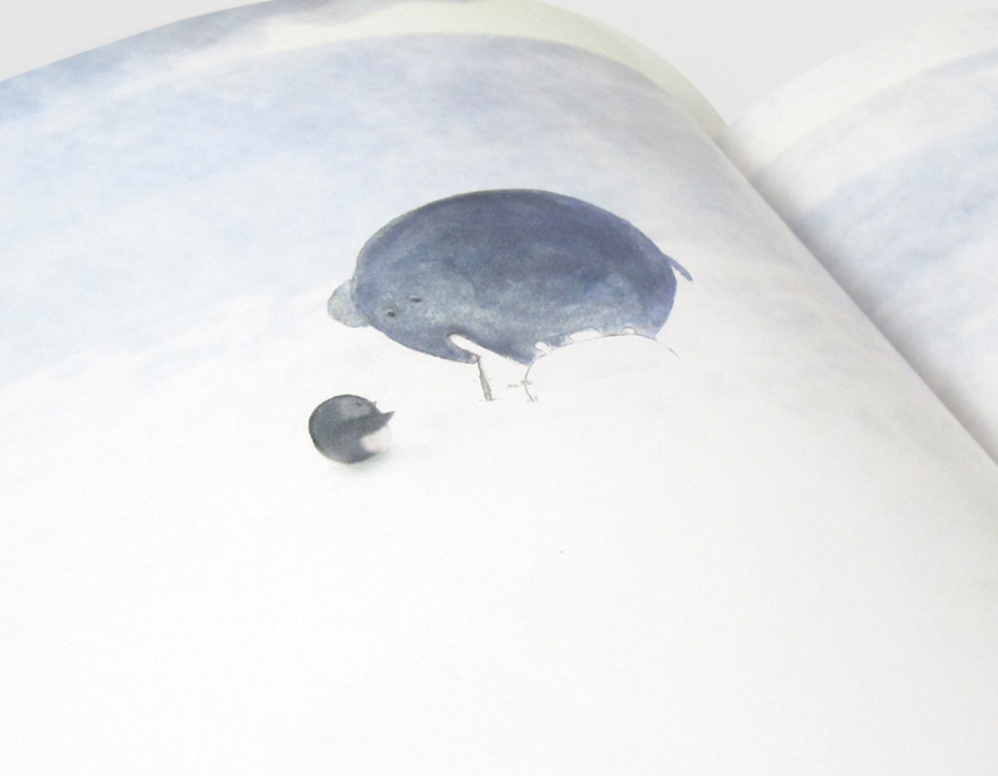

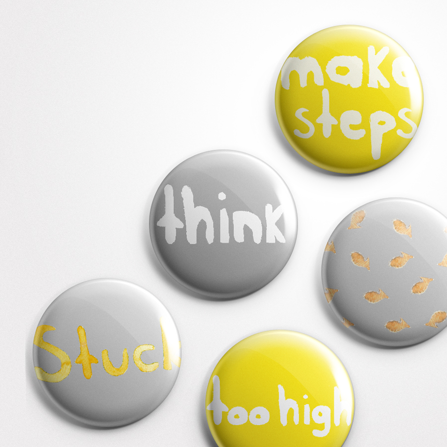
In regards to this project, I love the open-ended creativity and spontaneity that children’s books afford. I had so much fun creating this piece and I hope it touches a little corner of your inner child as well.
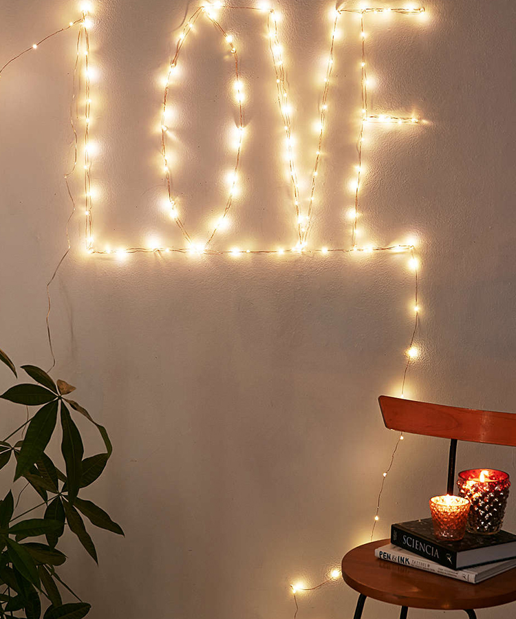
Despite the cave-like comforts of drifting off into a deep pleasant sleep, the shadows of winter time zones eventually take their toll resulting in indoor apathy. Here are 5 easy steps to brighten up any nook or corner of your home and add creative flair.
Step One
Choose a corner, shelf space, reading nook that you wish to “enlighten.”

Step Two
Gather a few indoor potted plants, preferably ones that require very little maintenance. Areca Palms, Aloe, Diffenbochia, Spider Plants etc. are all very low care plants which make for great winter companions.
Step Three
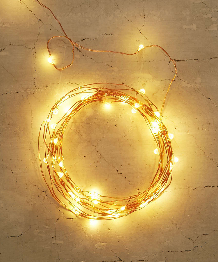
Next, pick up a set of decorative firefly lights, I found these from Urban Outfitters but really any décor retailer should carry something similar.
Step Four
Finally, collect a few glass items to display your lighting. Mason jars, fish bowls, cake covers will all work great for this set up and typically cost ones of dollars at your local thrift store.
Step Five
Done! A beautiful nook of light to cheer up any wintery night (or day).
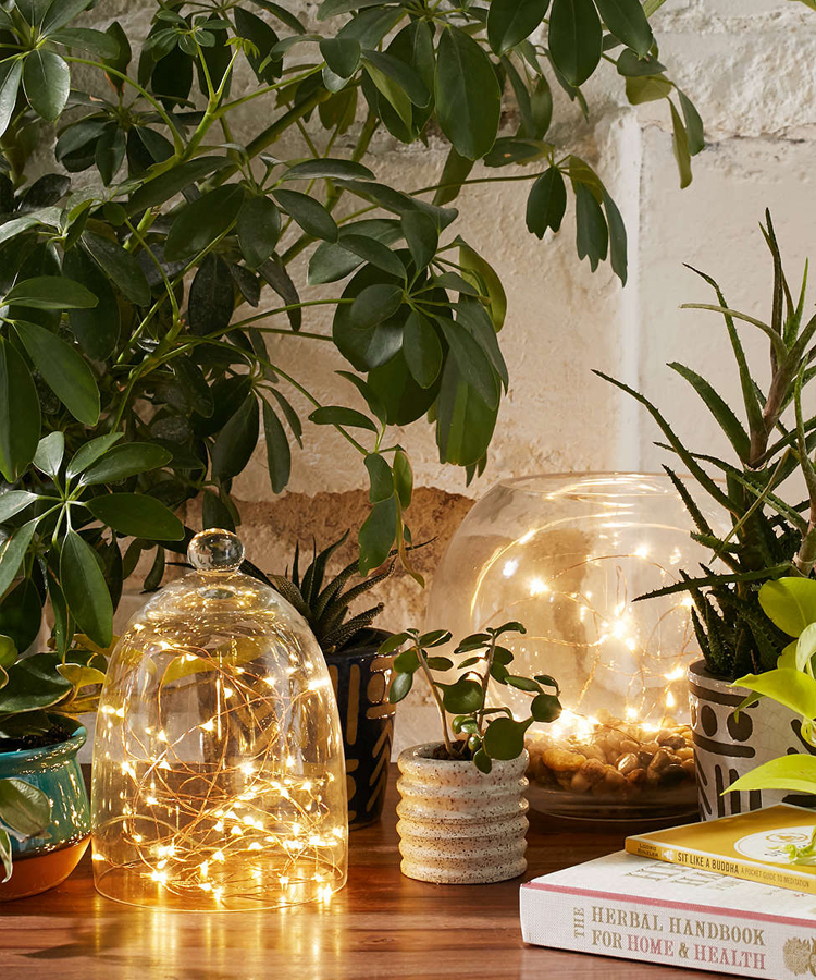
Photo credit: Urban Outfitters
I have an exciting new guest interview to share with you all! It’s my privilege to introduce local designer Kristen Williams from Pueblo, CO.
Check out our interview together and visit more of her work from the links below.
Interview
1. Tell us a little about yourself and how did you get into graphic design?
I was always artistically inclined. As a tiny child, I loved to draw and paint and when I turned five I finally got my hands on my mom’s Pentax SLR. I was drawn to typography and fell in love with the Egyptian typeface on my mom’s antique typewriter. I always noticed the logos on my toys. I think I was doomed from a very early age to be an artist and graphic designer.
It almost didn’t happen though. My family didn’t understand the difference between commercial and fine artists and I think they feared the “starving artist” stereotype. Wanting the best for me, they encouraged me to pursue other fields ranging from math, to aeronautical engineering and finally journalism, which is what they sent me to college to obtain. If it weren’t for a passing comment from my advisor that I could double major in graphic design, I’d probably be working at a newspaper right now. Ironically, journalism is far lower paying than graphic design, so I focused on my BFA and switched my journalism to the more complimentary integrated communications. I’ve never looked back since.
2. Describe your style/aesthetic and where do you draw inspiration from?
My style fluctuates a bit depending on my client’s needs, but it’s usually somewhere between eclectic retro, hipster and grunge on a Swiss modern structure. I’m a 90’s child and so grunge is a dominating influence, but I’m also inspired by 1960s advertising, halftones, drawing, printmaking and the colors of local Hispanic and Latin-American paintings. I’m in love with the contemporary Argentinian graphic design circuit as I see them working with the same influences—60s halftones, 90s grunge and contemporary Latin-American colors. There’s also a kinship in our environments and graphic design goals as I too am trying to use these in-your-face graphics to take a stand and promote change for Pueblo, Colorado.
Pueblo is my second home. I go to school here, met my best friends here, and I spend most of my free time here. Local leaders are trying to raise Pueblo to a cultural hot-spot and shake away the steel-mill roots and the 80s depression that crippled Pueblo. What was once a Victorian hot-spot for health and mineral water, the location of a Frank Lloyd Wright opera house and the home of gilded, marbled hotels became associated only with the dirt of working-class industry. This town has come so far, made so much progress, but people in other parts of Colorado (or other parts of the US) still over-look it.
We local graphic designers are trying to provide the visual component to revitalization campaigns, and so rebel graphics resonate with many of us. I’m one of them. Currently I am a designer at the Historic Arkansas Riverwalk of Pueblo, a down-town venue that is one of the fore-runners of Pueblo’s revitalization projects. The Riverwalk has already made major improvements in beatifying Pueblo (it ranks comparable to my favorite spots in San Francisco). My job is to help lead the charge of a fresh visual identity system that will make people remember the Riverwalk fondly and thereby remember Pueblo fondly. The goal is to help people see Pueblo as a thriving cultural and arts center, and forget the long-gone steel-mill past. My love for bright, in-your-face colors and rebel graphics that scream for attention are now a necessary inspiration for my job.
3. Walk us through a typical day.
A truly typical day almost doesn’t exist for me, especially while I’m juggling my last full-time semester of college and two internships. But there are some things I can expect (mostly!). When I walk into the office, I either immediately deal with an unexpected challenge that arose while I was away at class (such as a rush job), or I can go straight to my desk and work on my projects. I like to start the day researching the project, brainstorming the design direction and researching related design trends (as both an example of what to follow or to avoid).
The rest of the day is spent collaborating with copywriters, communications directors, the printers, my boss and anyone else assigned to the project. Graphic design is a lot to juggle, but that’s also what makes it exciting. It’s not like the fine arts where I lock myself into the studio for hours on end, drawing compositions to meet a gallery deadline. Instead, it is a collaborative, back-and-forth effort. Sometimes things change, sometimes I might lose favorite elements in pursuit of the greater goal (or the client’s specific desires), but almost always the project is richer for it. You can’t expect to have a lot of control in graphic design—instead you have to be ready to adapt to change, and quickly.
4. What are some of your favorite pastimes?
I love pastimes that inspire my design, or let me take a break from it. I’ll stroll antique stores in search of vintage graphics or walk the down-town streets of small towns for mural and sign inspiration. My photography is also a great way to decompress and reflect. When I lift up my camera, nothing else exists in the world but me and my subject. It’s complete Zen.
Sometimes I need to take a break from anything visual arts to avoid overstimulation and during this time I’ll focus on spending time with my friends, taking a stroll in nature or watching equestrian sports. There’s something awe-inspiring about watching a man and a horse soar over a five-foot jump in perfect partnership. Thinking about what they had to go through over several years to obtain that level of strength and finesse puts all of my graphic design challenges into perspective. And, in a way, equestrian show jumping represents graphic design—you need strength, confidence and delicacy to clear major obstacles. The jumps look formable, but they are actually delicate–make a mistake and suddenly that jump crumbles and you are out of the competition. I can’t think of a better analogy for graphic design.
5. Any advice for future/aspiring new designers?
Never lose sight of the bigger picture, the end goal of the project, and your client’s needs. These are the most important things and if you meet them, you’ll never go hungry. There are going to be times when you will have to stand your ground and defend your design aesthetics, but that is only when you KNOW that the design aesthetics are the best to meet the client’s goals. If they don’t meet the goals, then the aesthetics are just your babies and you’ll have to let them go.
Be ready to juggle multiple projects and a lot of little details, many of which will change as the project progresses. This is what makes commercial art different from the fine arts—it’s not about you spending hours on your favorite image until you’re done. In order to please multiple people and communicate a message, you’ll have to juggle a team of people and roll with the changes. Learn to multi-task and always welcome change. Be like that show jumping horse and rider where your talents are your trusty steed. Always have confidence, always look to the next obstacle (not down), know when to use strength and when to be delicate. Nothing can stop you if you learn that.
Thanks again! Photo credits @Kristen Williams
Hello good people! Hope you all had a great weekend, I took a short trip to the mountains today to get away from life, the city, my house…needless to say it was perfect and just what I needed to feel refreshed for a new week.
Speaking of refreshed, I thought it was about time for some good, old fashion typography inspiration. I love all things type, therefore; I found far too many examples to fit in one post so I’ll have to try to narrow things down. Enjoy!
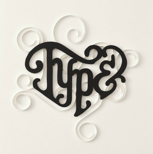
Photo credit @battery_full
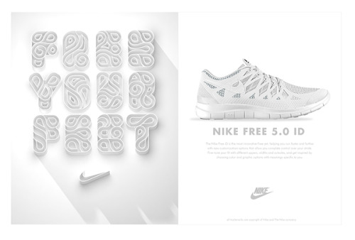
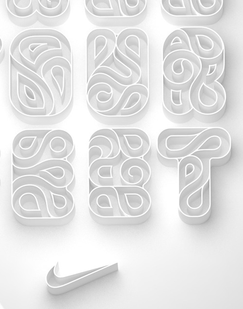
Photo credit @Luke Ritchie
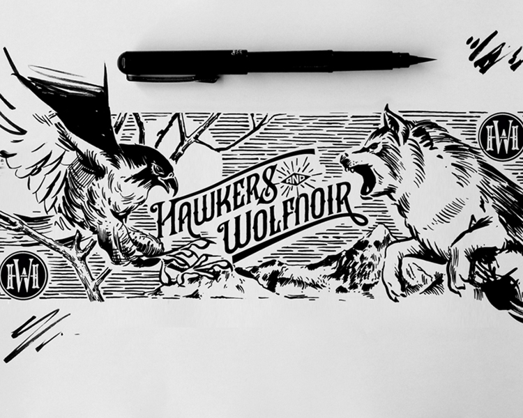
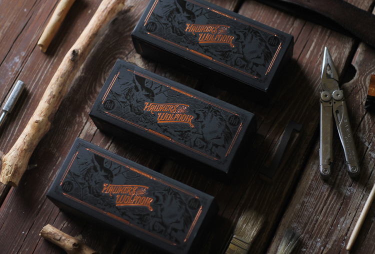
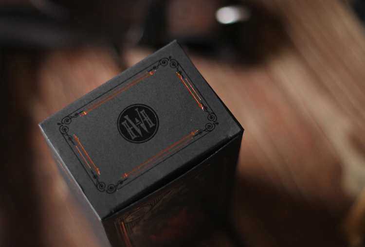
Photo credit @Multiple Owners
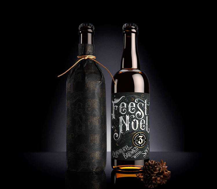
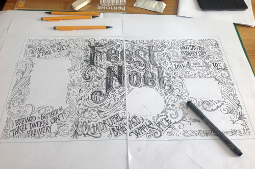
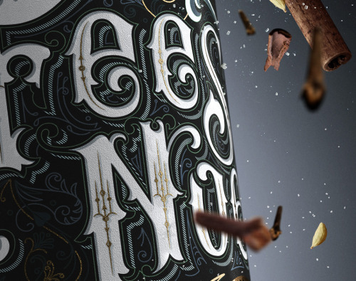
Photo credit @Anton Brumistrov
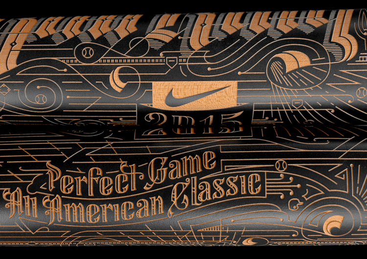
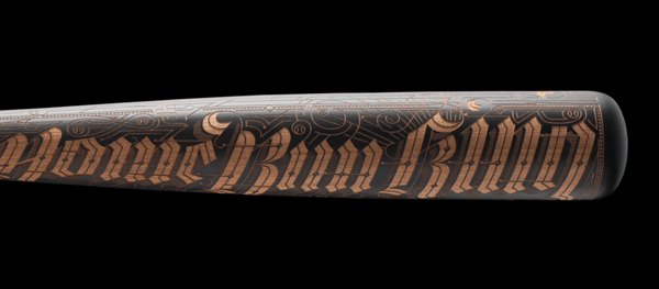
Photo credit @Multiple Owners
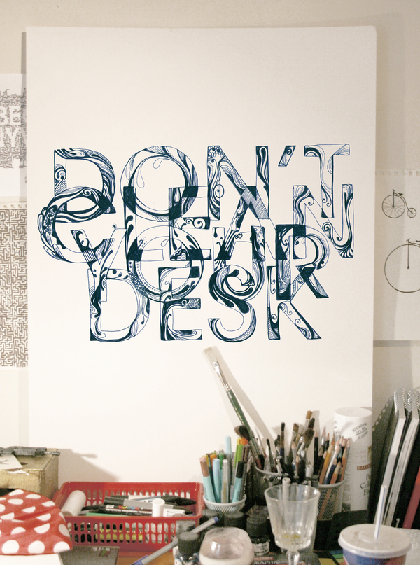
Photo credit @Hanna Viktorsson
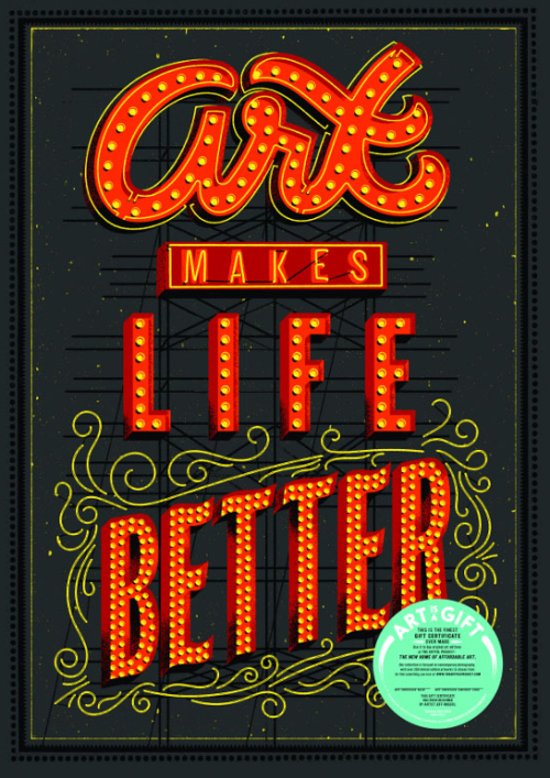
Photo credit @Jeff Rogers