Happy Friday Eve! Last time I shared with you my vision for a new personal logo to better represent my work. I’m going for a clean, simple, modern layout accented with strong visual elements of texture.
So what makes a strong identity brand? I asked myself the same question and came up with threes points based on my observations of successful branding.
- Original
Did you know that many template websites today also include a logo maker? You don’t want your logo to look so generic that it belongs on a template. Allow your logo to have a voice of its own, to represent you and your work in a visual way that people will remember.
- Harmony
This is the opposite of chaos and disorganization. Do your business cards look like they belong with your website? What about your resume to your stationary? Even though creating a harmonious system can be very challenging, it’s well worth the extra effort to pull off a strong presentation that speaks quality and refinement.
- Refined
The whole point of a personal logo is to brand oneself, but also to easily be identified by others. The best logos are usually the smartest and simplest. This is always easier said than done and demands trial and error refinement to flaunt creativity in a way that others will pause for.
Based on these observations; here are a few artists that I thought really nailed these personal identity systems.
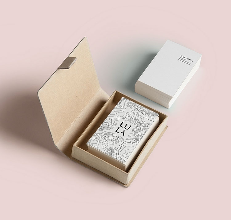
Go check out Luke Latham. Photo credit @Luke Latham.
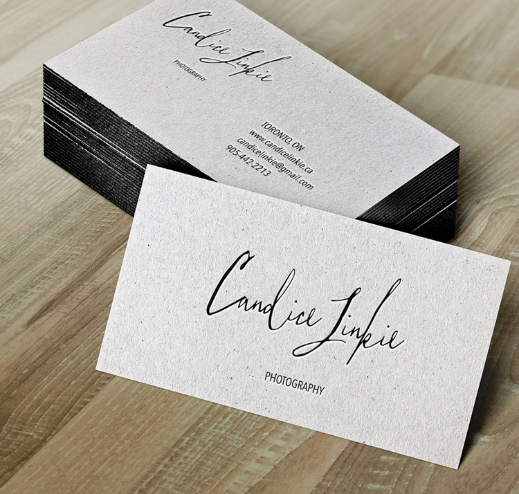
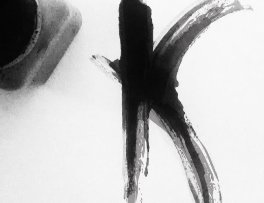
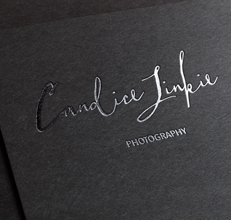 Go check out Taylor Hand. Photo credit @Taylor Hand.

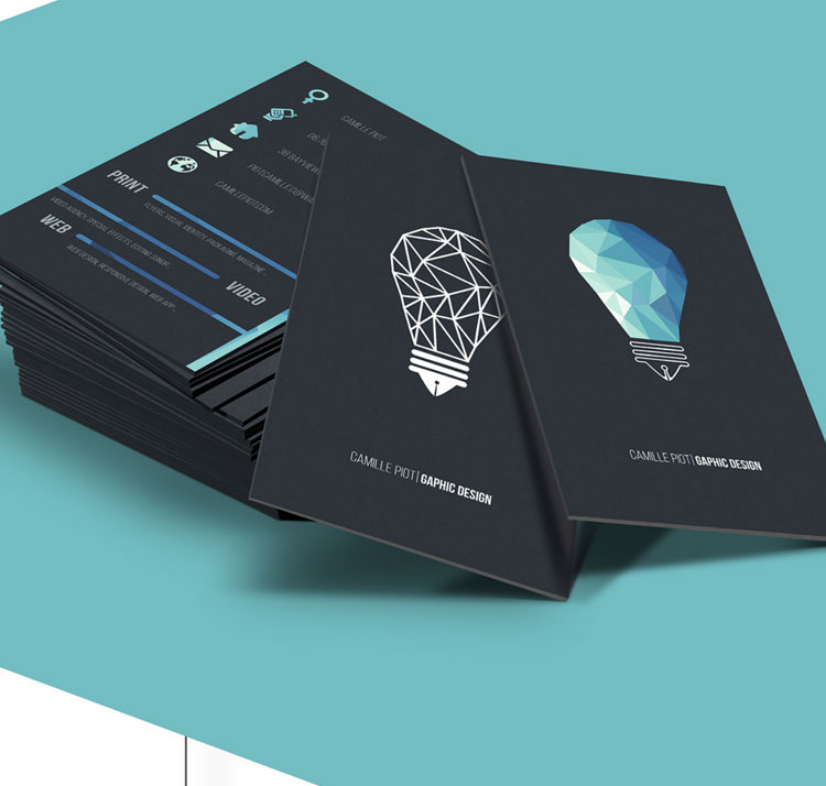
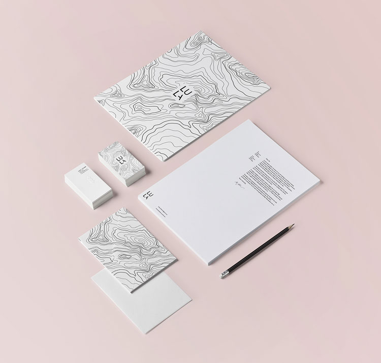
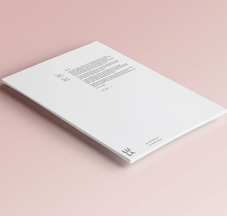
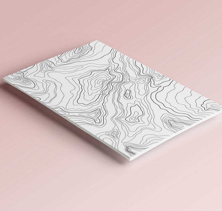
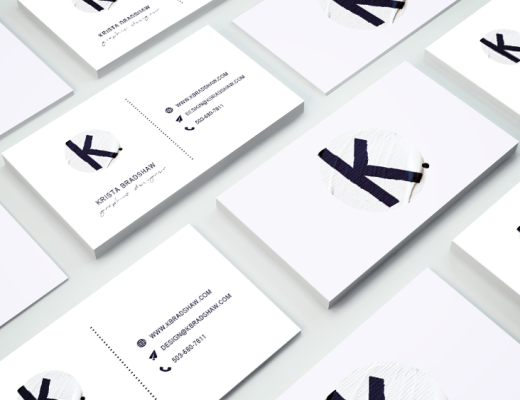
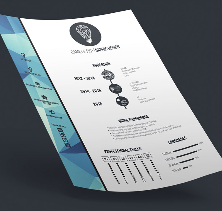 Go check out Camille Piot. Photo credit @Camille Piot.

Leave a Reply
Be the First to Comment!